
Growing Under Ground is a zero-carbon farm that sustainably grow fresh microgreens and salad leaves 33 metres below Clapham Town in London. It takes them just 2 weeks to grow their greens which then gets put out onto shop floors to be on your plate in as little as 4 hours later. The crops can be grown all year round using the latest hydroponic systems and is pesticide free from using 100% renewable energy. Due to the plants being grown in a prime location underground, it means their greens are completely unaffected by weather and seasonal changes. Below is a screenshot taken from the ‘About’ section on their website:

The entire website follows a bright and exciting colour scheme that doesn’t necessarily match each other but explores an idea of fun and experimentation. The traditional colours related to farming would be considered mainly as greens, browns, and yellows/oranges. This converts away from that statement and brings in pinks, purples yet conventionally still using greens to relate back to the brand identity. The complement of pink when looking at a 12-hue colour wheel shows a bright yellow green which is not seen as often as the more common blue, yellow, red, or purple complements. (McIntyre, 2018). When looking at the pale green next to the pale pink, they almost blend to make the graphic extremely aesthetically pleasing to the eye. Looking closely at the background pink, you can see light is used on the left to make it seem brighter and in the right bottom corner, which may lead the audience’s eye to the brighter part where the text begins. Pink represents friendship, harmony, and inner peace. The paler colour seems very approachable, and a slight warmth surrounds it. (Bourn, 2021).
The green image of plants used in the background is placed central behind the text and is a darker shade to the type on screen so it can still be easily read and doesn’t distract from the entire graphic. A slight critic that could be given is that the ‘SALAD’ text is slightly invisible when placed in front of the beige colour of the plant behind. The rest of the text is easily visible. Pale green is a green that is heavily saturated with white; this may link to a mossy type of feel rather than the heavy farming connotations with a block, bright green. It mainly stands for a symbol of freshness, spring, rebirth, and progress. (Spacey, 2021). Overall, colour is used cleverly in the graphic and heavily subverts the usual conventions of other urban farming organisations. It is a very recognisable scheme and will attract lots of modern viewers. (growing-underground.com, n.d.).
Moving on, Freight Farms is a world leading manufacturer of containing farming technology and is a global leader of the AgTech industry. They work to empower anyone to grow food for their community. Aiming to bring everyone access to local food by creating an interconnected network of farms and farmers. Below is their main logo used on the company website:

This black and white simple logo isn’t very colourful or catching to the eye and could be redesigned to attract a lot more customers to the site. The brand identity layout is very clever in the fact that you can see the shipping container located with an ‘F’ and it can be understood and would be recognisable to the audience perceiving it. However, this could be rebranded and updated to involve colour to create more meaning for the company. When looking at recent trends in the colours used in agricultural logos, the most popular ones involve blues, browns, yellows and black. The most absent colours would be purple and pink likely because they oppose the ‘down and dirty’ farming lifestyle that we are considering. (99designs.co.uk, n.d.). When sketching and thinking about this new design, colour is the key importance to focus on which can be shown below:
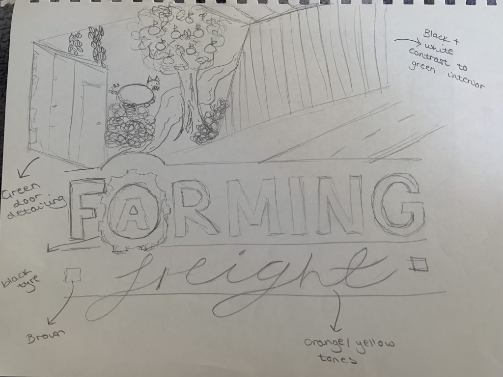
The sketch began a great starting point which could then be experimented on with software to discover some key colour combinations. The orange/brown tones in the text convey the soil and dirty work that is involved in the industry. Most companies use these colours in their logo at some point as it is a very conventional way to be used. The bright green and blue interior heavily contrasts the boring grey/black freight crate on the outside. The brand identity can clearly be demonstrated through this colour contrast and the green is very common for connoting health and growth. The red apples on the tree leaves are placed central on the page and attract the viewers eye to the highest point of the tree. Relating to the example at the beginning by Growing Under ground, the composition has attempted bold colours to please the audience’s eye. Overall, this redesign is more effective when comparing to the previous logo and uses colour consciously to match the industry ideas and attract viewer attention.
Bibliography
99designs.co.uk, n.d. The logo colors of agriculture. [Online]
Available at: https://99designs.co.uk/logo-design/psychology-of-color/agriculture
[Accessed 21 October 2021].
Bourn, J., 2021. Color Meaning: Meaning of The Color Pink. [Online]
Available at: https://www.bourncreative.com/meaning-of-the-color-pink/
[Accessed 18 October 2021].
freightfarms.com, 2021. Taking Local Food Global. [Online]
Available at: https://www.freightfarms.com/
[Accessed 21 October 2021].
growing-underground.com, n.d. Unseasonable Good. [Online]
Available at: https://growing-underground.com/
[Accessed 18 October 2021].
McIntyre, C., 2018. What is the Complement of Pink?. [Online]
Available at: https://www.celebratingcolor.com/what-is-complement-of-pink/
[Accessed 18 October 2021].
Spacey, J., 2021. 14 Types of Pale Green. [Online]
Available at: https://simplicable.com/en/pale-green
[Accessed 18 October 2021].