
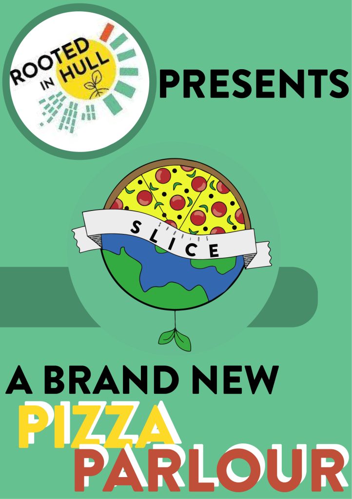
Introduction to Brief
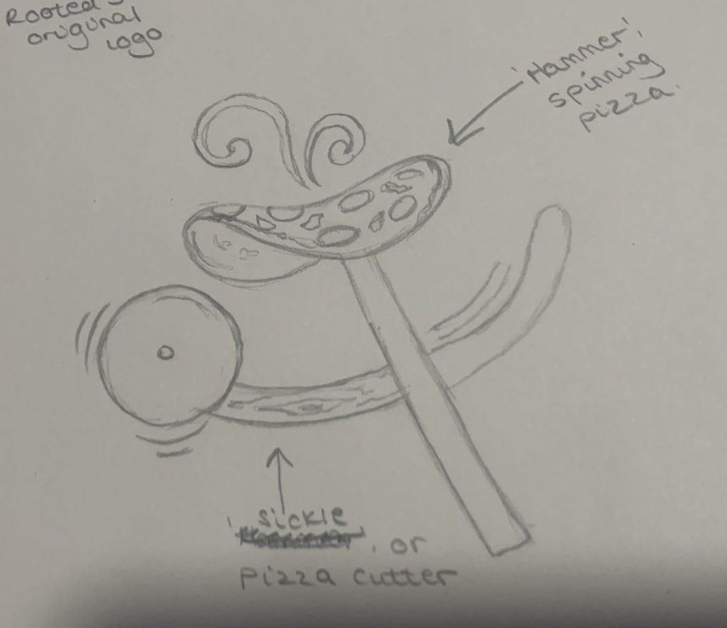
While the Graphic Design students where currently working on the main Rooted in Hull project, an email arrived from the CEO Adrian Fisher. It was exclaiming that he had recently hired a baker who wanted to open his own Pizza Parlour. The student’s job was to create a logo and some designs to help the start-up of the store. Due to a friend letting him down, he had some basic designs, but nothing finalised up to Rooted in Hull’s graphic standards. His main requests were as followed “He wants to use some variation of the hammer and sickle to represent community and food, to look ‘underground’, ‘for the people’, not for the establishment. Keeping it ‘edgy’.” This was the perfect opportunity to base the first major design part of the project to base around a real-life situation.
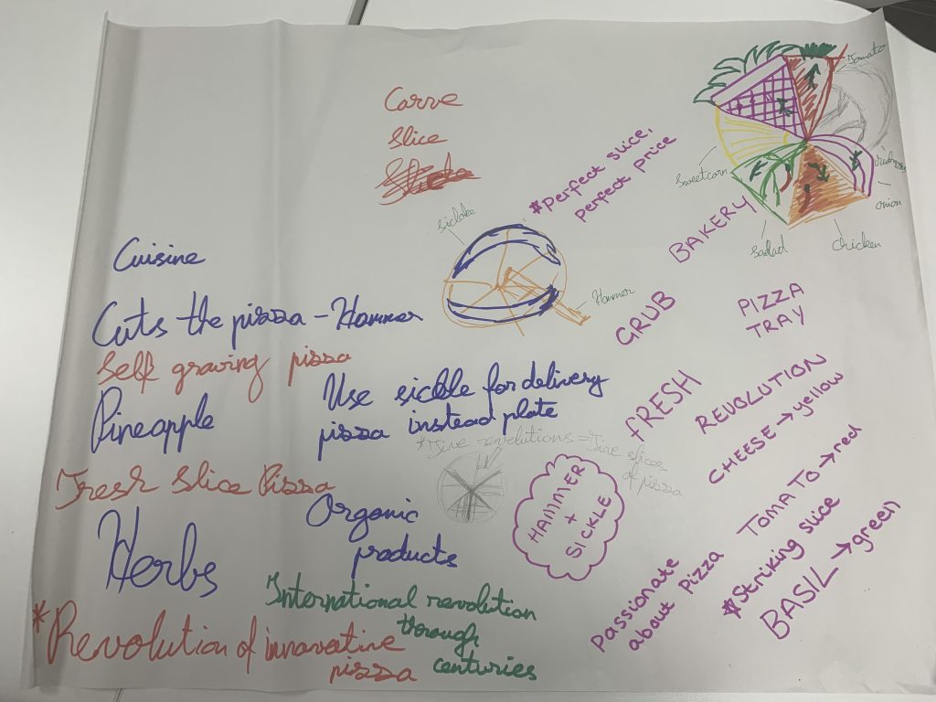
To begin, a smaller side Master Plan was created for this new, exciting idea and they brainstormed one logo design that was linking to the baker’s requests, and one that was completely original. This was done in pairs so that ideas could be shared and discussed before finalising.
Master Plan
Initial Sketches
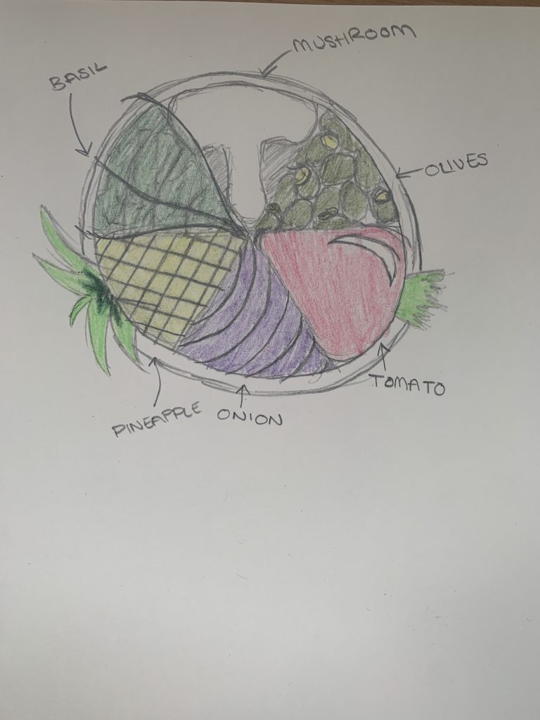
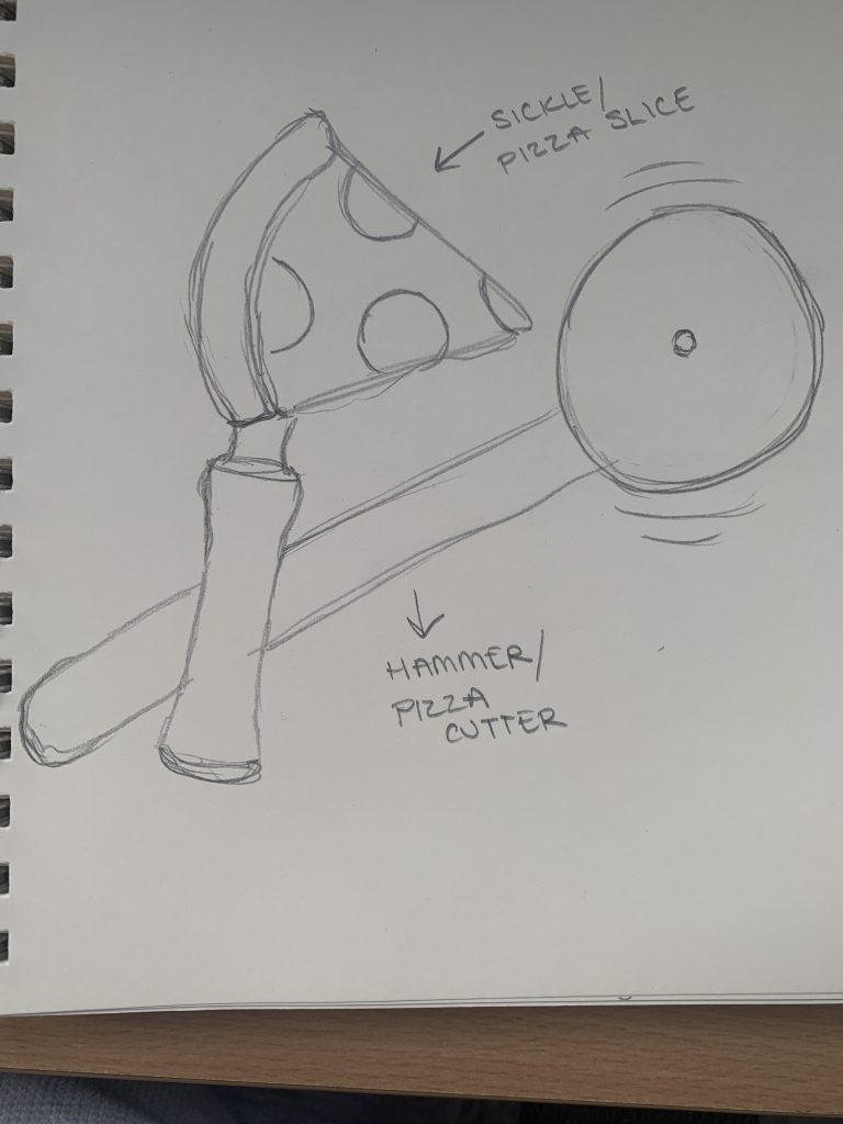
From this plan, the two extremely rough sketches were then refined to detailed sketches for some early basic thoughts for the two different logos.
Basic Research
Looking back at the Rooted in Hull website and their overall identity, their logotype is very simple yet effective with lots of deeper connotations. That was heavily noted when looking at redesigning the pizza logo. They stick to very similar, basic colours which again include colour theory and the composition is cleverly planned to attract the target demographic. This is all looking at what was initially studied at the start of the year.
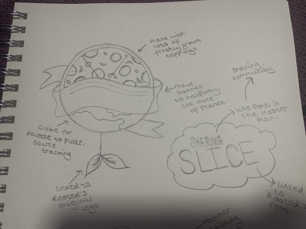
It was realised a lot more links could be contributed to Rooted in Hull’s original design and branding. So, looking back at the Master Plan, some new fresh designs were created.
Adobe Designed Logos
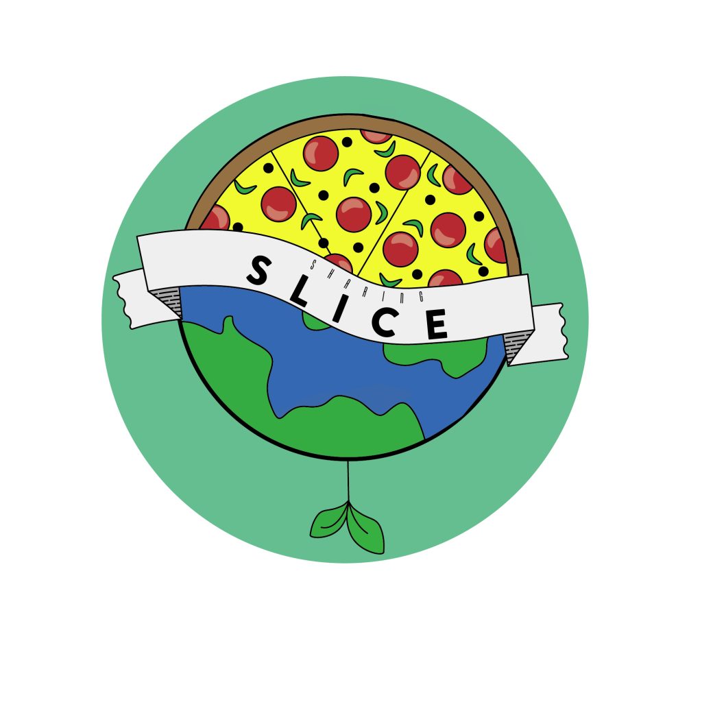
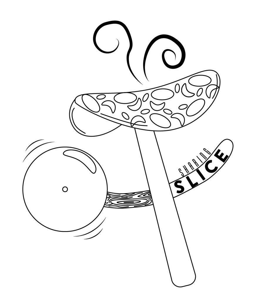
Then putting these sketches into Illustrator, it ended up being extremely successful. Using the Pen tool and the Direct Selection tool to manipulate lines and shapes, they ended up looking professional and like the original thoughts. The Hammer and Sickle logo looked a lot more effective in the black and white outline whereas, the original thoughts logo on the left looked a lot more thorough and in-depth with a hint of colour. These were obviously conforming to the previous Graphic Standards that were created to relate to being professional and in line with how it’s supposed to be. For the leaflet and the packaging, the chosen logo to continue with was the personal designed one as it conformed to more of the 4 previous subjects that were being studied: colour, composition, conceptual design, and typography.
Promotional Leaflet Produced in Software
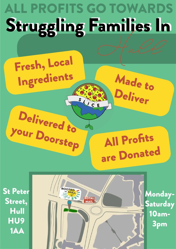
The leaflet was heavily influenced by the Rooted in Hull website and some research from local pizza takeaway pamphlets that get posted through doors. The colours used were the original ones produced from the graphic standards manual. The main idea was to advertise as many people as possible to come and visit the brand new Pizza Parlour at the site. This needed to portray the message of where the public’s donations and profit would go – to local families in need. The front of the design was very straightforward and eye-catching, including lots of large text and shapes. The back had all the key details on such as a map and address, prices, offers, and menu. All of the aspects were effectively communicated and presented in a positive manner.
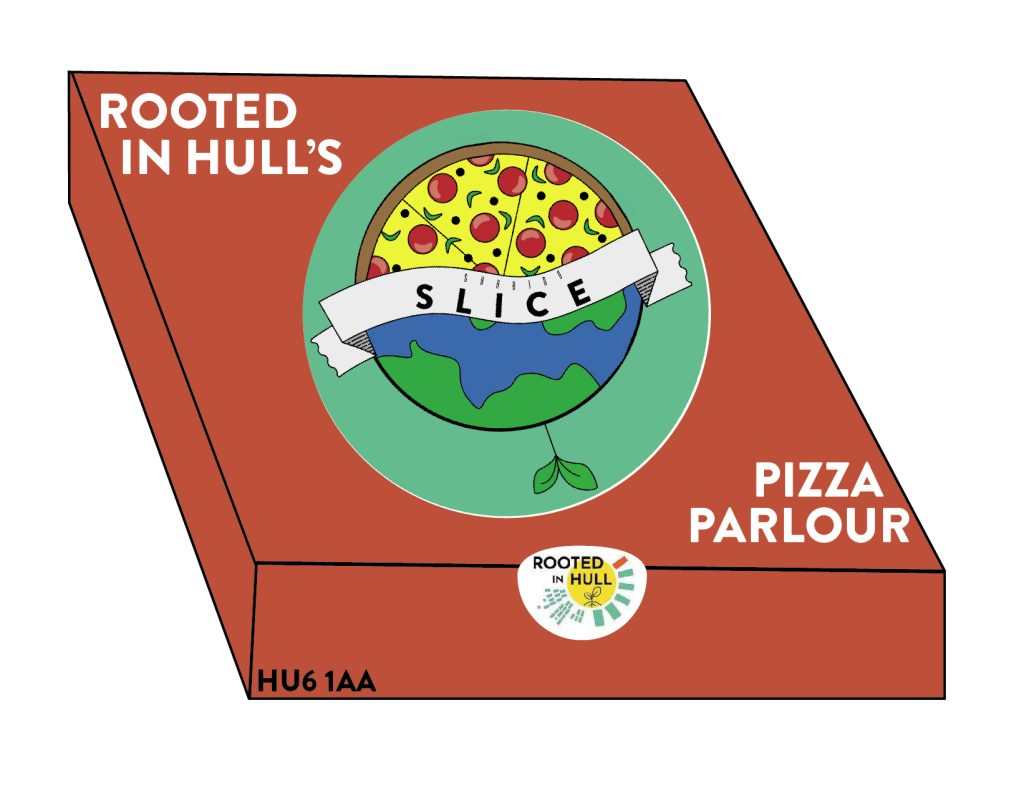
Pizza Packaging Produce in Software
The final piece of this first project was to tie everything together with some packaging pizza boxes. Obviously, the main part was to make the box that the pizza would come in. Sticking to the graphic standards and thinking about the colour palette, the central logo is mainly green so the box became red. Promoting the parlour, the logo was made large and placed central to wear the viewers eyes are going to gaze first. The composition is fairly simple as there is no need for huge amounts of information on the box. On the size is Rooted in Hull’s postcode to attempt to gain people visiting the site too. The final touch is a Rooted in Hull original logo sticker to place over the lid to keep it shut. This is so that the audience will have to interact with the sticker to open the box and it may make them inquisitive about visiting.
Visit to Site
This original artwork project was a huge success. To finalise the pizza logos and to receive feedback, a visit to Rooted in Hull’s site was carried out and helped put into perspective how working for a company will be like in the future.
