
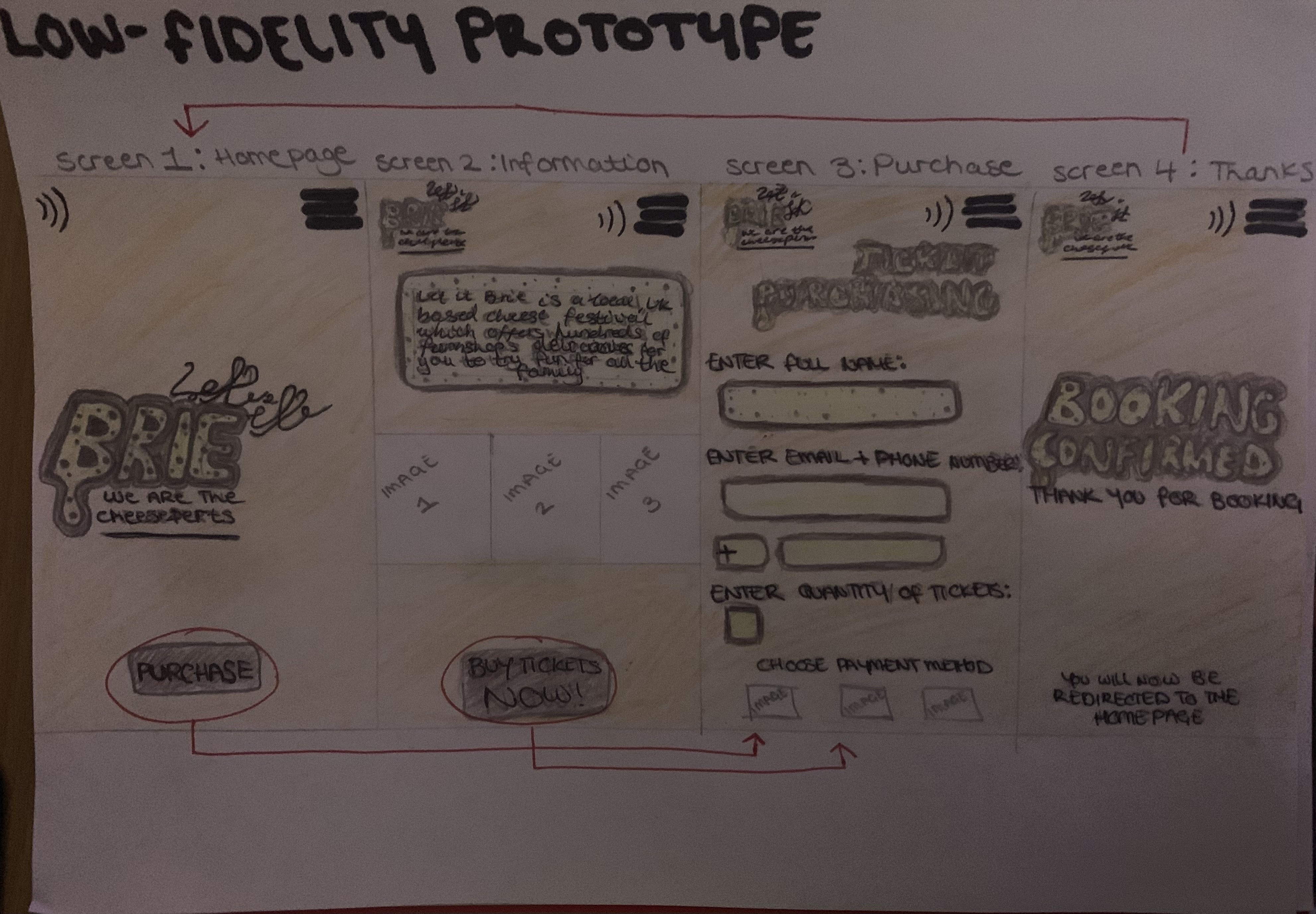
Paper-Based Prototype
Paper-based prototyping is the quickest way to get feedback on a preliminary site/app information architecture, design, and content. Therefore, this is the method that is used when designing a low fidelity UI prototype so we can easily figure out the positives and negatives with the design. Below is the final low fidelity UI prototype created for ‘Let It Brie’ cheese festival.
Constraints to guide Stakeholders
If there was relevant feedback to say that the stakeholders needed a separate operating system, then considerations would be taken to alter the user interface to guide them to the correct choices. Actions would be taken to direct them to book a stall at the festival instead of purchasing a ticket. There would be more information applicable for the event details instead of just enticing them to visit. This could also be done through the companion app by stakeholders logging in and taking them to a separate interface designed for them.
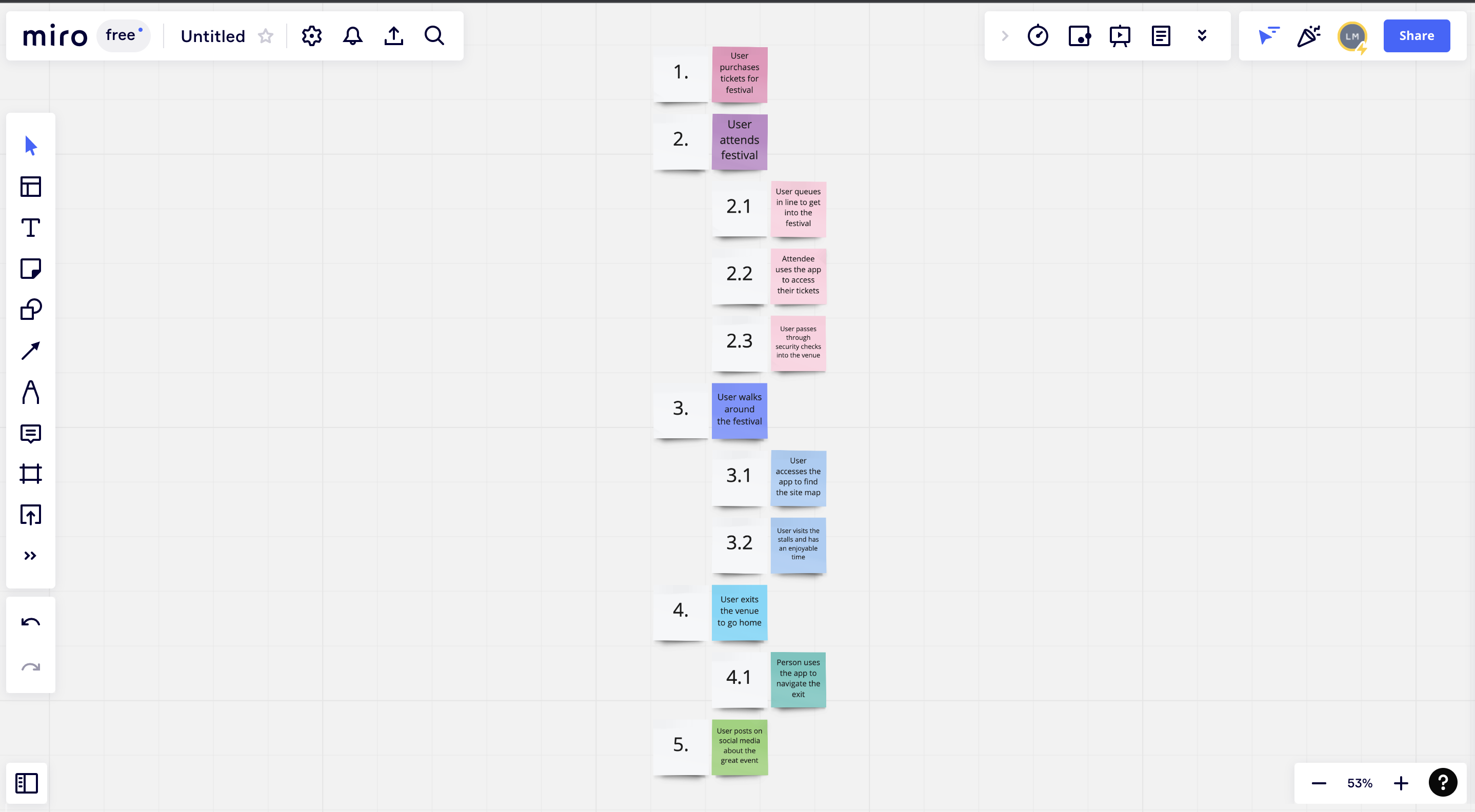
Hierarchical Task Analysis
A Hierarchical Task Analysis was created to show an understanding of the tasks the user needs to complete to achieve certain goals. Below it shows the tasks a user needs to complete to have an enjoyable experience at the festival:
Organised Content
The content on the website and app is organised so that the user can access relevant information simply. This also gives the stakeholders of the festival a good overview of everything so that they know what is happening and can keep up to date with news of the event. This must be accessible for the stakeholders as well as the audience.
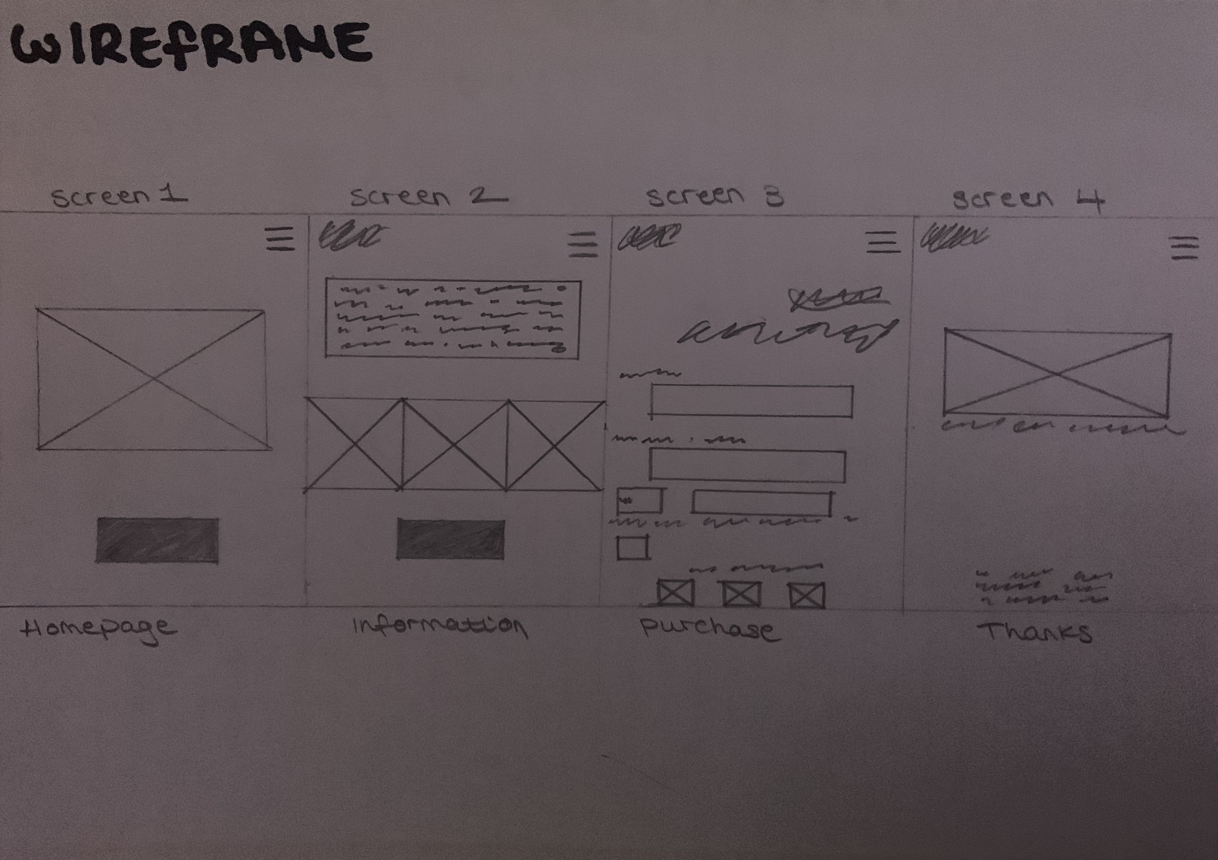
Wireframe
A wireframe was created so that the content can be structured in an organised manner so that users can methodically digest information. This is where the Z-layout is used. First, you place the items that the reader is going to see at the top. The eye will naturally follow the path of the Z. Along it, bits of information should be included that build up to the final call to action button at the end. This layout can clearly be seen when looking at the paper-prototype wireframe. (Jones, 2010).

References
Jones, B., 2010. Understanding the Z-Layout in Web Design. [Online]
Available at: https://webdesign.tutsplus.com/articles/understanding-the-z-layout-in-web-design–webdesign-28
[Accessed 10 03 2022].