
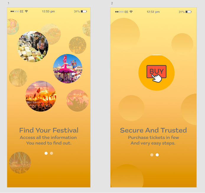
Onboarding is a designed series of instructions that help the user be eased into a product’s experience, almost like a tutorial, just for the app side of the design. There will usually be a greeting and some key benefits of the product that set the user up for success. The idea is to make the audience slightly familiar with the app before they begin to use it. (Chapin, 2010). Onboarding is very important as it is the first thing the user will see when they open the app and the first thing that the user will decide on whether to discard the app or not. Customer loyalty is a key factor in the success of the app; consequently, onboarding should not be an afterthought. (Chapin, 2010).

We don’t want to make this too complicated as it can easily overwhelm someone, and they won’t make it past the onboarding stage before quitting. Using Adobe XD and the prototyping tab, it was very simple to create a 2-page swipe design that is simple to use by just dragging the screen onto the next. Once the user clicks the ‘Let’s Get Started’ button, it will advance them to the home screen of the app where they can continue with their journey. In the future, if I was to develop this app further, I could add onboarding throughout the journey and not just at the start. For example, I could add coaching popups that help guide the user throughout completing actions.
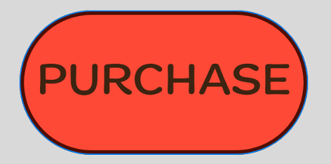
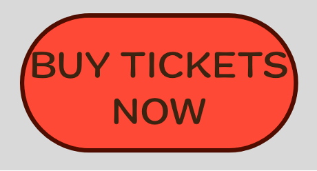
A call to action is a written directive which encourages users to take a desired action or perform a certain sequence in the design. They create a sense of urgency and urges viewers to stay engaged on the app/website. It’s a great tool to give direction to an uncertain user who may need help finding the right choice. (Quadros, 2021). Since our festival design is encouraging ticket purchasing, the strong action words I chose to use were things like ‘BUY’ and ‘PURCHASE’ so it is clear where the user is being redirected to. If we added the word ‘NOW’ onto the end of these CTA’s it would further emphasise the urgency needed to buy these tickets and will make the audience more inclined to click.

t was discussed to potentially have a longer CTA included that could potentially provoke emotional responses, but I preferred to stick to the short and sweet button clickables. Adding these words to a bright coloured button will add further effect as it will be bold and stand out. Depending on what colour that button was would depend on what emotional reaction the user would give. Following back to the previous colour planning post, we know that red is heavily linked with necessity and stimulates the body, therefore, that is the colour used for our call-to-action buttons. (DashBurst, 2014). The buttons are cleverly placed on the home screen and second information screen which will catch the viewer’s eye instantly to lead them to the ticket purchasing screen.
References
Chapin, B., 2010. First Impressions – A Guide to Onboarding UX. [Online]
Available at: https://www.toptal.com/designers/product-design/guide-to-onboarding-ux
[Accessed 10 May 2022].
DashBurst, 2014. How to Use the Psychology of Colors When Marketing. [Online]
Available at: https://smallbiztrends.com/2014/06/psychology-of-colors.html
[Accessed 10 May 2022].
marketingdoorway.com, 2022. Guide to Create A Social Media Call To Action (CTA). [Online]
Available at: https://www.marketingdoorway.com/blog/guide-create-social-media-call-action/
[Accessed 10 May 2022].
Quadros, M., 2021. 15 Call To Action Examples (and How to Write the Perfect CTA). [Online]
Available at: https://adespresso.com/blog/call-to-action-examples/
[Accessed 10 May 2022].