
“Storyboards provide a narrative direction for design, documenting collective ideas and concepts that guide your projects from conception through completion.” (Visualmodo, 2021). A storyboard is both productive and practical, abstract and analytical. It explores graphic representation of how any project will grow throughout the design life cycle. If we are being honest, no successful designer would be without one.

The first example I want to explore is a wordless comic that takes a theme of absurdism. It demonstrates a simplistic, mundane experience with a twist. It repeats the meaningless task of eating a banana but with a twist that uses the same starting illustration with the ending. The entire collection is explained to “accept the punishment of mundane life and find happiness in these meaningless tasks so that we can face the absurdity and overcome it”. (Wang, n.d.). The simple colour palette relates to the thought of happiness being simple and foreshadowing the collection of images.
The strip has a comical side along with the rest of the collection, but each idea is so unique and an even stranger concept. There is no main purpose or informatic message behind it apart from the deeper message explained earlier: “The essence of life and the world is meaningless; this gives us an opportunity to find meaning in our lives through fun and sparkling moments and by choosing to be happy”. (Wang, n.d.). I chose this comic as it explores one of the most mundane activities and transformed it through the moon and added that twist to make the audience smile.

The next storyboard strip I chose to analyse is one from the author Sarah Vettori who explains these comics are “mostly about something I encountered that day. There’s always a true element in the stories, but I usually tweak reality a bit to make it entertaining”. (Vettori, 2019). This one spoke out to me as a viewer to the relatable humour. There is a serious message at the beginning that explores feeling lost and clouded in the world; your mind fogged from ideas, and you feel spaced out. Everyone goes through this whether it’s often or not, and it has been twisted into the unexpected ending.
The short copy underneath allows the viewer to focus on the images to stay put and get the message across quickly and clearly explaining each frame. Apart from the start and ending frame, the strip contrasts a dull grey and blue colour scheme which emphasises this serious message and allows the last screen to stand out from the rest. After viewing this composition, it entices me to explore the entire collection due to the relatable nature and has successfully drawn me in as part of her target audience. Many of the comics stick to this serious twist message however some are just straight comical which draws away from this entire sombre tone.

The final storyboard sequence I wanted to look at was the following which includes some very interesting design choices. This strip is from a DC comic called ‘Challengers of the Unknown’ and this page is specifically in volume 5. I assume that the white space is not included in the retail comics and has been added in by this author on purpose. The overall stair-like layout represents what the sequence is telling us by having the character at multiple stages down the stairs. As a viewer, I enjoy how the way it’s set out allows my eyes to follow the stages and can foreshadow how the next page is going to be played out.
The white space centralises the story and adds to the dominant storyline of the character and how he evolves throughout the page. There are also small spaces of text which are placed in each screen, so the audience can separate each scene and take in the actions appropriately. The copy further emphasises the images and relates to the simple flow of the storyline. This is a comic storyboard through various design choices such as the image style and typography.
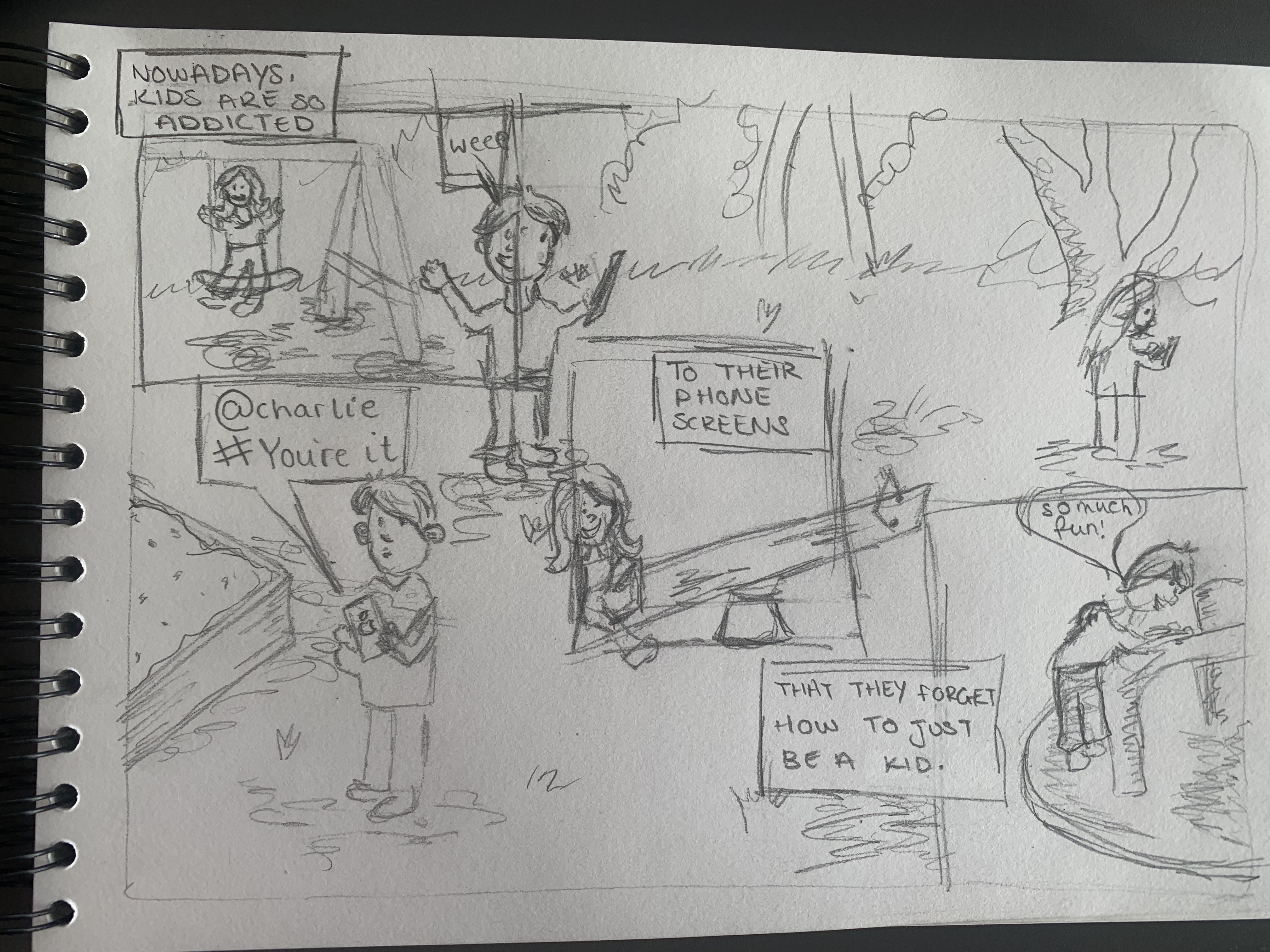
After seeing all of these different types of storyboarding, I went on to create one of my own consisting of a questionable, unique layout but also showing an important message. I researched some modern generational problems that are occurring and decided it was suitable to agree on children’s mobile phone usage. The layout explores how the current generation of children behave in a playground compared to how personally I grew up by playing in the park with my friends. The small amount of copy allows the viewer to start at the top left on the image and work their way through to discover the final message. The main image will have duller colours to emphasise how the older generations would’ve had more colourful times when playing games with each other.
References
Loeb, J., 2014. BENDIS!. [Online]
Available at: https://brianmichaelbendis.tumblr.com/post/75587423290/challengers-of-the-unknown-5-dc-comics-july
[Accessed 22 October 2022].
Vettori, S., 2019. My 30 Comics About Little Observations In Daily Life. [Online]
Available at: https://www.boredpanda.com/my-little-comics-about-daily-life-sarah-vettori/?media_id=1859387&utm_source=pinterest&utm_medium=social&utm_campaign=organic
[Accessed 22 October 2022].
Wang, X., n.d. Sisyphus Happy. [Online]
Available at: https://www.micaillustrationpractice.com/xwang
[Accessed 22 October 2022].