
The brief that we were given for this development log group task was to create a social media campaign surrounding a cultural event of significance. The branding and visual must correlate and span across different social media channels and we can use appropriate tools to guide us. After some quick initial research between me and my partner, we decided to create our own campaign based on the existing Instagram account @hu5.with.friends. They are a collective group of people who host local events and allow people to gather and complete activities as a community. The idea was initially produced during lockdown to have socially distanced walks so people could escape and not become lonely.
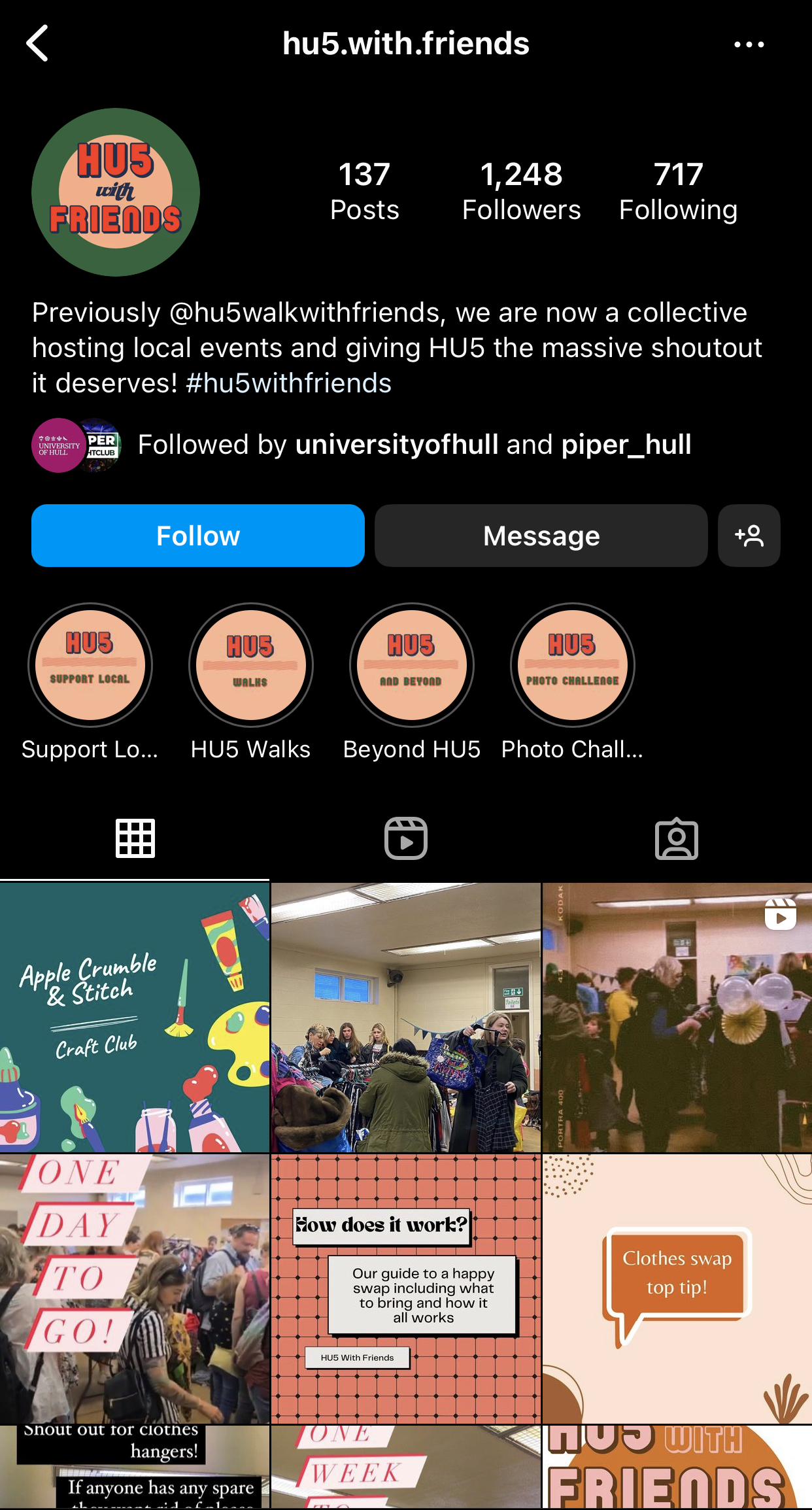
The cultural campaign demonstrated allows the university community to come together and complete outside activities that promotes making friends but also helping the environment. We would host litter picks, gardening workshops, communal walks, etc. As the brief explains it needs to span across different social media channels, we agreed that I would produce the Instagram content and my group partner would complete the Facebook content. These are the 2 mainstream platforms to raise awareness of our project on.
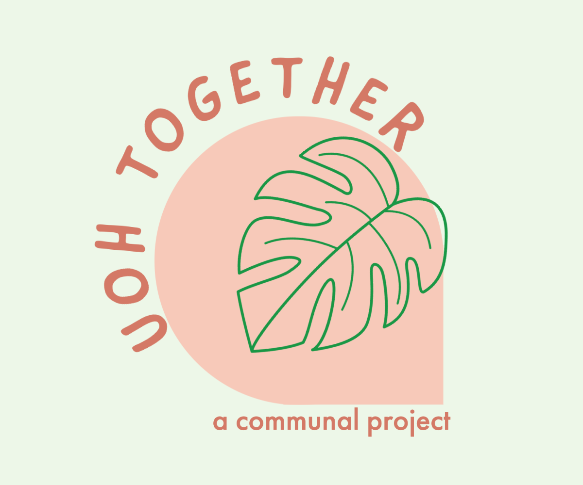
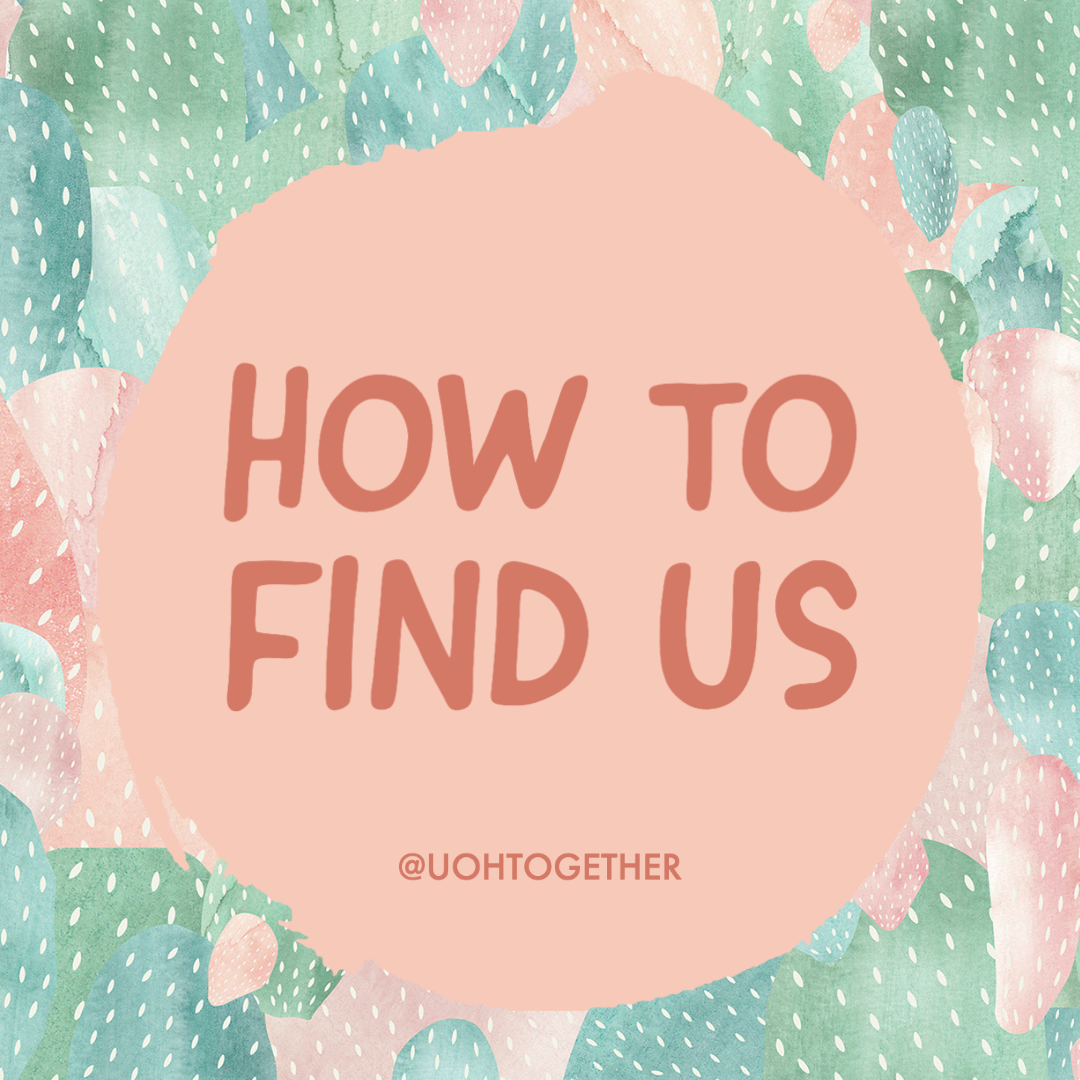
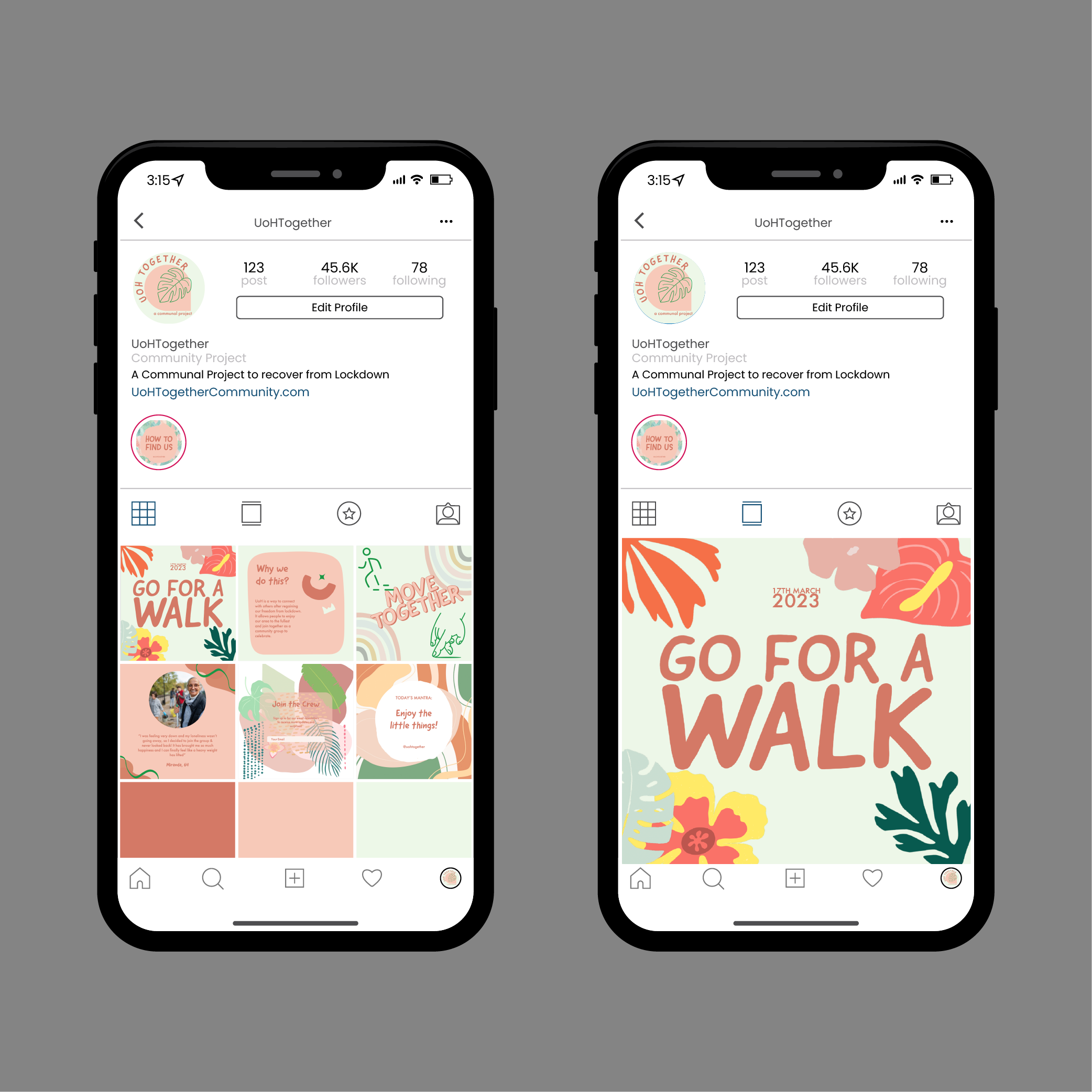
In the beginning, we worked together to compose a modern logo and colour palette that would relate to our young target audience and that we could be consistent with through our posts for brand awareness. As you can see, the pastel green and rose pink colours worked best with the layout. Further, the typographical choices created an informal and friendly nature so that people would be enticed to contribute. The first individual creation I produced is a highlight reel cover. When presenting the campaign, I wanted to use a profile layout so that the audience can view multiple posts so it was appropriate to include this. It simply explores ‘how to find us’ so when the user clicks the highlight cover, multiple stories will pop up and they can easily find information without having to endlessly scroll.
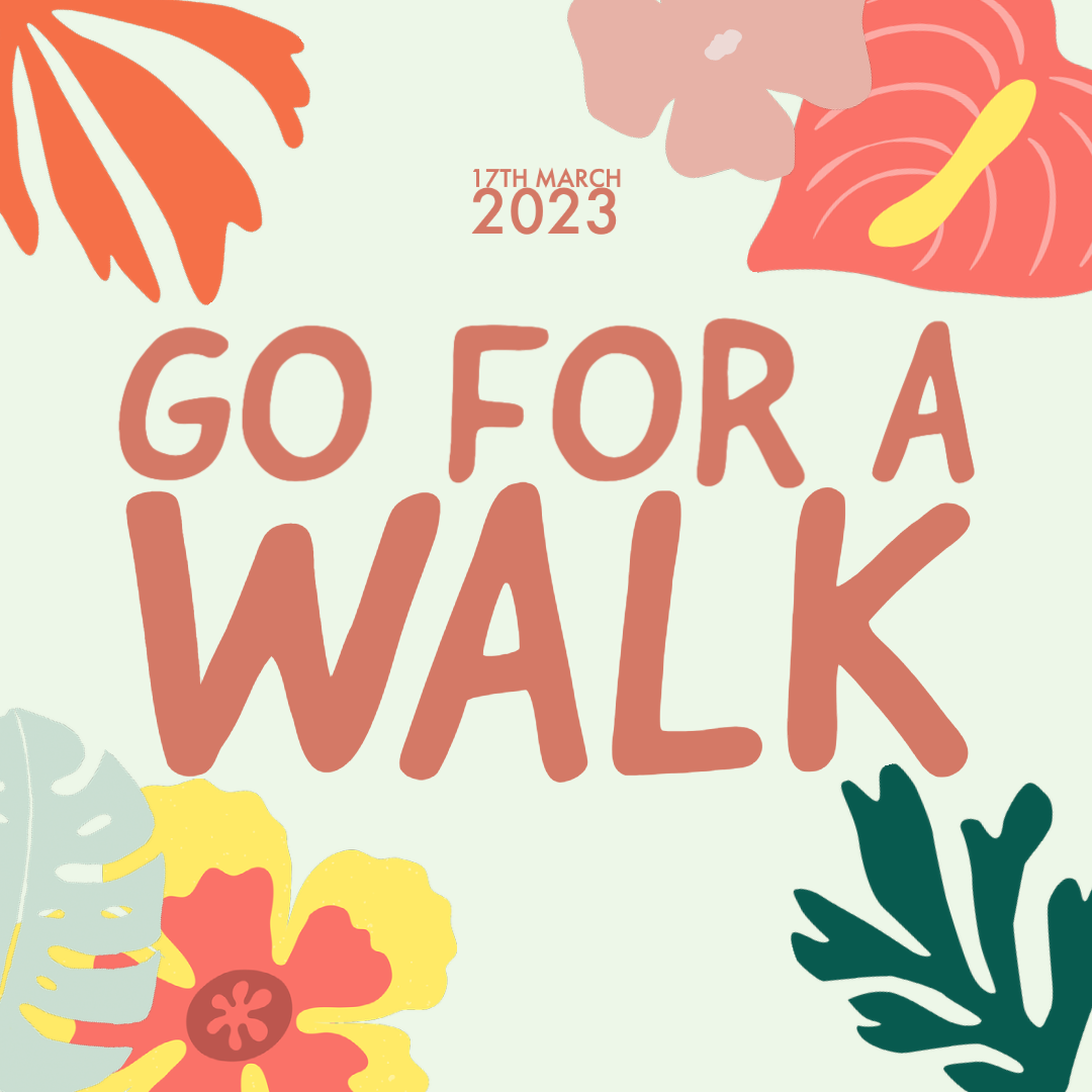
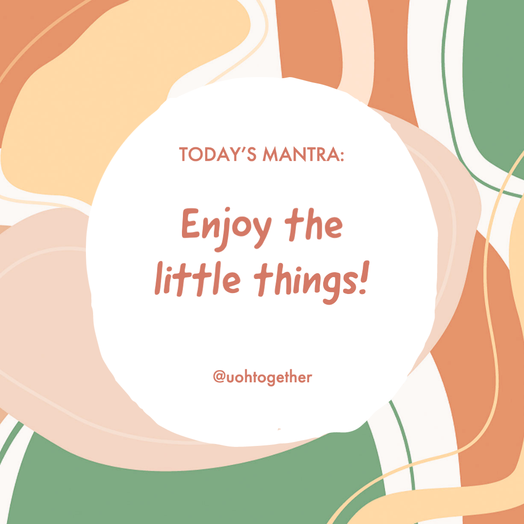
When thinking of 6 separate posts to create, I mainly wanted to focus on a specific event that would be advertised – a communal group walk. The brand image had to flow throughout which Adobe Express allowed me to do with importing a brand logo and colour palette. This feature is very similar to the global settings in elementor. The first post was very simple and to the point. The copy was large so that the user is able to see clearly what is being promoted and displayed a clear date of the event so there was no confusion. This is the first image that the user will see when bringing up the profile. The floral shapes add to the light, dainty theme. The next image produced uses a simple background with a positive mantra in the middle. This is to give the audience some positive inspiration on why they should join the project and hopefully encourages them to keep coming back to the profile for the daily quotes. The design choices maintain consistent throughout.
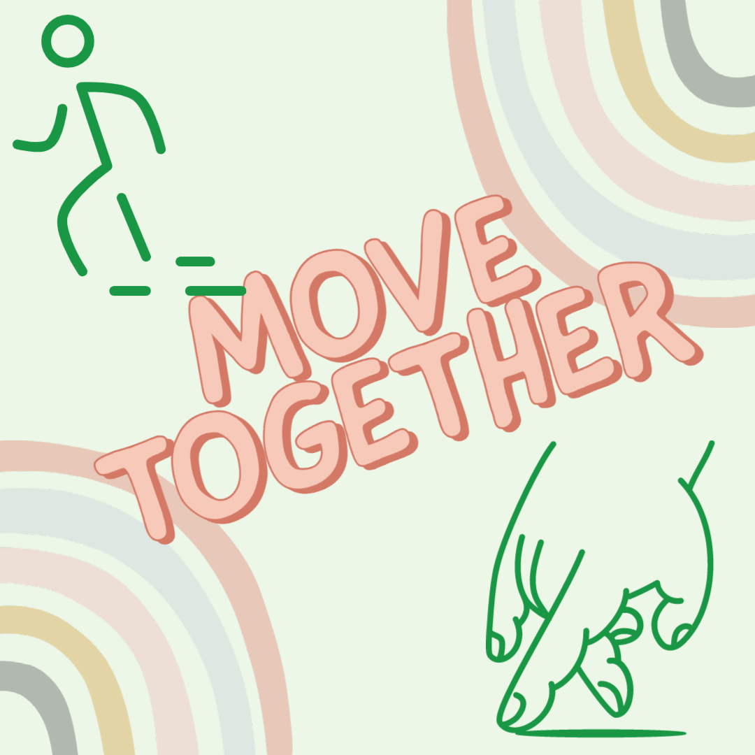
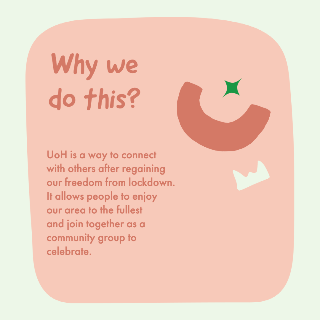
The next post includes simple content again relating back to the initial ‘go for a walk’ post above. It combines both the healthy and communal aspects of the campaign. The simple copy is straightforward and to the point to gain the interest of the audience. Adobe Express allows use of simple shapes, icons, and design assets which I have included in this specific post. The colours aren’t intimidating and allows for a calmness that we want the reader to feel when viewing the posts. The following is thorough and contains more text than any previous composition. This is a simple statement of why the project has been formed and it’s aims. The post doesn’t ramble and is easy to follow and again, hopes that the audience will see this and want to get involved and it may relate to them. There are no big graphical elements to draw the users attention away from the purpose of the project.
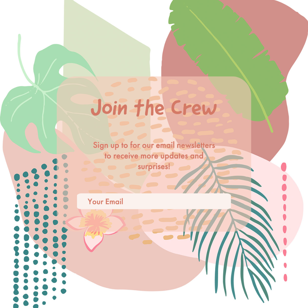
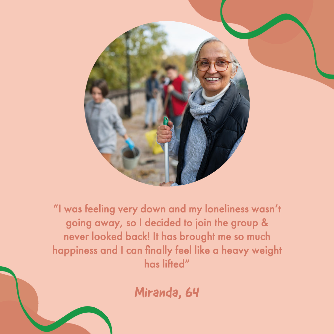
The next image has been used as a post but may be more useful on a website as a pop-up graphic due to it’s interactive element. I have used it in the context of promoting a new feature that will include the link in the caption for the newsletter sign-ups. This is the next step in promoting the brand as it includes multi-channel marketing and gives the option for the user to become further involved. This may not be an ideal post for promoting individual events but more for exploring the brand as a whole. The final post I created for the Instagram feed is a personal attribute from a member of the project. Using an anecdote allows for a potential follower to see how well the events work from a second perspective. This entices the potential audience as they have heard a good review from someone besides the actual brand. In this case, I have used an Adobe Stock image on the graphic for the purpose of the campaign.
Overall, I feel as though the campaign has worked very well and the brand image has positively been explored on a specific social media channel. The posts follow consistent branding and allows for the target audience to have a successful experience when browsing the page. I have included a template of what the profile would look like on a mobile device for the user.
There has been further work produced by my partner on the task who produced Facebook posts to emphasise the consistent branding and how the posts look from different social media channels. Unfortunately, this was not included within the time of submission which has affected it being included in the final post. This would need to be communicated better in the pair so that it could’ve been added and prove the successful social media campaign.