
The aim of this final exercise is to test and evaluate the entirety of our WordPress Sites enabling a thorough interrogation of eight chosen tasks to carry out. This is a key role that allows preparation for the industry and getting content with peer reviewing. We could also somewhat call this user testing whilst improving our personal blogs in the process.
It is reminded that the goal of this task is to ensure our sites meet basic usability goals and that it is completed in one of the standard testing ways. I chose an extensive list of 8 items for the user to complete and give relevant feedback for the improvement of my blog.
- Access my Pinterest Board
- Get in contact with the designer of the site
- Locate my final portfolio post
- Play a YouTube video in a post (use EX4 post for an example)
- Expand images of designer on homepage
- Discover when the SpellZone analysis post was published
- Search for specific posts in a search bar
- Return back to the homepage from a post
The following video below is a detailed evaluation of the user attempting the tasks given and describing the process with improvements for the designer to alter.
As you can see, the user has given detailed feedback on what works and various sections that need to be improved. As a designer, it is key that my portfolio blog works well and users can easily navigate to my work and have a pleasant experience throughout. Due to some experimenting with my homepage, a lot of the features broke during so it was clear that work needed to be done. My task now is to annotate key points of what has become on the testing and make these changes to my blog.
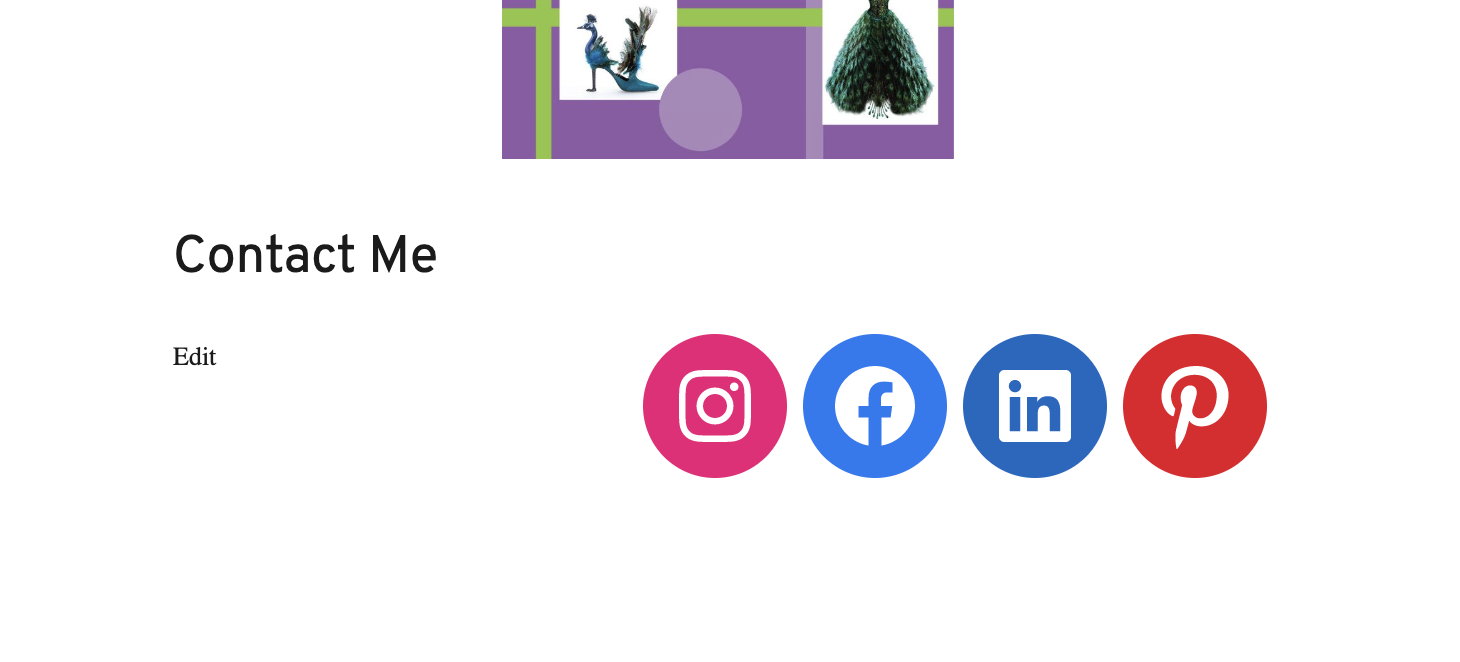
The first comment from the user testing is including my Pinterest site onto the homepage along with my contact links. This is clear so that anyone visiting my blog can see the inspiration behind my work and posts. I wanted this to be incorporated into my overall social links. The user gave feedback to convert the further social links into embedded icons which will then allow the viewer to be taken to a separate homepage. This was easily done by using the ‘social button’ to switch from links to aesthetically pleasing buttons. I added a ‘Contact Me’ heading and section to make it clear of my intentions to the audience. As you can see, I have made the change in Figure 2.
The next testing feedback that was provided was to import a home menu as the logo link may not be obvious for all viewers. I definitely struggled with the settings of doing this stage but it ended up being effective and filling up white space on my homepage. I started with creating a new custom link called Home to add to my main sidebar menu. This then takes the user back to the homepage when clicked whilst viewing any other blog post. This feedback effectively allows an smoother experience for anyone accessing my blog.

The final constructive feedback given from the user testing was to make my search bar more accessible as it was only available when actively searching through categories. Again, this was difficult to find and implement initially but after I figured this feature out, it proved very successful in improving my site usability. To create this search functionality, I used the “SearchWP Modal Search Form” plugin which created a category on my sidebar menu. I further tested that this feature works to ensure a thorough and efficient user experience on my blog. This adds a professional feel to my blog so that future viewers can navigate easier. Figure 4 explores a video proving this improved feature works.
Completing this design testing and evaluating was extremely effective and allowed for many features on my site to be improved. I agreed with the user on every alteration that was mentioned. This allowed for insight on how I could complete testing on my final design portfolio and for any future projects I complete. Testing ensures that anything the designer misses in the creation process can be altered before publishing. This exercise was extremely successful.