
Successful Energy Drink Branding
Attempting to reach the largest possible audience, energy drink brands packaging needs to be rememberable and display their benefits through their appearance. It is essential to maintain consistent and recognisable to consumers, while ensuring the right motives are being explored. (thedrinklabs.com, n.d.). It is clear that many well-known brands use bright, loud colours as “they tend to actually make us feel more energised just by association.” (Alves, 2017). The bright colour choices are also key to stand out in a store when customers are looking at what to buy on the shelf.
For this specific brand project, it is needed to subvert these typical conventions as we are altering our demographic to the older generation. The bright colours and loud fonts may scare any older person who is wanting to purchase an energy drink. Therefore, I have decided to keep the aesthetics of the brand quiet and content so that this appeals to our audience as you will see in the developing sketches. The name is also important as this needs to relate to the demographic and won’t link back to the younger generation for sales.

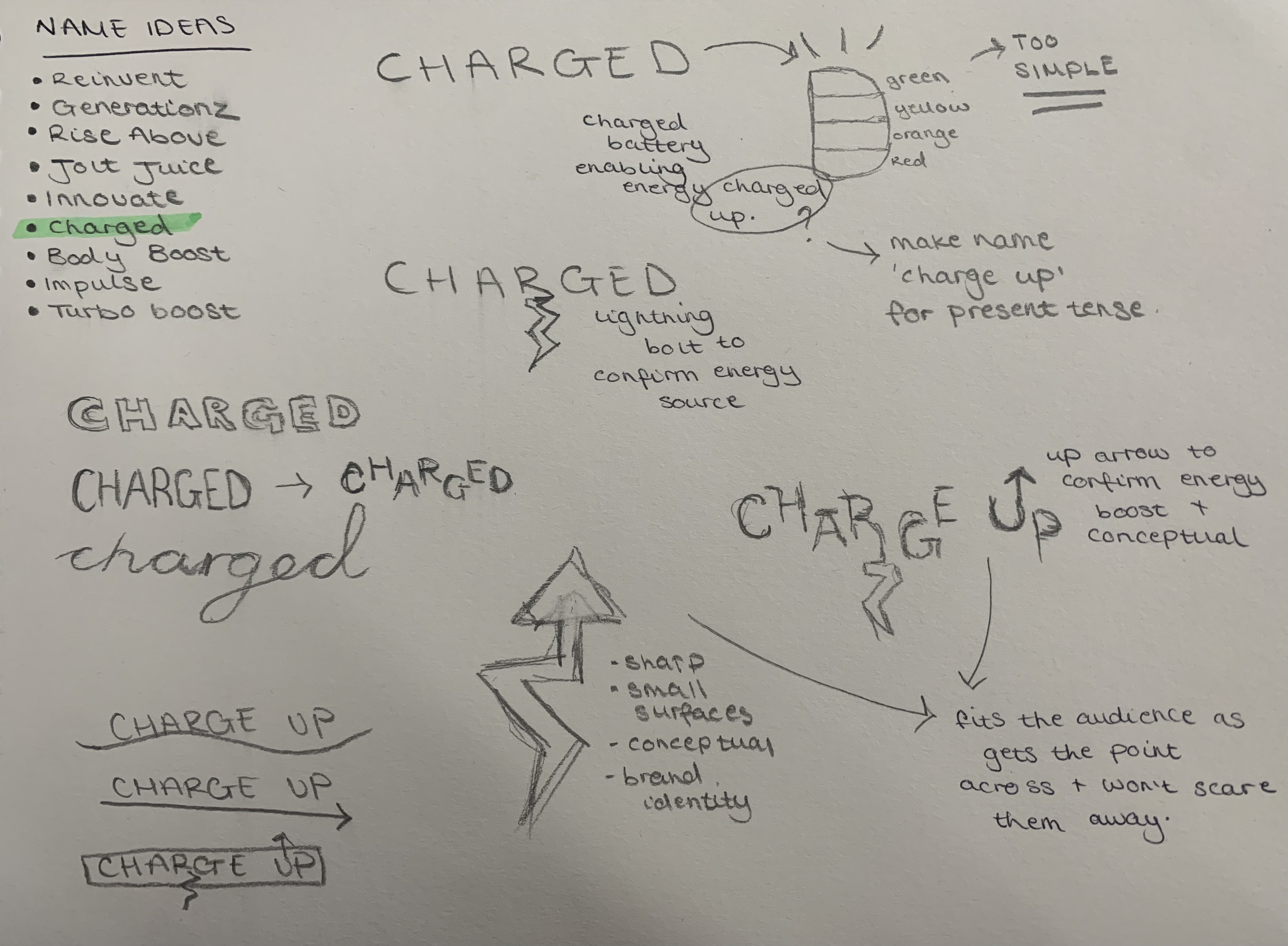
Logo Sketches
I initially began generating a name for the brand as this will spark the conceptual logo to form in the future. The name is half of the reason for sales when discussing branding as this could be the reason that the buyer purchases your product over the one next to it on the shelf. “Charged Up” relates to the thought of achieving a high energy boost after consuming yet isn’t overpowering and the endurance can be contained. This is a key mention as the older target audience may not want the instant rush of energy and more of a slow release.
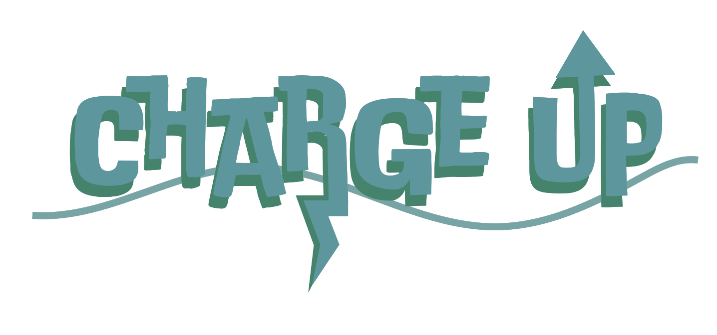
The experiment consisted of finding a suitable typeface that will represent this brand and revitalising energy. I wanted an informal sans-serif font that allowed manipulation to conform to include specific iconography and allow for a conceptual design in the future. I tried and tested a few different Adobe fonts and settled on one that I felt was similar to the successful sketches. The colours chosen were cooler tones with a dominant teal and surrounding accent blue colours to allow for a consistent brand image and iconic colour. This was trailed and tested on Adobe Illustrator software. (canva.com, n.d.).

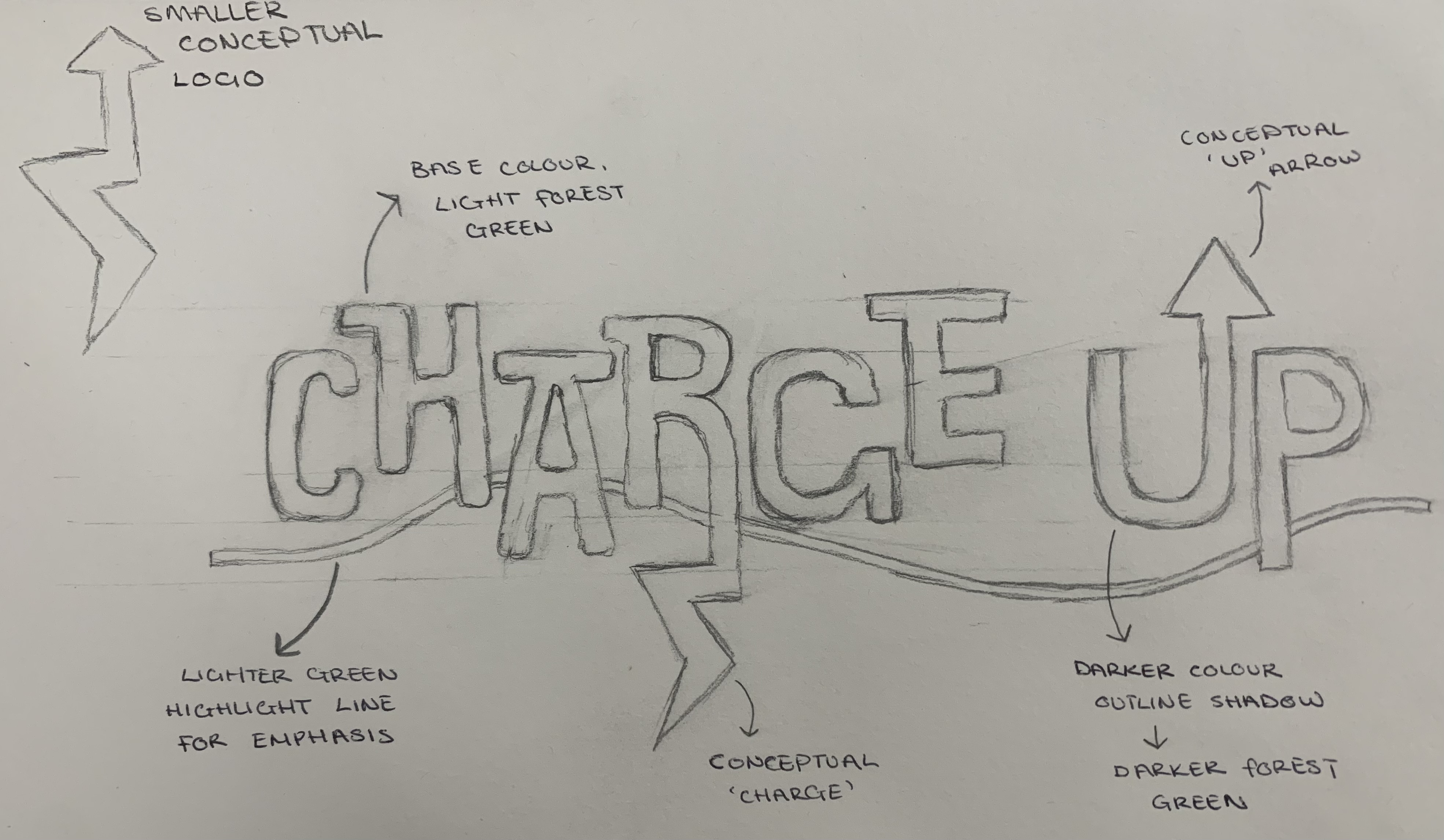
The final additions to the logo included the relevant iconography in order to finalise the brand image and allow for the nutritional benefits of the drink. I attempted numerous different placement options and size alterations and settled on a final sketch that will allow me to proceed into software and create a final successful conceptual logo.
Conceptual Logo Design
When associating the words ‘charged’ and ‘up’ two main images come to mind – lightning bolts and arrows. These will be the two iconography elements that allow for the brand logo to become conceptual. The aim was to again keep the ideas simple so that the intended older audience wouldn’t be intimidated by a complex logo. Conceptuality doesn’t have to be severely hidden or complex, and can be as simple as the icons I have chosen to include; it is very obvious what they both intend (linking back to the product) but also allow for the elements to add meaning to the words.
I also created a separate logo that only consists of this iconography to further have brand identity in a smaller form if needed as it is clear that the cans can have small proportions. Both items included on the original text are combined to allow for a final design that will ensure the audience links back to the original brand logo. The intended conceptual elements ensure clear communication of what the energy drink will do – increase a person’s energy – in a way that isn’t overpowering or too loud to suit our final target audience. This all links back to the initial research of subverting stereotypical energy drink brand’s clear conventions and allowing a new market from a niche audience.

As you can see, all of this research of conventions and looking closely at what targets are needed to set for our specific audience, has created a simple yet effective conceptual brand logo that will feature on our energy drink packaging and will entice a new market for these products.
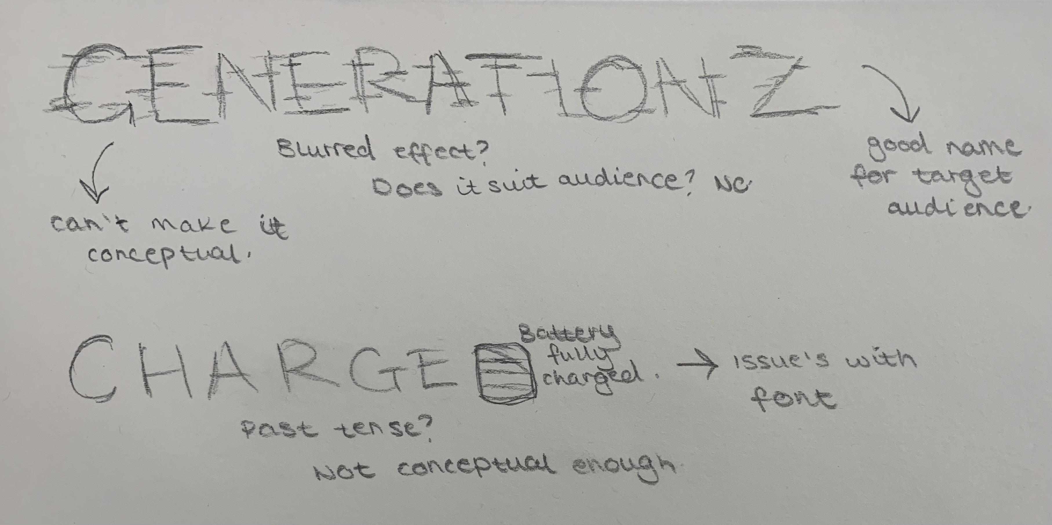
Rejected Designs
Throughout the initial design stage, there are always rejected ideas and sketches that may be a good standard but aren’t quite acceptable for what the target audience is after. It is good to include these as you are able to see my thinking process and design choices that all add up to a final successful design. Here are the few sketches and trails that were not included to the final design logo.
References
Alves, A., 2017. How To Brand A Beverage?. [Online]
Available at: https://www.drinkpreneur.com/beverage-howto/how-to-brand-a-beverage/
[Accessed 13 March 2023].
canva.com, n.d. Color Wheel. [Online]
Available at: https://www.canva.com/colors/color-wheel/
[Accessed 21 March 2023].
Sahadeo, A., 2020. Energy drinks: What are the health risks?. [Online]
Available at: https://www.foxnews.com/health/energy-drinks-health-risks
[Accessed 21 March 2023].
thedrinklabs.com, n.d. The Best Marketing Strategies You Should Use For Your New Energy Drink. [Online]
Available at: https://thedrinklabs.com/blog/the-best-marketing-strategies-you-should-use-for-your-new-energy-drink-2/#:~:text=The%20Best%20Marketing%20Strategies%20You%20Should%20Use%20for,Best%20Marketing%20Strategies%20for%20Your%20Energy%20Drink%20
[Accessed 13 March 2023].