The initial activity for today was to research a few clever, responsive website designs that majorly transform for tablet and mobile devices. We then attempted to recreate these responsive methods in our own website. Before that, we had to see how this works in elementor so we can use the widgets to our advantage. These tools are crucial when thinking about our final portfolio campaign design as it will be essential to make it responsive for all screen sizes and rotations.
The first step of our beginning experiment was to create a page within our WordPress site named Responsive to then take it to the elementor plugin for editing. We discovered the pages file on our blank page and found the photography layout example to use. You can see in the screenshot below the amount of different pre-made templates they have for the public to access. The specific one we used was ‘Photographer – Projects – page’.

As you can see, there are multiple headings and images displayed throughout the page so we need to ensure that they respond to different screen sizes and layouts when minimised.

In order to do this, we need to access the elementor responsive mode. This adds the option to differ the screen size you’re working from to either desktop, tablet, or mobile which allows emphasis on the creation of your site being readily responsive and accessible. This is the main tool I will be using when creating my final campaign post as it will be easy to constantly see how my work reflects to mobile.

The next experiment we demonstrated was adjusting menu sizing using the Royal Addons plugin within our post. This allows us to switch from a bar menu on a desktop screen size, to a hamburger menu on mobile. This again will help encourage responsive designs in my future campaign post and allow transitions to be smooth into separate screen sizes and rotation changes.

The final stage of the experiments was to mainly familiarise myself with the menu settings that allows for further responsive measures for individual assets within the page. In particular, the mobile menu formatting in the Nav Menu settings. This can be edited to tell elementor when you want the hamburger menu to replace the normal menu (in most cases, when transferring data onto mobile format). This was the final set of settings that allow a designer to ensure the highest level of responsiveness that I want to appear on my future campaign post.

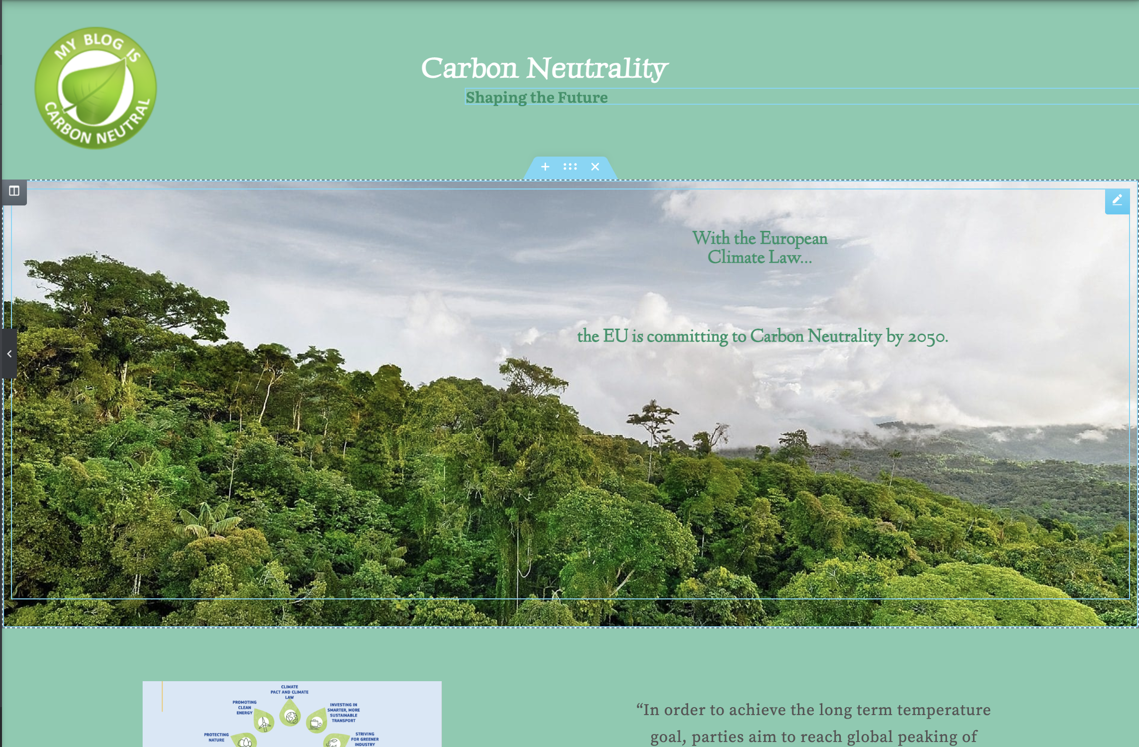
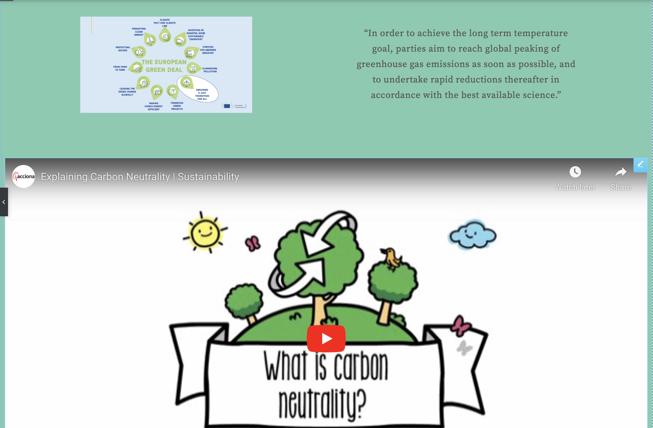
The next activity was similar to the final portfolio with the idea of creating a campaign/informative website outlining the importance of becoming carbon neutral. The theme to consider was the transition from fossil to carbon neutral and aim to develop visual and text that supports all devices. This allows us to use the previously taught responsive modes and explore this in an example campaign that may have input into our future portfolio design. I decided to start with a mobile-first approach as I knew it would be easier to scale up my assets when transferring onto desktop and tablet screen sizes.

I then decided to switch the settings to tablet mode in order to change and distort my elements so that they fit the tablet screen sizes. I mostly had to change the sizing of images and ensuring that the copy was legible on the screen.
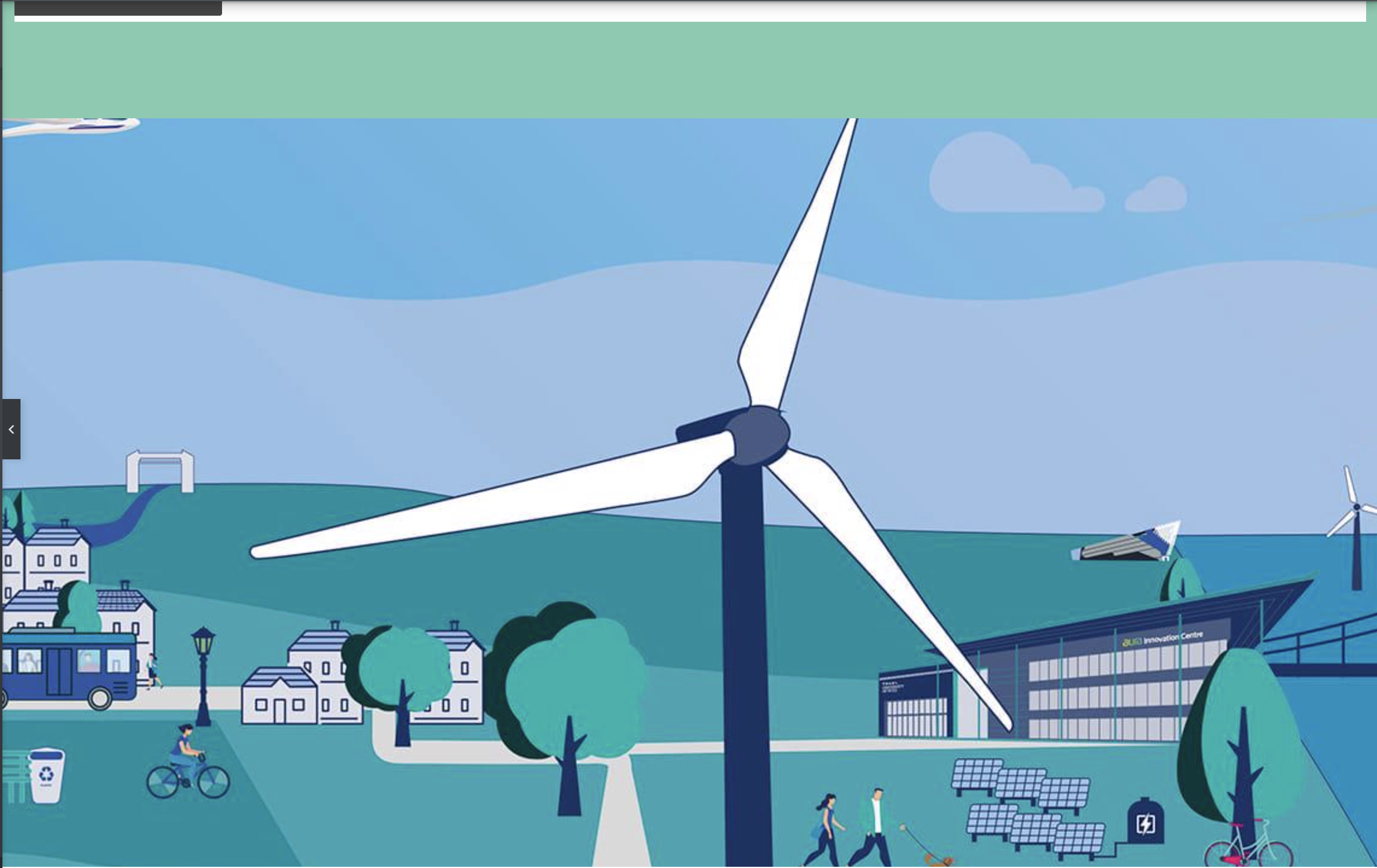
The final and largest size I had to create media for was the desktop screen. This was the most alternate design to the mobile one as the orientation changes and the sizing of different elements can be at their largest here. It is clear that the content is most supportive for the cause on desktop sizing and it was the easiest to scale up from the mobile rather than down from website.