
Our group activity in this session is analysing a site that was designed a long time ago and focusing on designing some visuals to broaden the appeal to other markets. In our team, we decided that it was best to go away individually and do some research on some important questions before reforming and creating a visual solution. Our group from today explored multiple different personalities so we chose this option before some people got too overwhelmed from others contributions compared to their own.

The first section was to analyse the onboarding of the site and the design of pre-login/registration. On first look, it was clear that this was a poorly designed onboarding sequence that needed updating and modernised for a wider target audience. You initially had to scroll more than halfway down the page to discover it; the section was cluttered and the images are too small for viewers to receive any important information. For a modern onboarding, we would want to see an interactive element as soon as you enter the site which would demonstrate large images and small copy to support these. The sequence further isn’t responsive when transporting to tablet size which needs improving so that any user can access it.


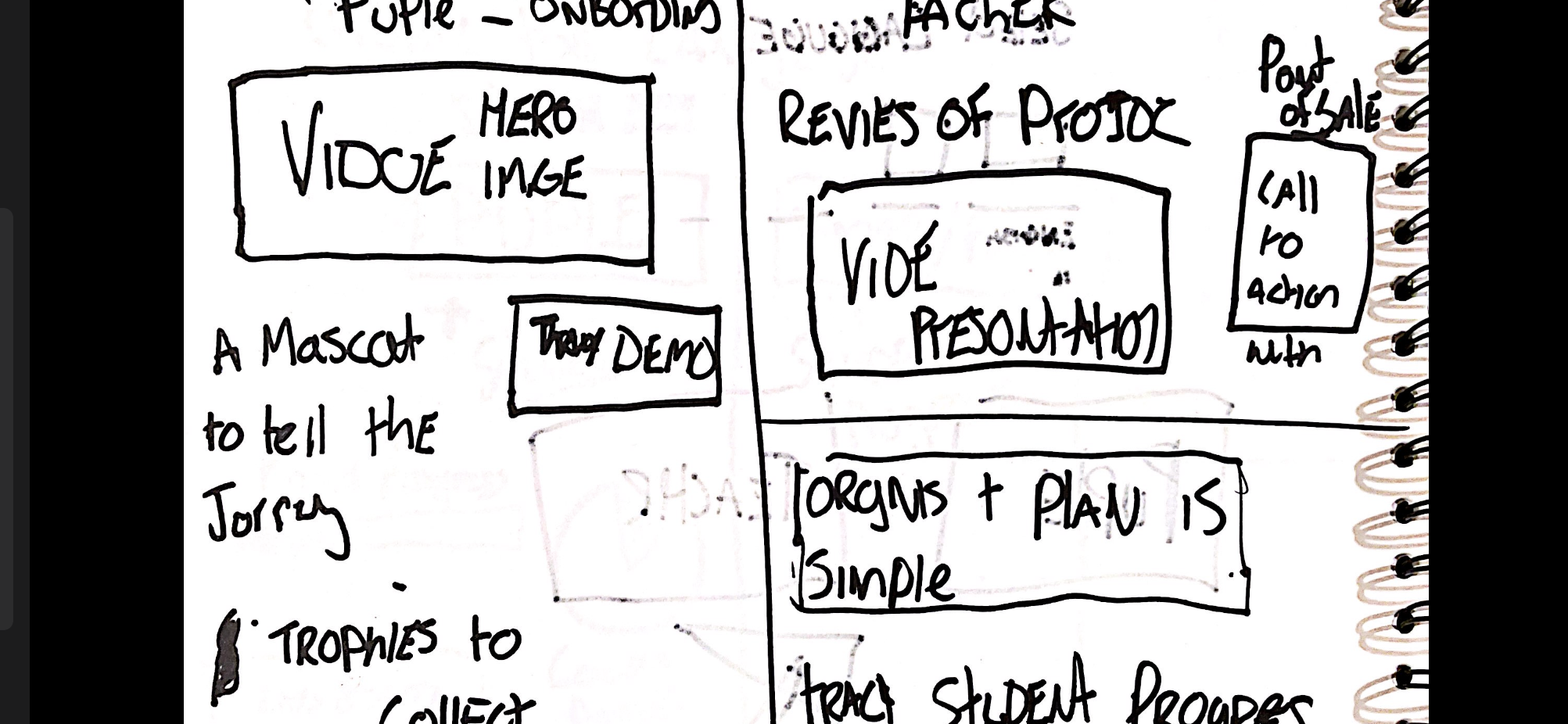
On initial look of the homepage, there is a ‘free trial’ call to action button that is placed small in the bottom right of the screen and doesn’t display its real purpose to stand out. This would need to be advertised bigger and bolder to attract a wider audience for sign-ups. After scrolling down some more, you notice a video that explores how the site has improved children’s spelling ability and some good reviews from the teachers using it. The interactive element is a good choice for the software to be positively demonstrated, however this needs to be close to the top of the screen so that users don’t have to search for it and can initially prove how good the application is. After analysing the Spellzone site, it has a lot of unnecessary graphical elements placed in a confusing order for a designer and needs to be updated so that a broader audience can be accessed.

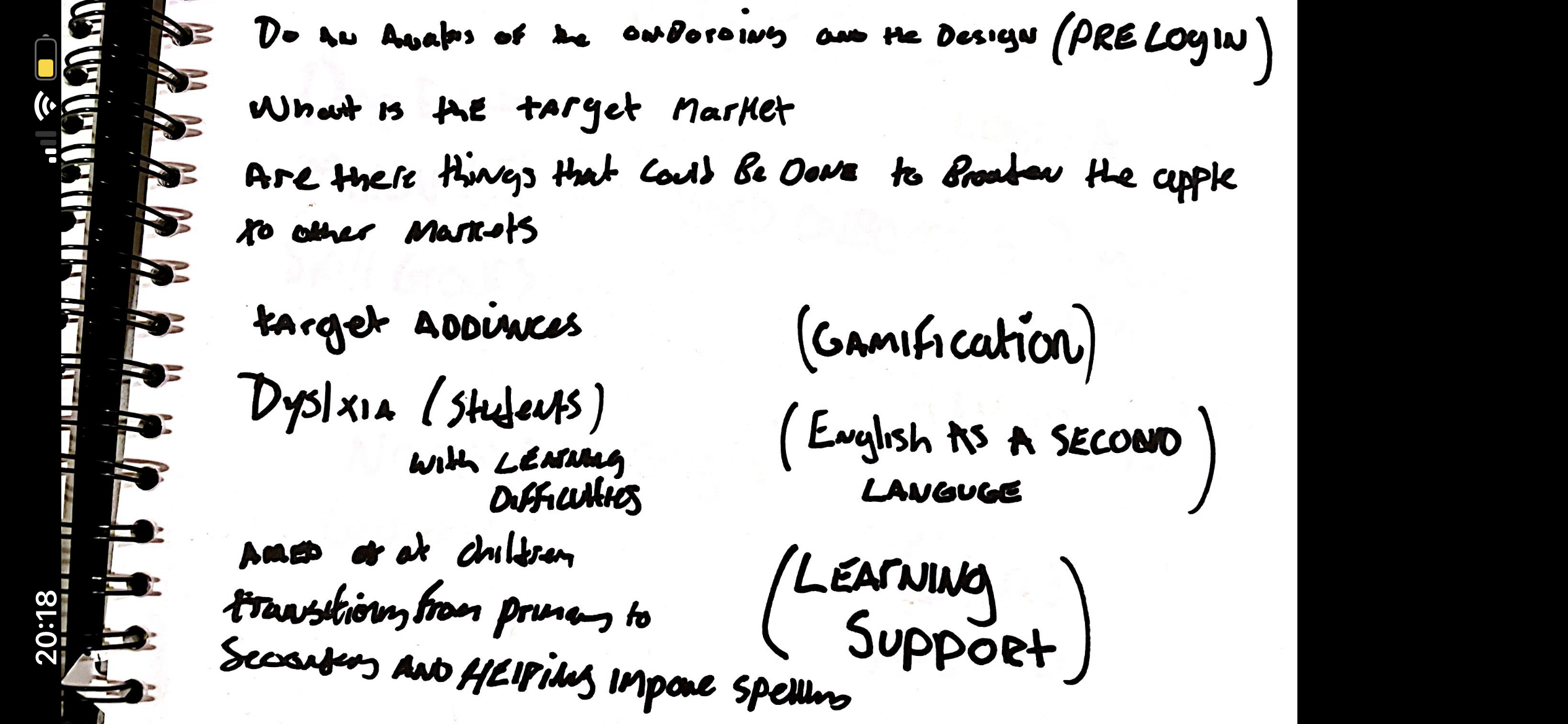
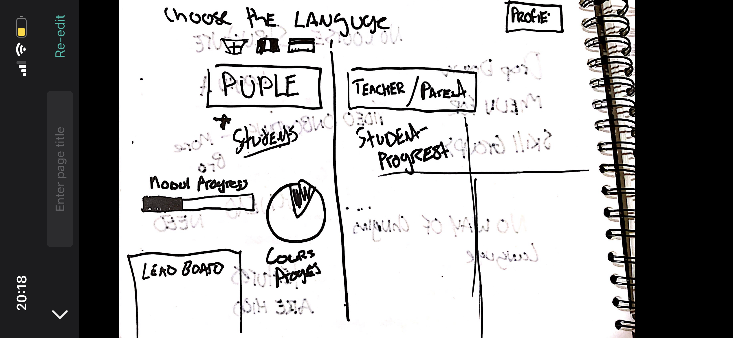
The next stage was to discover the target audience the site portrays and discover how we can alter the layout to widen this. It was clear that the site was aimed at parents/teachers wanting to purchase due to payment options but what is most confusing is the student login option at the top of the screen. We could look at the initial audience in more detail and specify the local councils/head teachers that will fund this project for the schools and want to see results there and then on the site. There definitely needs to be a separate admin page for the children’s login screen as they may get confused when loading the site up and becoming bombarded with information that isn’t suited for them. We decided as a group we wanted to expand the market to adults with disabilities that may affect their spelling (such as dyslexia) and students where English may not be their first language.


If we were to alter the design of the site, there are multiple design choices we could change to allow for this wider target audience to be apparent. On the new onboarding sequence we would include an initial language option for approaching users so that they can navigate the site in their own language if they aren’t certain on English yet. This is a clear indication of widening the audience before even loading the main landing page. A great feature that Spellzone already includes is its variety of accessibility options placed next to the login screen. The process and options included are very effective and allow disabled users to interact, however this needs to be bolder so people’s attention is brought to it and it isn’t hard to find. The wording should also be changed to an icon/symbol so that it is widely understandable for languages or people unable to read the current copy.

One way of improving the user experience is separating the two interfaces to have an informative website for the buyer of the software and a second which allows children to log straight in and proceed with worksheets. As the initial audience is councils and teachers, we will focus on designing a website that provides relevant information on Spellzone for them to acknowledge. The content and layout should be more interactive and in an order than allows the viewer to access the most important information first. Realistically, they want to see results and how well the software competes with rivals. This meant we included reviews and statistics inputed into videos at the beginning so the audience doesn’t have to search for the information they require. Then the information about how the software works and the ease of this would be included so that the user can explore more and go on to purchase the material. This improved approach will ensure an increase in buyers.

Below are some group sketches we created to explore the changes to the site and allowing a broader audience to access the software.
The group worked well together and we contributed an equal amount to this task which is an improvement as to when I have worked with a few of these members before and felt isolated. The next improvement we need to make is contributing a fair amount each when presenting our ideas to the rest of the class and allowing individuals to have a confidence boost when their ideas get praised.