
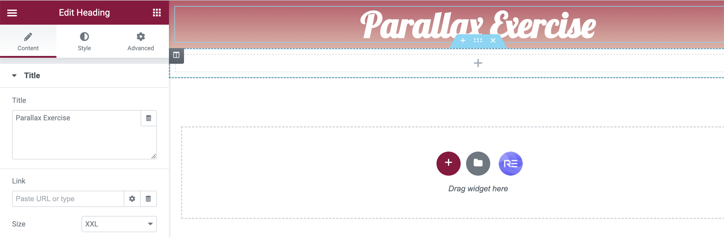
Our first exercise was based on parallax websites and fixed elements when scrolling throughout a website page. This is usually used to tell a story within web design. The initial set up was simple; we created an additional elementor page and named it ‘Parallax Exercise’ and downloaded some sample files to work with. We began with creating a single column section and changed the colours to a gradient that fits the entire screen. We added a heading section into this named ‘Parallax Exercise’ and altered the layout and style until happy.
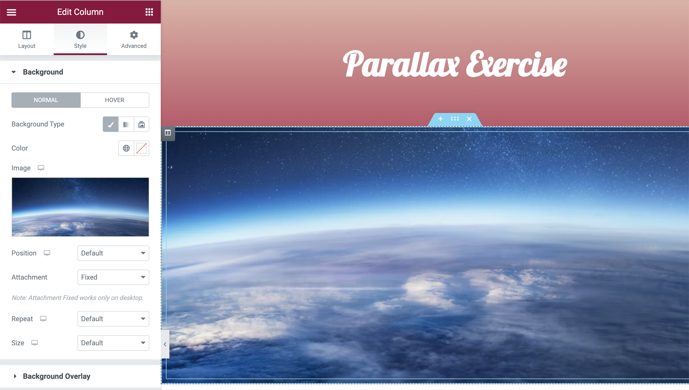
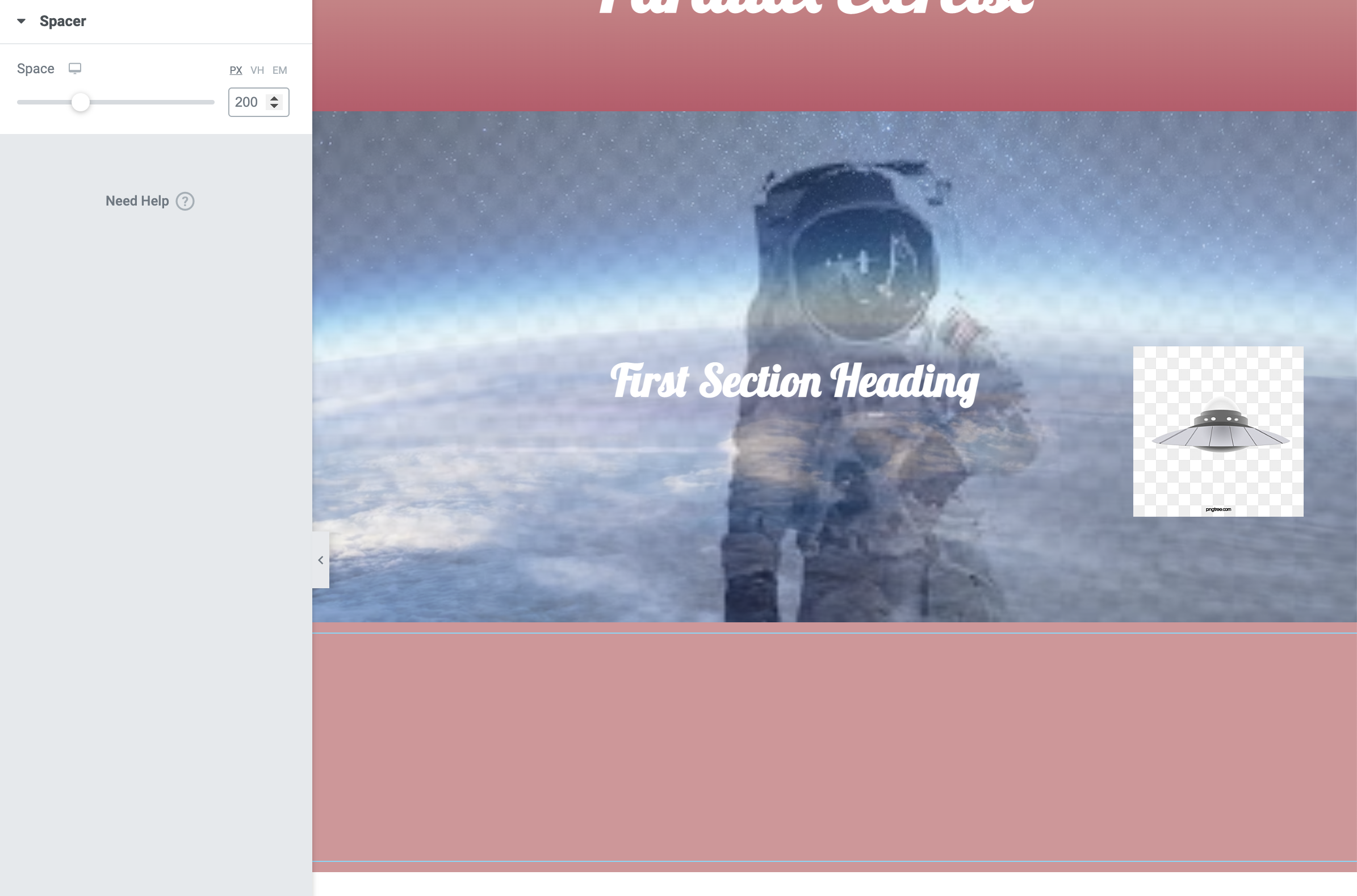
The next stage was to create another single column section below the previous one and changing the background to one of the presaved images. In this case, we wanted to create a background and add additional elements over the top of this. A space scene was imported and set using a fixed attachment style. This allows the image to remain anchored as the user scrolls throughout the rest of the page.
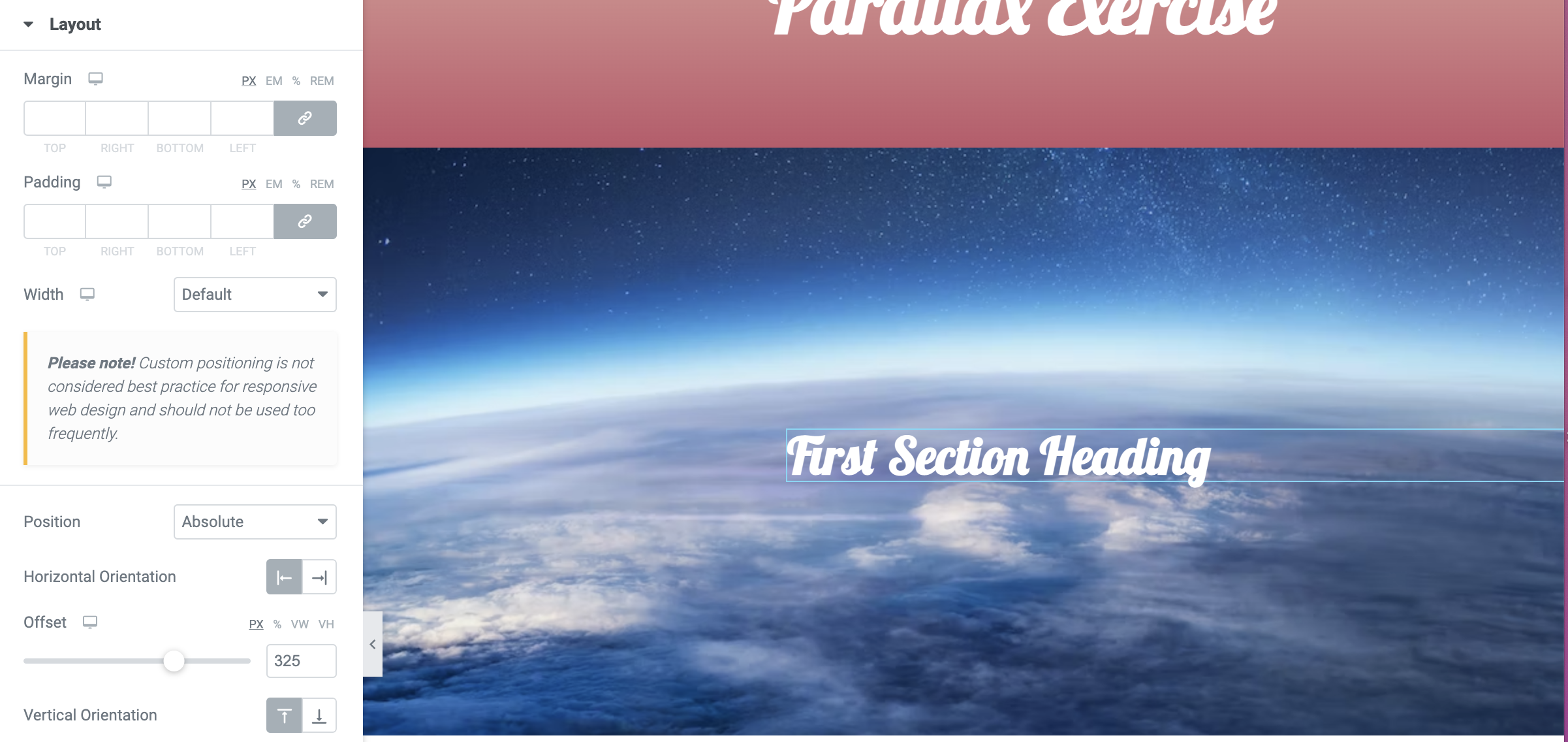
We then added an example heading on top of the current section and changed the attachment type to absolute. This enabled us to move the position of the heading around the image and can be placed at any point chosen. This means that the heading will move with the scroll like conventional web design.
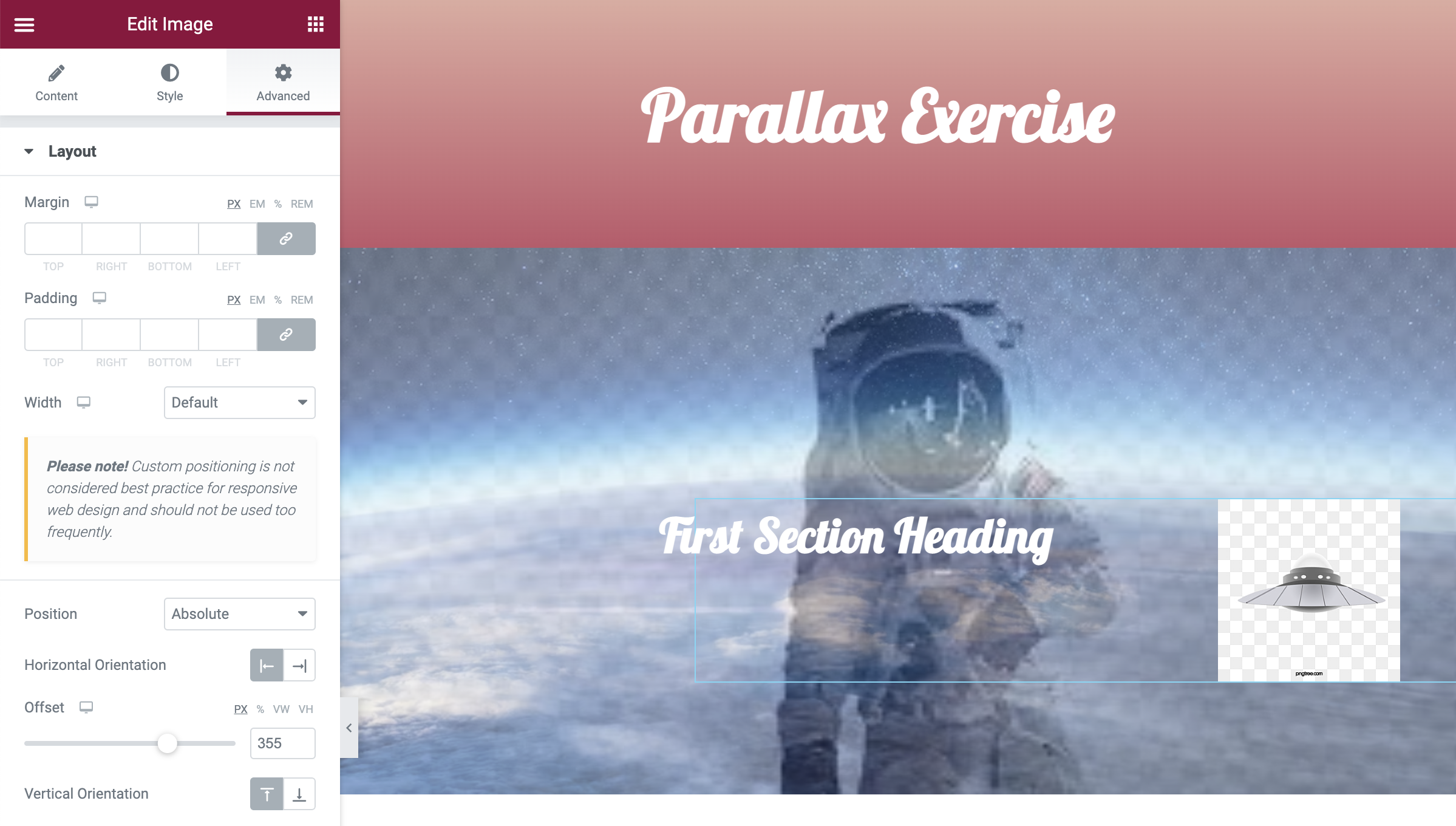
Now we needed to add further elements into the section to emphasise the parallax effect. Using the background overlay option, we were able to import a spaceman transparent above the space background image. This gives the effect that the astronaut is floating on the image. We ensured this was fixed in place to once again remain anchored. We further added an additional image of a UFO to create this story environment with separate components. This was made the absolute attachment style in order to resize and adjust its placement in the background. Once we were happy with the positioning, the option to animate it flying on the screen was enabled. I decided to have it fly in from the left to emphasise some additional movement when scrolling.
A simple stage was to add in a solid colour section underneath the above imagery. I tried to relate the colour to the previous gradient so that symmetry was key. Including this allowed a break in the site and the next image we were about to edit.
Following one of the first image steps, we imported a skyline image to a single column section and ensured this remained a fixed attachment type. Using a heading widget, we created a line of copy to import over the top and made this absolute to move more central. This solidifies the knowledge we have of importing images into elementor and making them parallax.
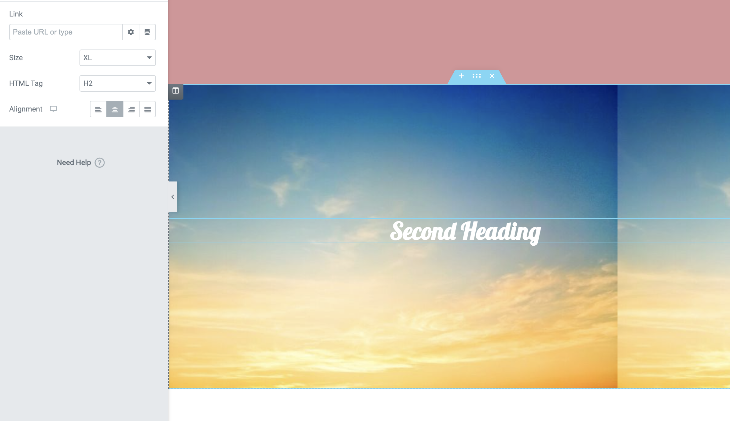
As you can clearly see, once I had practice the method, I revisited the images and used my own colours to make the screen seem more professional than above.
The second exercise made us aware of layering three images together and allowing them to move at different speeds to follow the user’s mouse. The example we followed was some code from the codepen site which related back to previous exercise work. It makes use of three separate images positioned on top of each other and as the mouse moves over each layer, they follow at different speeds. We weren’t given any instructions on how to complete this task which exercised our HTML knowledge on how to import code into the widget on elementor. The below screenshot shows the code we used.
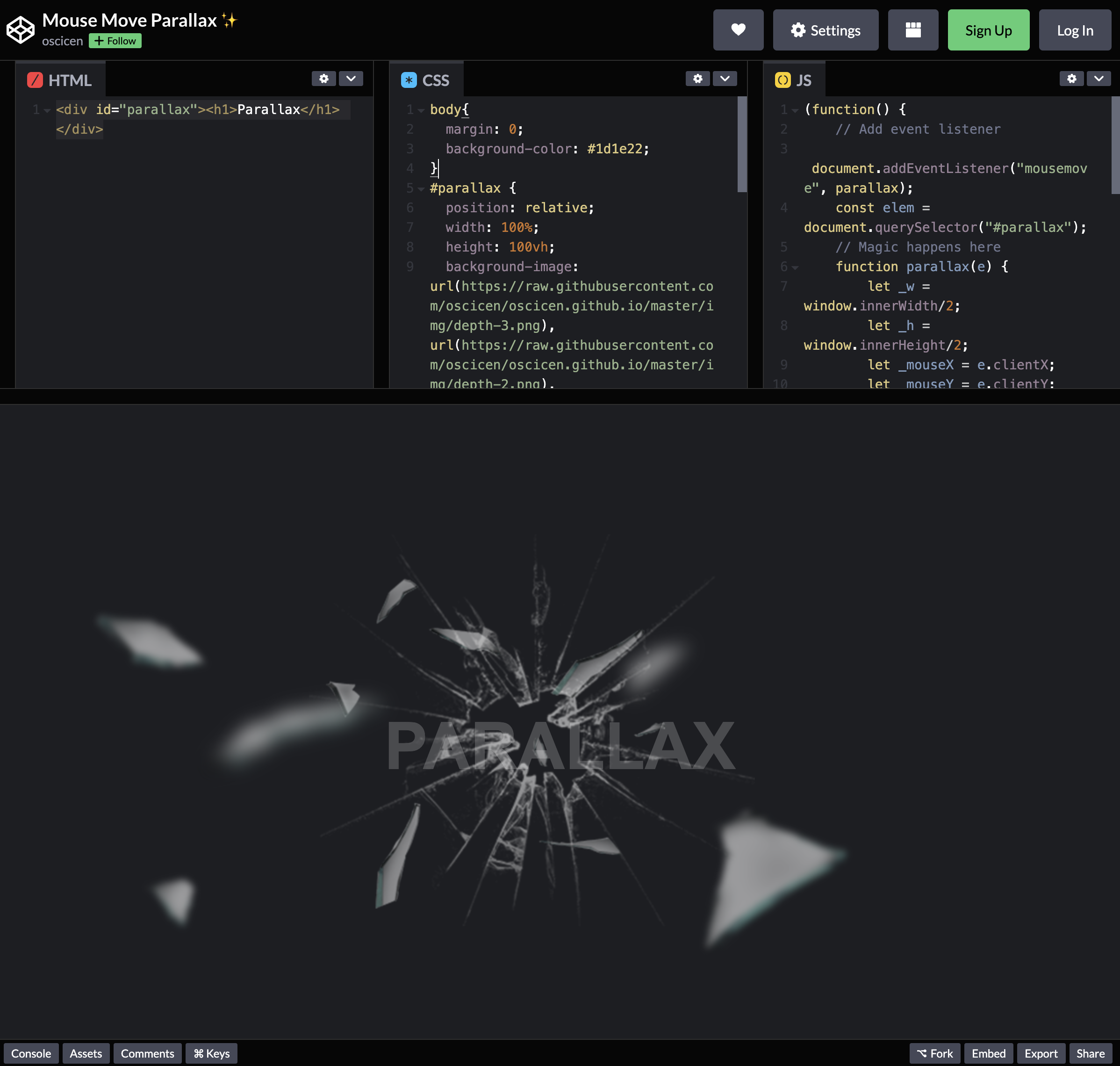
I remembered that we had to initially start off by importing the CSS. This was simple to copy and past into the widget and wrapping it with ‘<style>’. Once this was added, we needed to include the HTML below. This step was simple enough to just copy and paste was codepen had provided. The final part was to add the JavaScript. After this was pasted, I wrapped it with ‘<script>’ and updated the widget to show the final result. The code was successful and matched the example we were given.
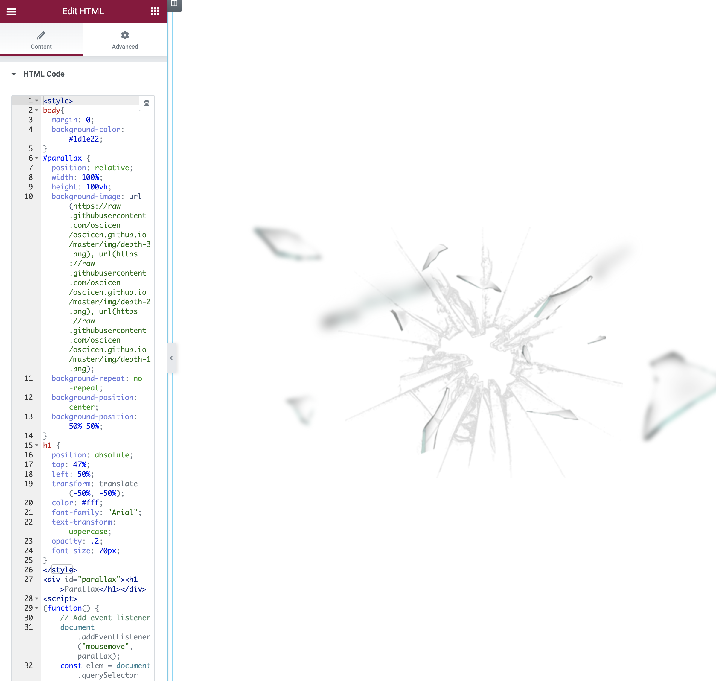
The final style step I chose to add was changing the background colour to emphasise the shattered glass images and make the text visible. I found this exercise simple when the code was given and also intriguing as to how I could potentially use this in my final portfolio site. You can see the final element in the video below.
The final task of the session was to individually put all of our knowledge to the test and create a FairTrade website that represented some parallax elements. I wanted to mainly focus on providing information on FairTrade products but ensuring the parallax design is priority. I stuck to using the first task’s settings in order to allow for 2 fixed images on the screen which allowed a simple aesthetic. The aim was to not focus on the information but more on exploring the design effects and practicing elementor’s widget settings. I feel as though this was successful and I hope to include examples of parallax in my final campaign design.