
Secondary Research
This project based in Adobe Substance Stager is aiming to produce a series of renders demonstrating product design selling something in a box. My main aim is to merchandise a product that isn’t widely sold in boxes. After some secondary research, I concluded that it would be clever to reach the bakery market and attempt to sell full-size cakes in boxes. This is widely unseen in the current world and would create a niche audience to aim my product for. Looking at the few designs that are floating around, the boxes are minimalistic and the branding is clearly demonstrated over multiple surfaces.


Subject and Audience Purpose
The intended demographic for this product is mainly anyone who has an interest in bakery products or want to purchase a celebration cake for an event. This would be any age and gender who have this interest and are able to order these products. My choice for this concept is mainly personal interest in baking and the small audience already available. This allows for a high amount of creative freedom when producing the branding for the box. When focusing this onto Substance Stager, it will be simple to form my brand around the box. The brand aim is to focus on a minimalistic design approach to cater for the entire audience spectrum.
Design Thinking Process
Thinking about the desired audience, I began brainstorming bakery names that would suit a broad baked goods company. Pinterest was my main source of inspiration and I created a simple mind-map allowing ideas for the branding possibilities. Here you can see my very first initial thoughts and design thinking choices.
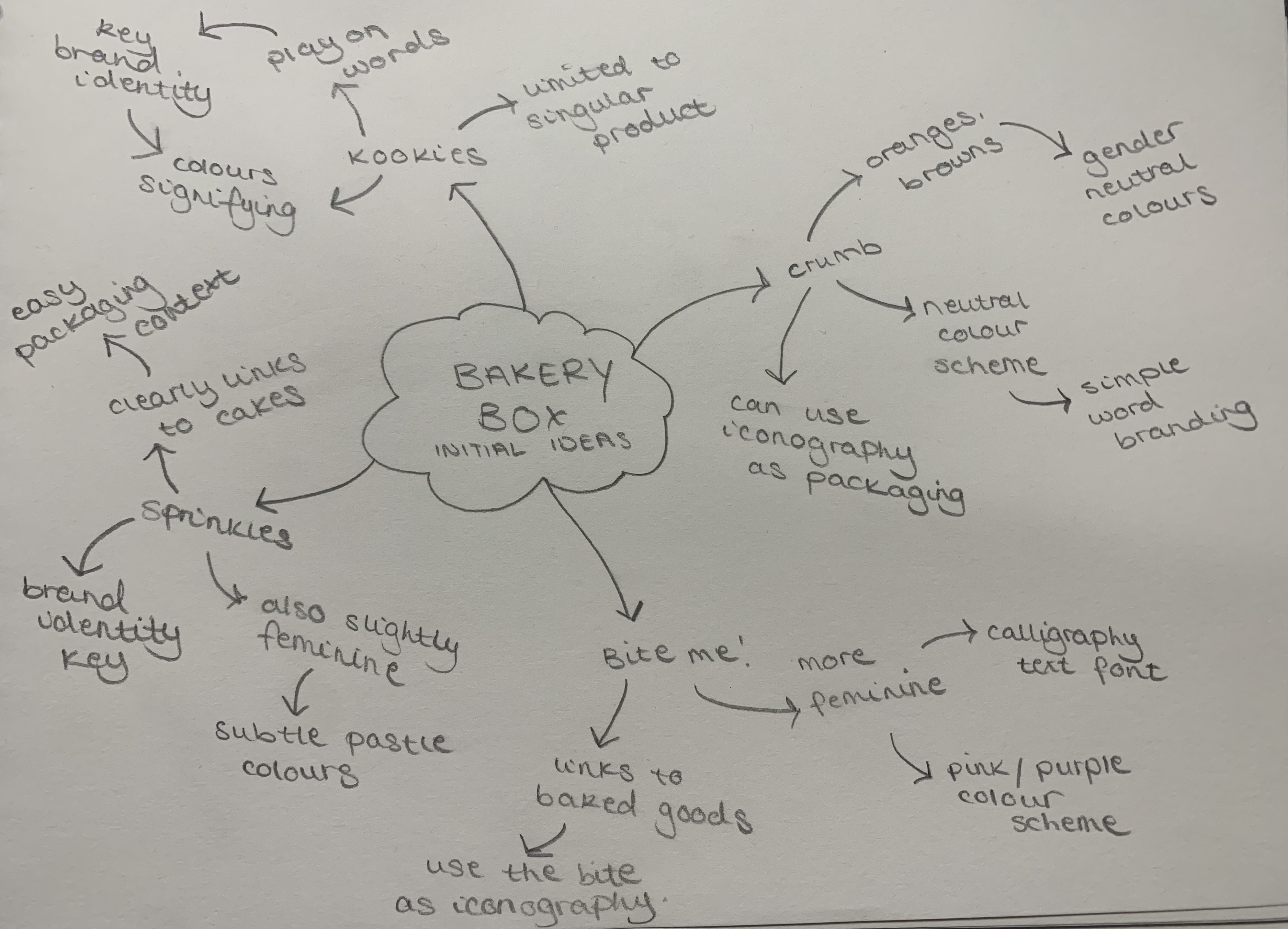
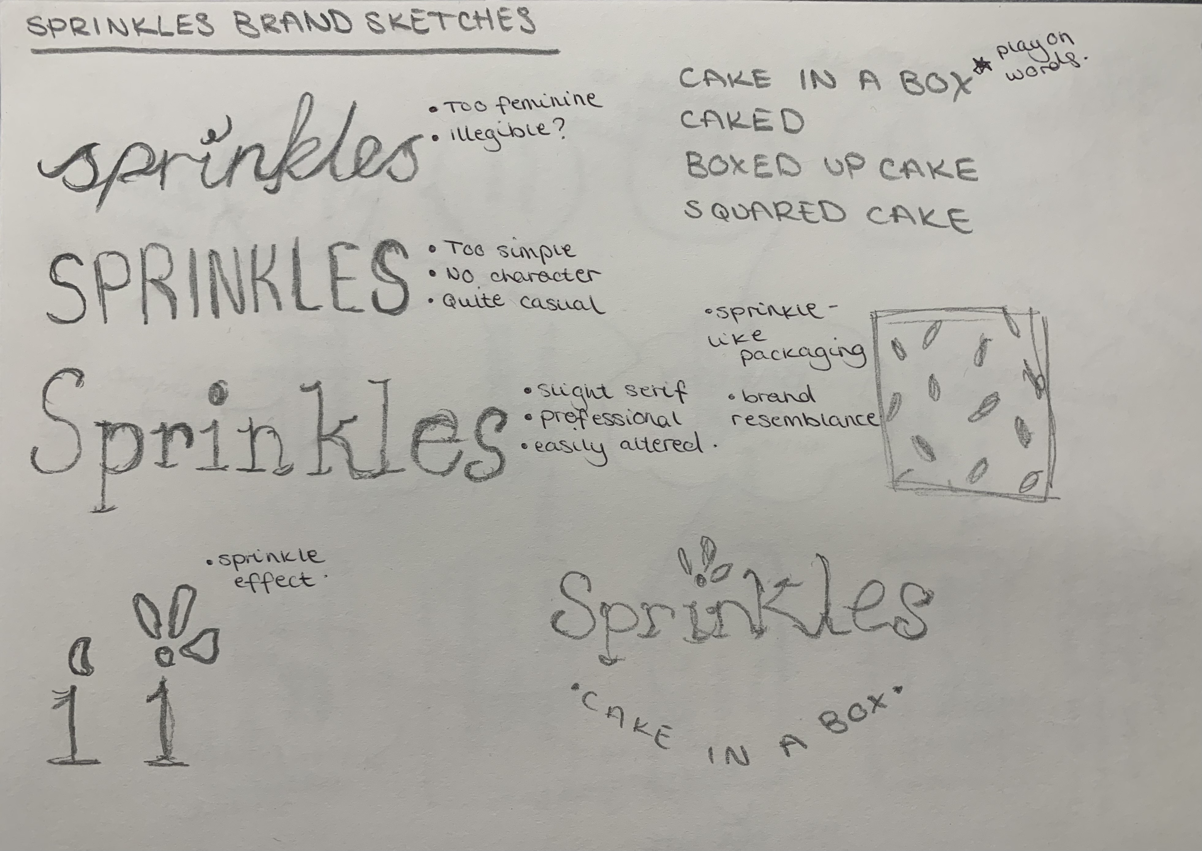
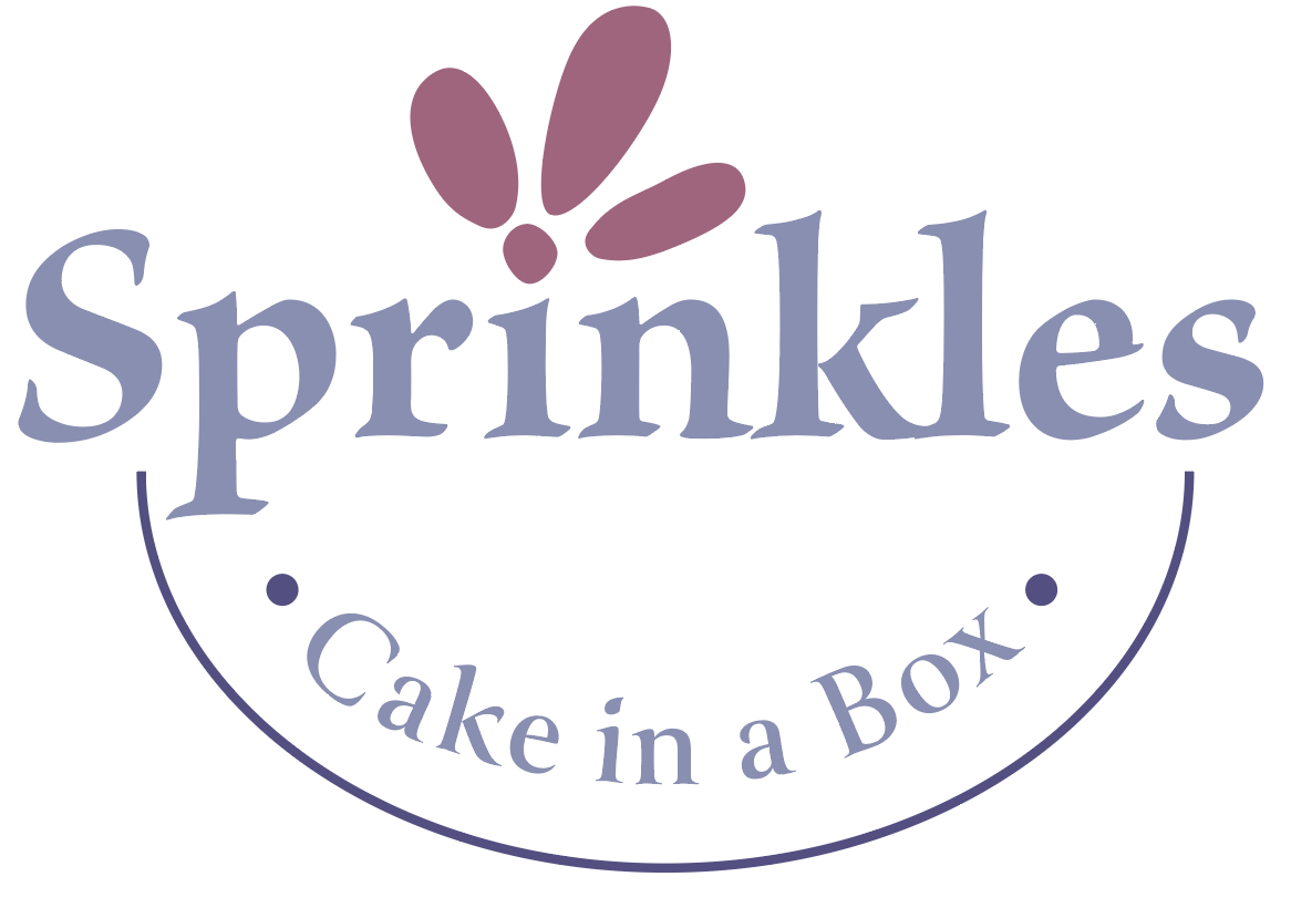
Looking at my subject purpose, I chose a name that was very obvious and could easily relate to my brand without looking directly at the brand. “Sprinkles” is a simple yet effective brand that conveys the purchasing of cakes whilst being in a contained box. The logo I began to sketch represents this idea allowing the packaging to contain this minimalistic approach. Further, the packaging idea’s can heavily link back to the brand which concludes the main features needed to sell the box and its produce. The simple calligraphy-style font was the best choice as this can link back to the brand constantly and overall help the sale of the box. I decided overall to wait until I produce software developments to then create the colour scheme that will be featured throughout.
Further Brand Development
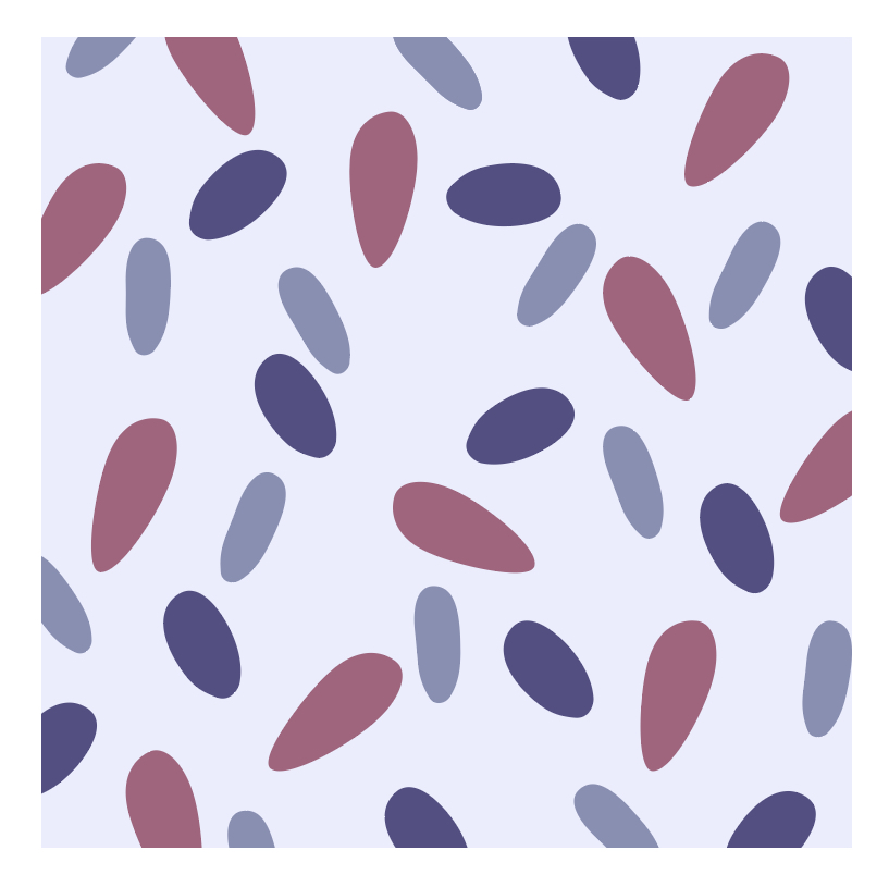
When transforming the initial sketches into Adobe Illustrator, it was key to ensure that the brand relates back to the target audience and subject. I found a similar font to the one on paper and altered it to have the desired final affect on the audience. This was also where I produced my final colour scheme. Looking at current bakery brands, they are either extremely feminine or contain a neutral palette. I wanted to conform this norm and use a single colour that surrounds the brand that isn’t either pink or brown. “The hue lilac is commonly linked with attributes such as sociability and open-mindness. The lilac colour is claimed to help minimise antisocial tendencies.” (acrylgiessen, 2022). This is where my base colour began and I expanded variations from that. This is also the palette I used to create my packaging material which you can see below.
I feel as though my final logo and brand identity clearly links back to the target audience and subject which coherently allows the packaging developments in Substance Stager software to be thought through thoroughly and can produce a successful product.
Adobe Substance Stager Developments
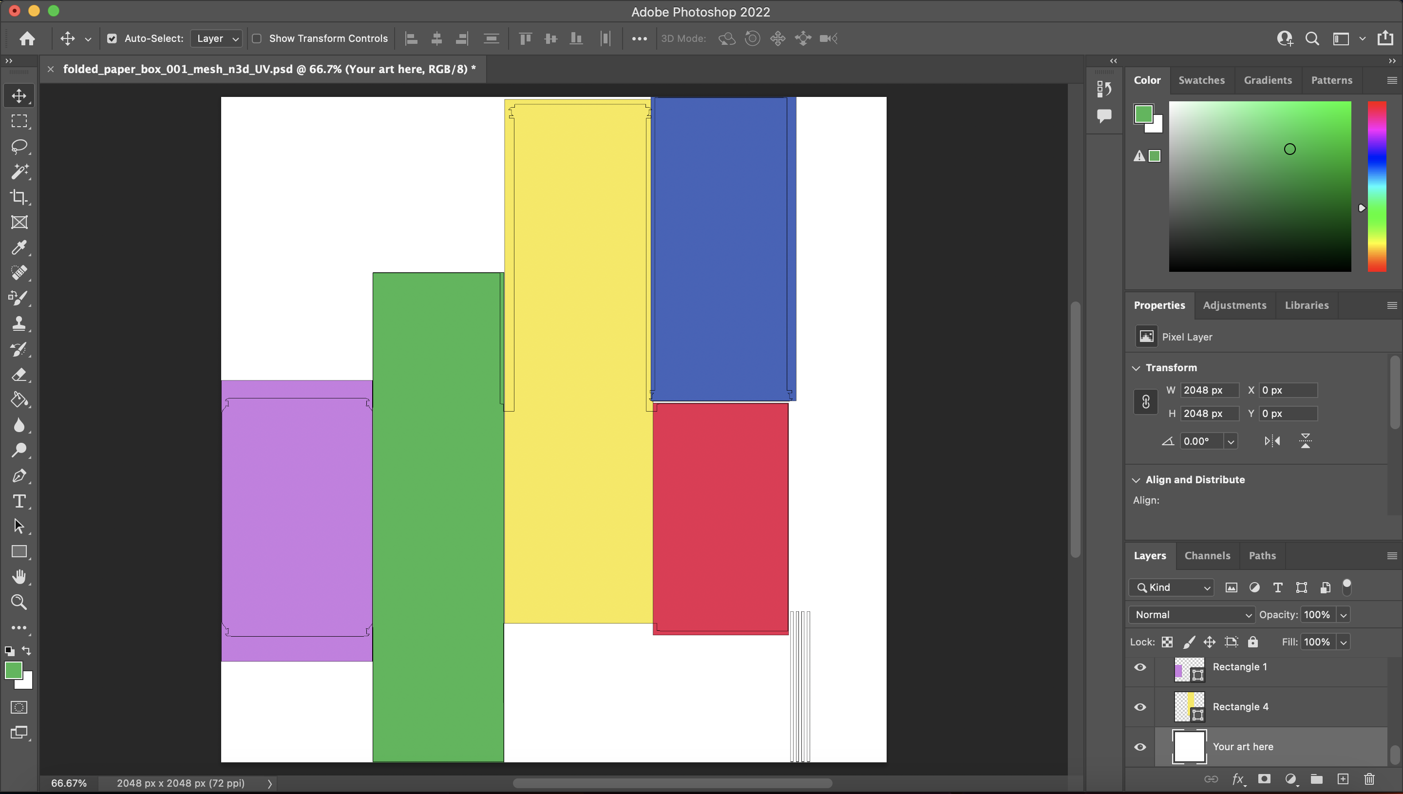
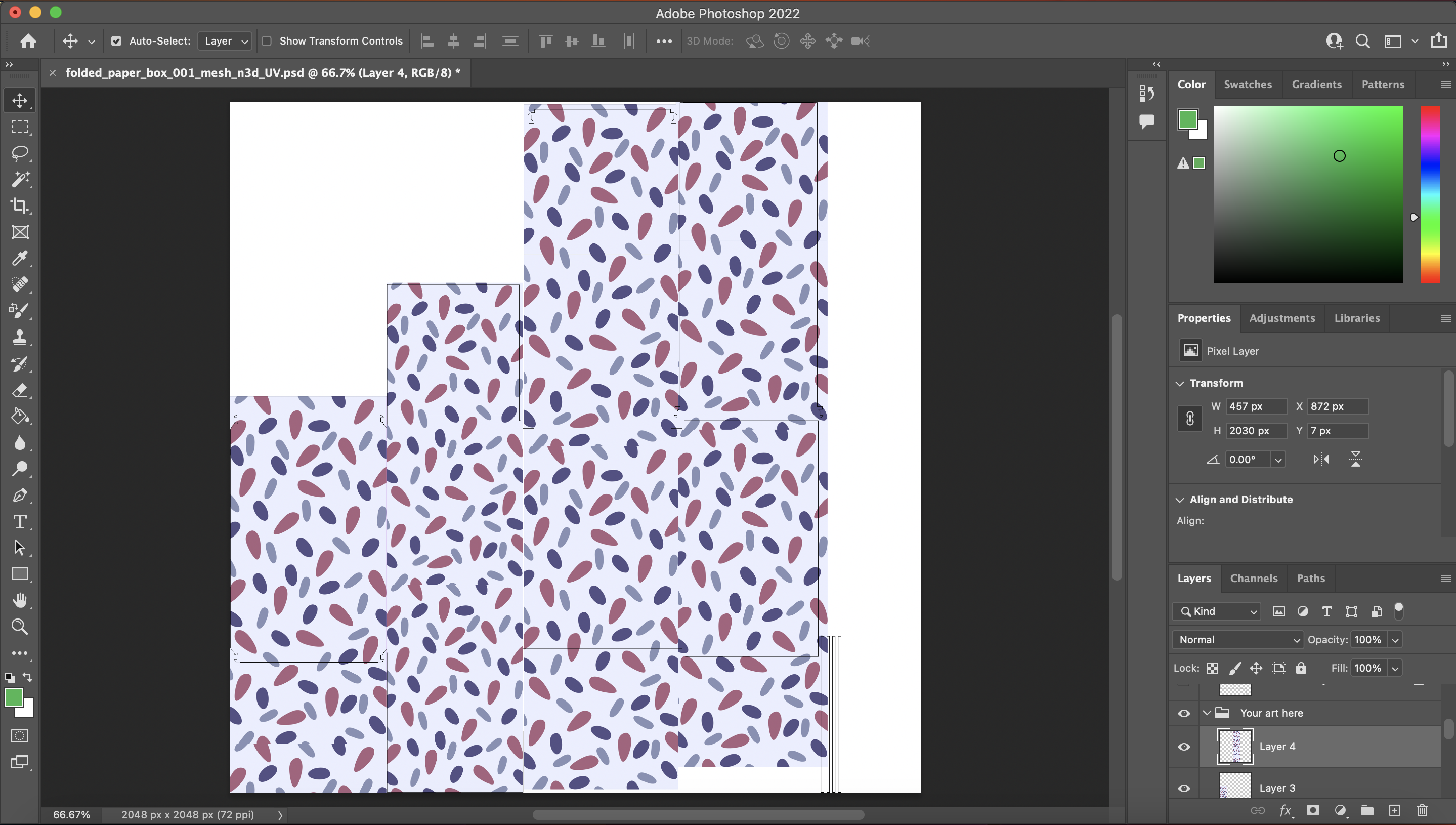
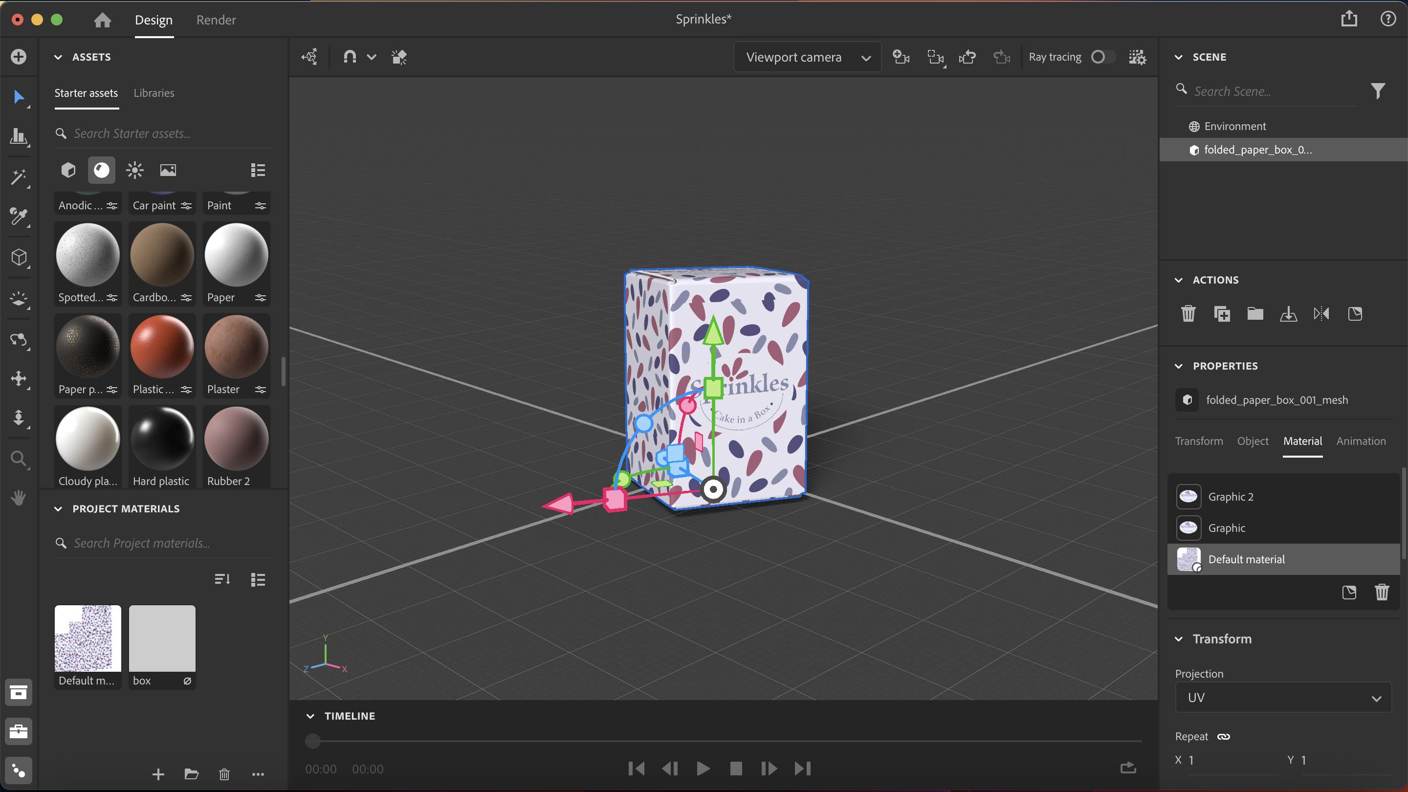
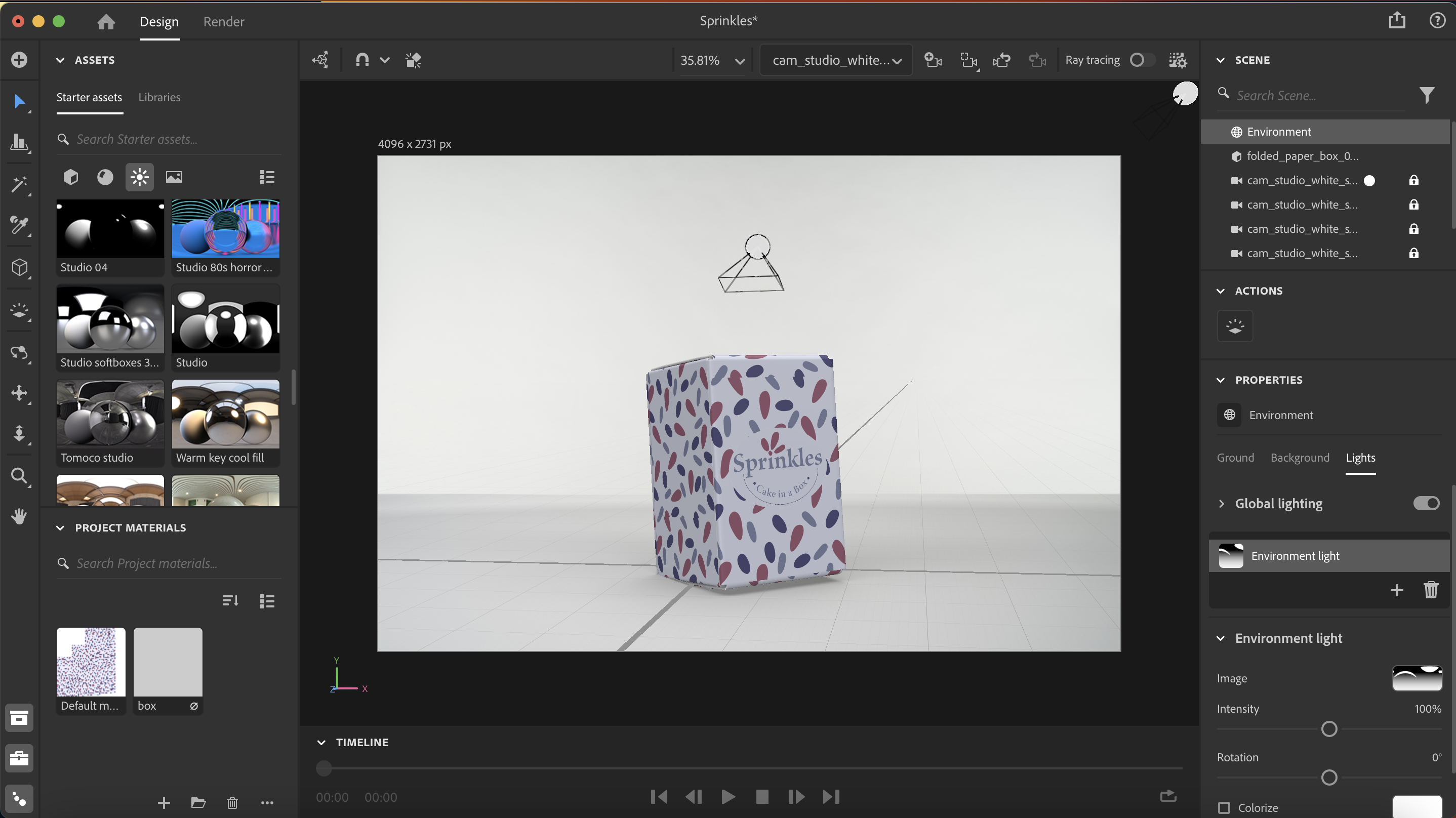
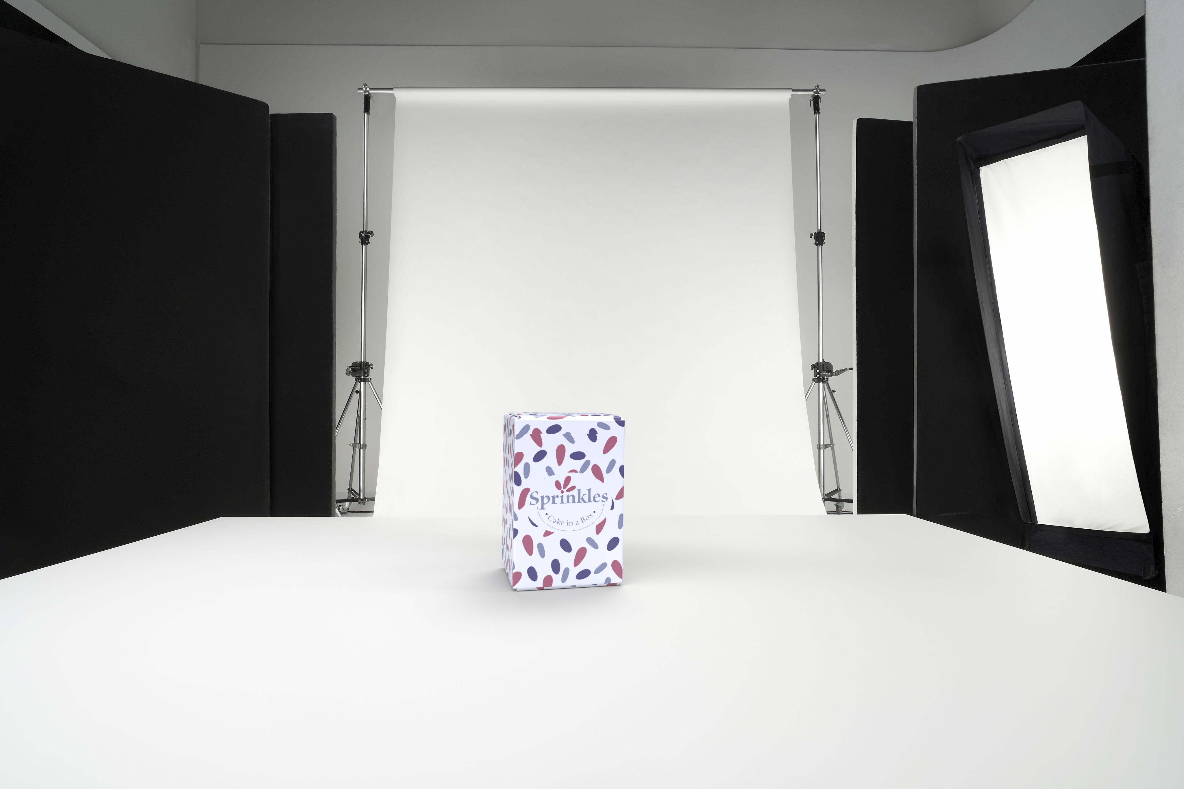
To begin producing the final 3-Dimensional packaging design for my box I initially chose the object intended to work with and unwrapped this. I opened this file in Photoshop which then allowed me to see the entire box’s UV layout and proceeded to add my packaging created on Adobe Illustrator. I checked the decal numerous times to ensure any mistakes or mishaps were corrected and when I was happy with the final layout, I saved the document and imported this in Substance Stager. Once the base of the box was correct, it was then time to add my “Sprinkles” logo to the box in its varied planned positions. I added these as separate images to ensure the accuracy when changing the layout. Finally, the designed packaging was complete in a 3-Dimensional form.
The next step was to complete the lighting setup and choose the best camera options to render my 6 images. I chose an environmental scene that best suits the sales of my box which was the studio white soft scene. This then allowed me to add specific lights to enhance the features on my box. I used the square lighting which automatically makes my object the centre of the screen and positively impacts my renders. I adjusted the box multiple times and produced the final renders.
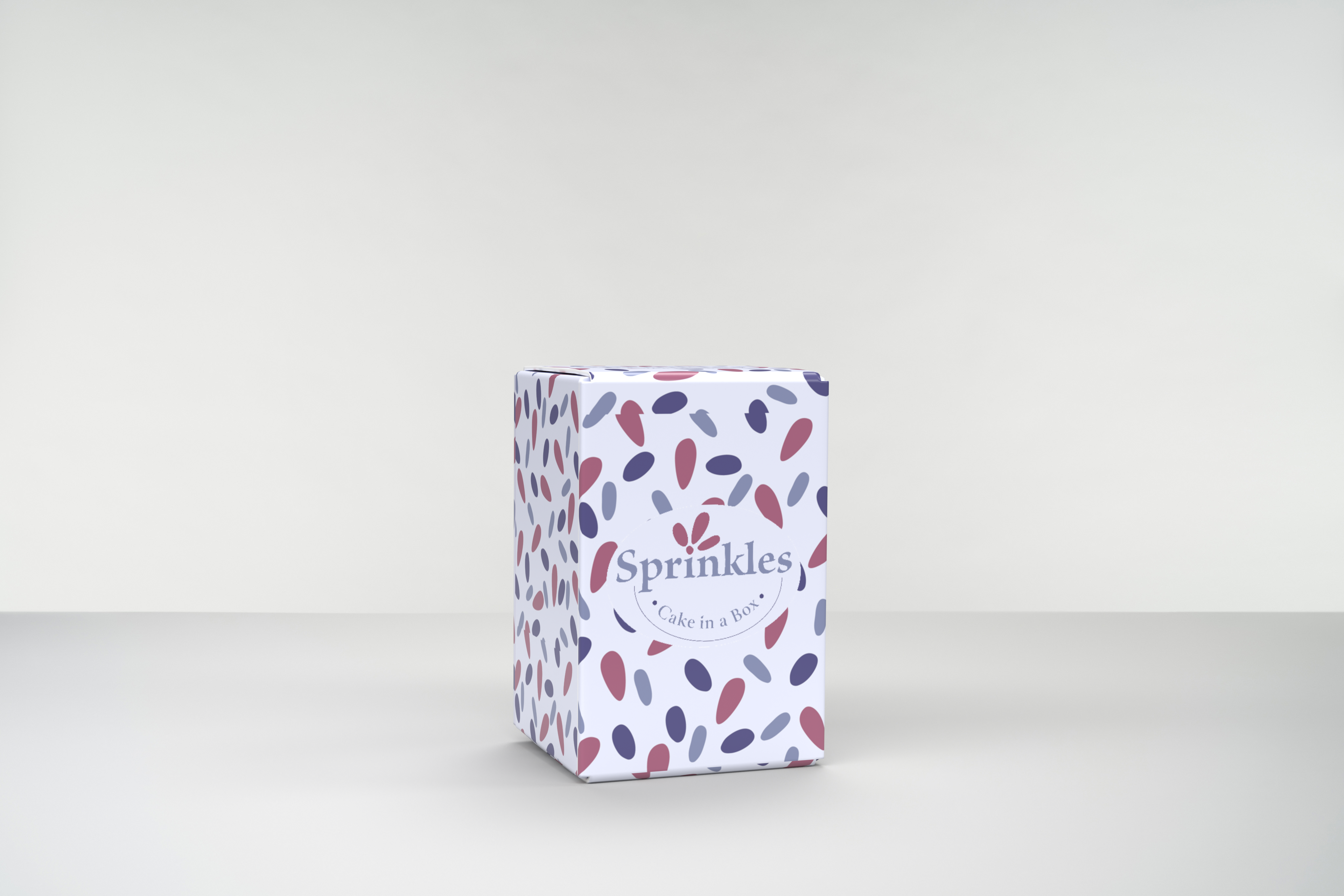
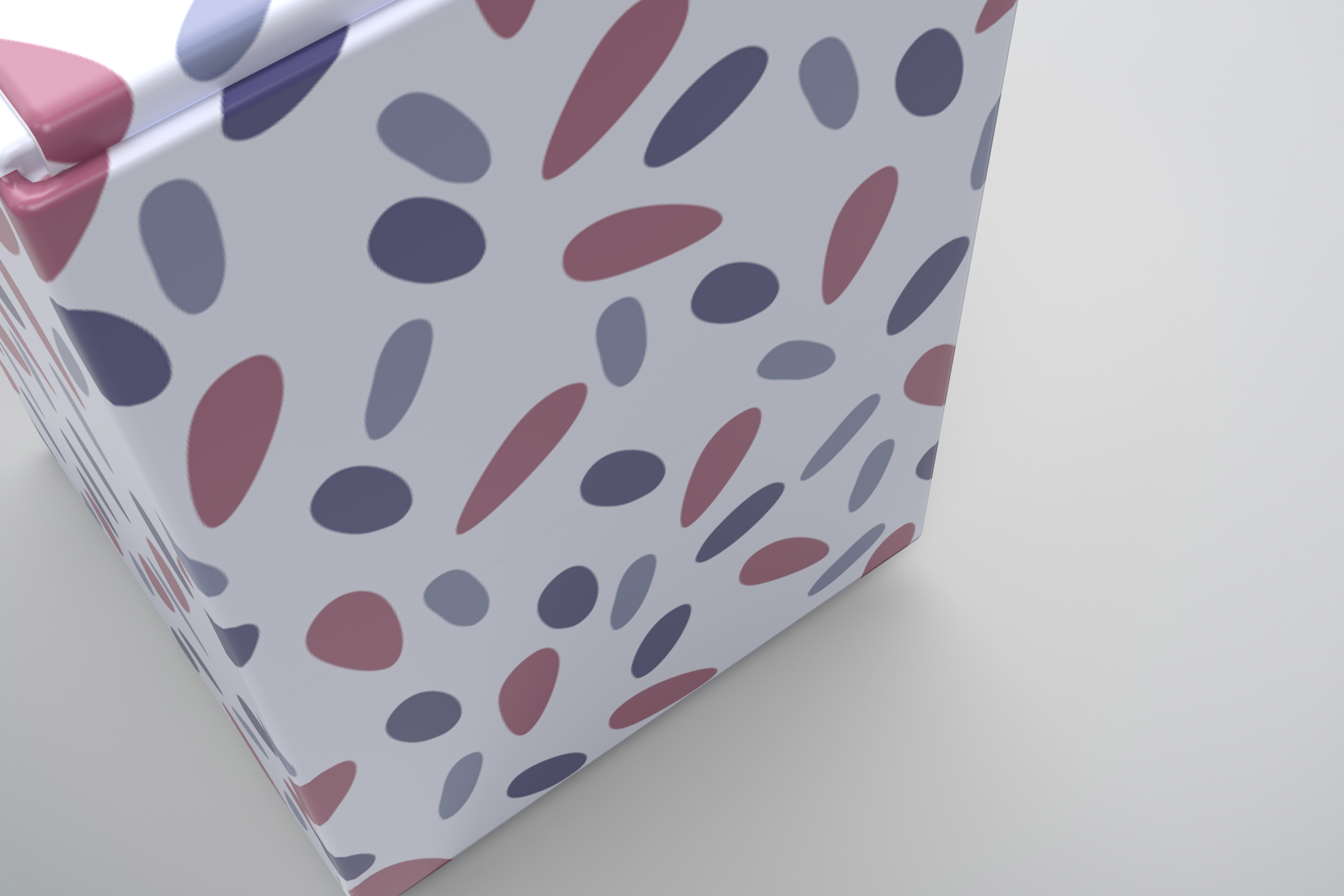
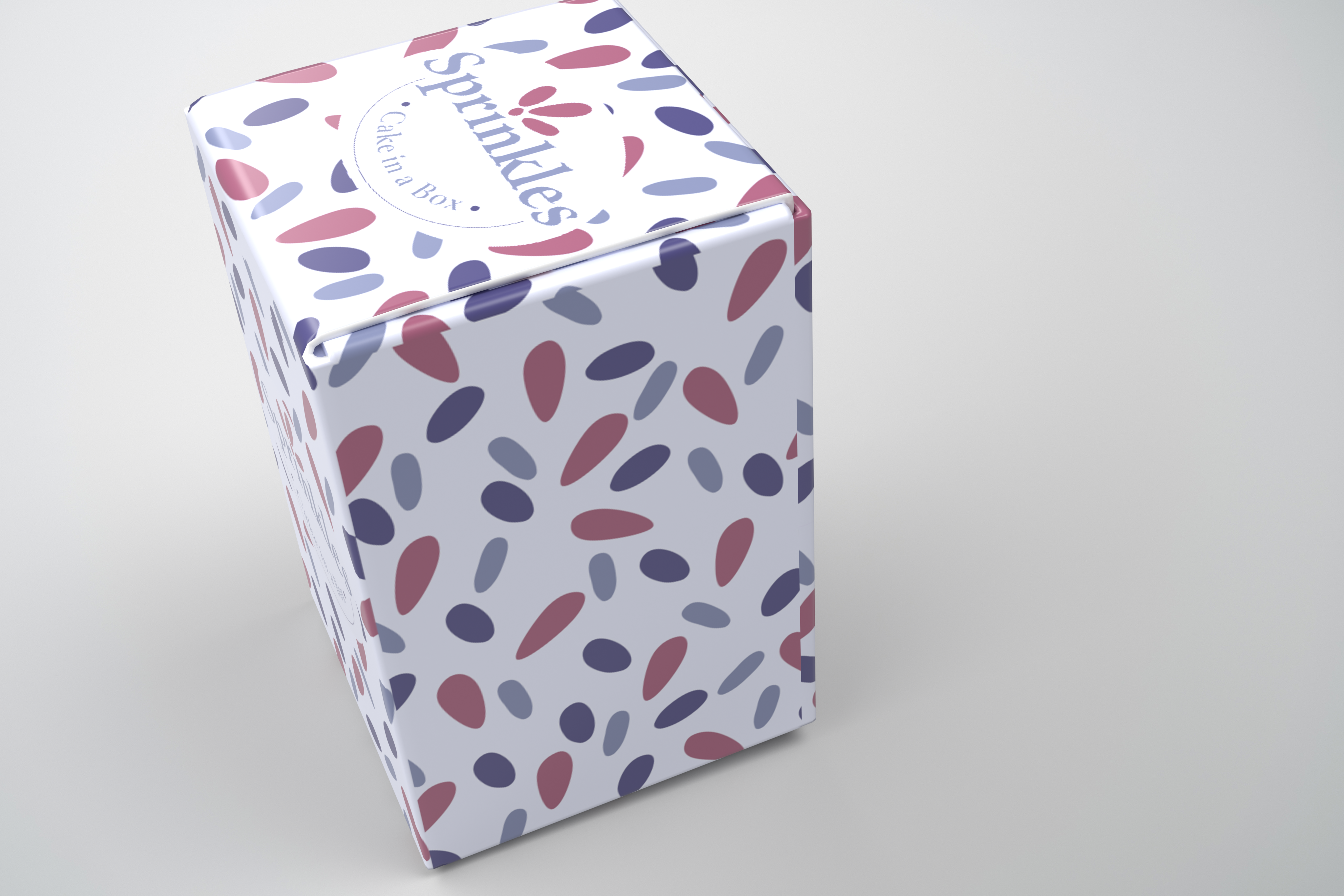
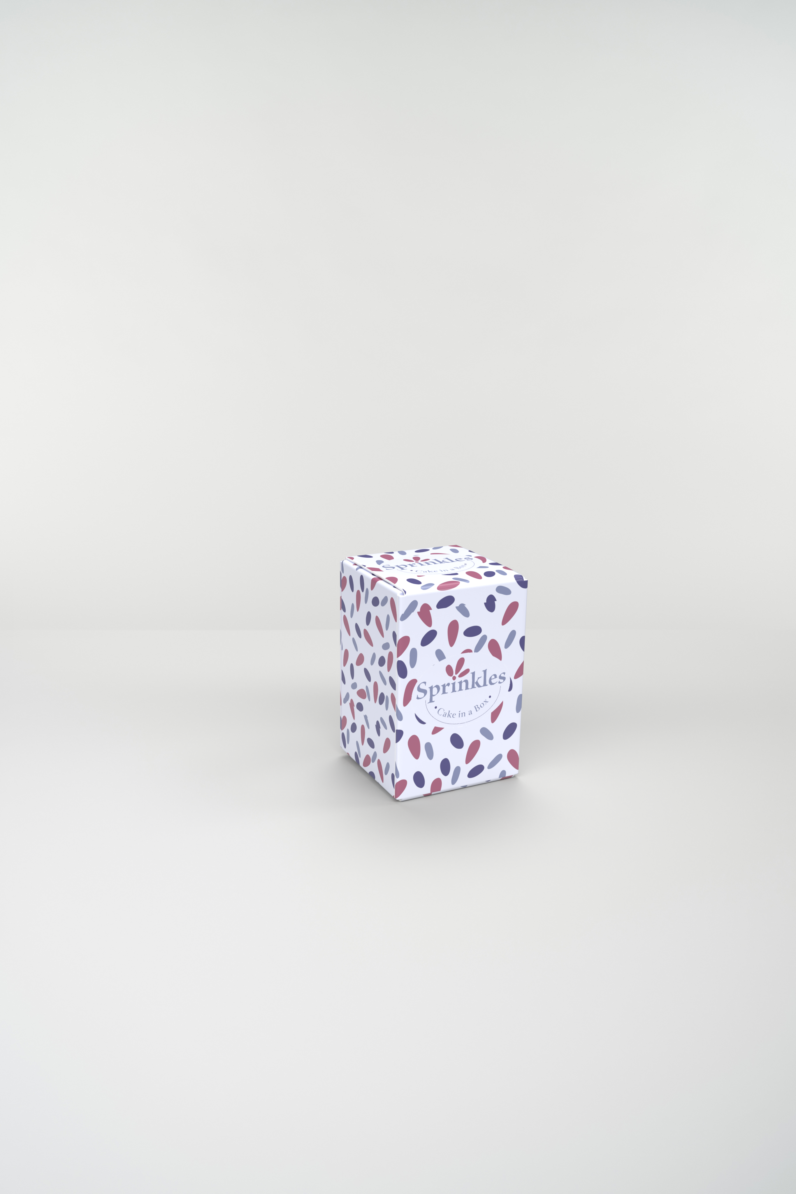
Final Product Design Renders
Below you can see my Final 6 Renders that demonstrate Product Design, included an Animated Shot.
References
acrylgiessen, 2022. Lilac Color – Learn All About This Soft Purple Shade. [Online]
Available at: https://acrylgiessen.com/en/lilac-color/#:~:text=The%20hue%20lilac%20is%20commonly%20linked%20with%20attributes,claimed%20to%20help%20minimize%20antisocial%20tendencies%20and%20hostility.
[Accessed 18 April 2023].
clawscustomboxes.com.au, 2023. Bakery Boxes. [Online]
Available at: https://www.clawscustomboxes.com.au/product/bakery-boxes/
[Accessed 13 April 2023].
Oscar, E., 2019. How Custom Cup Cake Boxes Help in Delicious Desert Appearance?. [Online]
Available at: https://www.pakboxes.com/blog/how-custom-cup-cake-boxes-help-in-delicious-desert-appearance/
[Accessed 13 April 2023].