
Edward Tufte’s Main Theories
Edward Tufte is an American Statistician noted for his writings on informational design and a “pioneer in the field of data visualisation.” (en.wikipedia.org, 2023). Within each of his works, there are 4 main principles that are key to be followed when presenting a criteria for good visual information representation.
“These consist of:
- Graphical Excellence
- Visual Integrity
- Maximising the Data-Ink ratio
- Aesthetic Elegance.” (interaction-design.org, 2020).
Throughout my metamorphic animation, I am going to focus on his principles that are outlined in his ‘Envisioning Information’ book. These focus on achieving visual excellence away from statistical graphs and envisioning the whole graphic design world. “His principles of visual display are predicated on the idea that excellence in visual design is largely realised through the creation of graphics that correspond with the mental tasks they are meant to support.” (C, 2004).

In his book, Tufte defined five functions of visual informative design that could be related to every aspect of the design world. The key now was to attempt to relate each theory to parts of my storyboard and final animation and explaining the reasoning behind each one. I may need to alter my final storyboard to display the thoughts of each one.
Incorporating the Theories
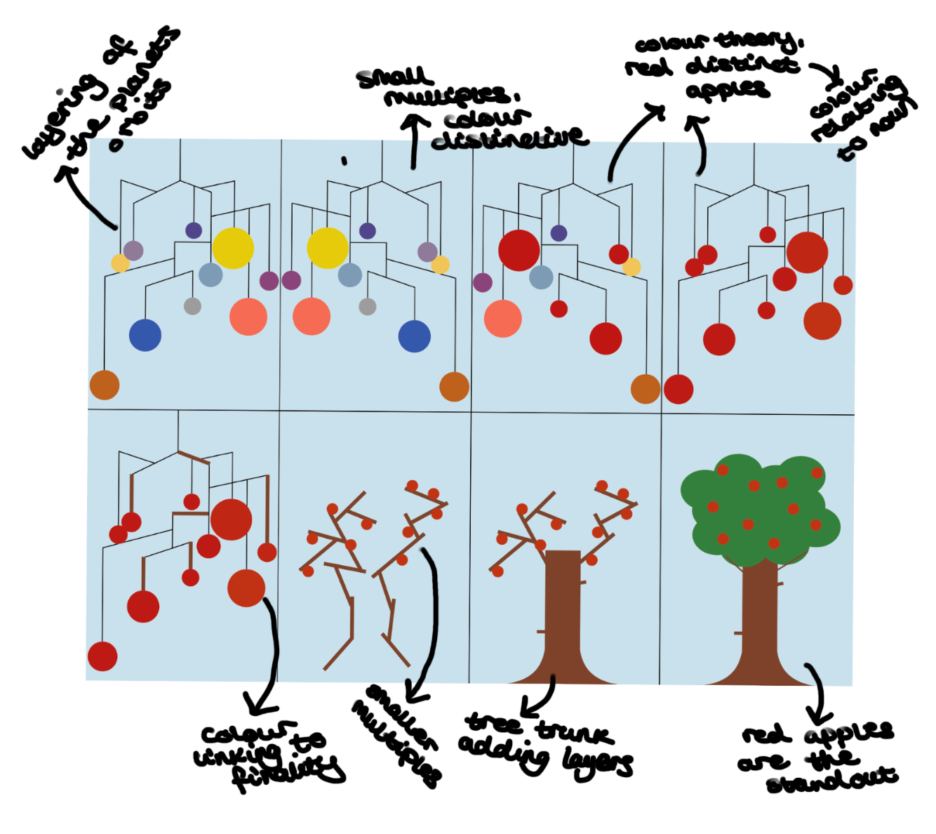
I plan on incorporating Tufte’s use of Colour Theory to my animated design as the main function of his work. I will label information with colour to incorporate it as a well known noun in the red colour that I will produce my apples. This is also a colour that will stand out among the duller colour of the trees and therefore gives valid reasoning behind the choice which is what Edward Tufte believed in. This will allow for the first theory to be incorporated through my project and is shown on the last half of my storyboard when the planets change colour. The final image displays the bright colour amongst the rest of the dull background. I have made this choice so that the audience clearly understands that the tree relates to the Garden if Eden and therefore, the story of Adam and Eve.

The second Edward Tufte theory I want to incorporate is his Comparison of Small Multiples. He defined the comparison of small multiples as “positioning similar chunks of visual information within the viewer’s glance.” (E.R., 1990). The constancy between each model helps the audience to perceive each separate part of information. This is going to be shown through my solar system models on a mobile. Each planet will be similar in size and position so the only way we are going to separate each is from the texture choice. This theory will be conjoined to the colour one and will explore visual depth and separation to imitate how the audience views each planet. I emphasised this when explaining on my storyboard that while the planets are spinning, each texture is clear to relate to a singular model and none is the same.

Layering and Separation is the final Tufte theory that I want to display through my animation. I want this to refer to each of the start and finishing frames of the storyboard and not the metamorphosis transition in between. The mobile at the start is the base frame and layer that holds each planet together. Due to the 3-Dimensional aspect, it is easy to portray the layering through each planet. However, the theory is more clear in the final frames when the tree starts to become one. The mobile frame slowly becomes the branches that will begin forming the tree. The second layer is the trunk that grows and adds a second structure to the model. The final layer is the leaves that bloom around the red apples which concludes the final layer and brings each separated section together. The aim of this method is to display to the audience that the universe is a complex solution created from numerous different layers no matter how you believe it was formed.

Final Storyboard Including Tufte’s Theories
A positive relation to including Edward Tufte’s envisioning information theories is that there is forced reasoning behind every decision made. It allowed me to think carefully about each design choice that I made and second-guess areas of my process. There was constant development to each area of design and I am happy with the conclusion of each Tufte theory that was involved. I also learnt a lot about design further and the importance of visualising information in a positive light.
Below you can see an annotated and edited version of my final storyboard for my animation which includes each theory I have described above.
References
abulsme, 2013. Book: Envisioning Information. [Online]
Available at: http://www.abulsme.com/2013/07/22/book-envisioning-information/
[Accessed 08 May 2023].
Allison, R., 2016. How to make infectious diseases look better. [Online]
Available at: https://blogs.sas.com/content/sastraining/2015/02/17/how-to-make-infectious-diseases-look-better/
[Accessed 15 May 2023].
C, Z. M. a. T., 2004. An Interview with Edward R. Tufte. [Online]
Available at: https://www.edwardtufte.com/tufte/s15427625tcq1304_5.pdf
[Accessed 08 May 2023].
E.R., T., 1990. Envisioning Information. In: Envisioning Information. Cheshire(Connecticut): Graphics Press, pp. 81-93.
edwardtufte.com, n.d. Current Topics. [Online]
Available at: https://www.edwardtufte.com/bboard/q-and-a-fetch-msg?msg_id=0000hv
[Accessed 15 May 2023].
en.wikipedia.org, 2023. Edward Tufte. [Online]
Available at: https://en.wikipedia.org/wiki/Edward_Tufte
[Accessed 08 May 2023].
interaction-design.org, 2020. Guidelines for Good VIsual Information Representations. [Online]
Available at: https://www.interaction-design.org/literature/article/guidelines-for-good-visual-information-representations
[Accessed 08 May 2023].
Steinfeld, K., 2018. Envisioning Information. [Online]
Available at: http://blah.ksteinfe.com/181106/tufte_envisioning_information.html
[Accessed 15 May 2023].