
Social Farms and Gardens are a UK wide charity who support local communities to come together to complete nature-based activities which helps improve the wellbeing and coming together of people. They believe that their community gardens offer an array of benefits and opportunities to improve people’s lives. Their main logo and brand identity consists of some very clever conceptual design:
This design demonstrates the generic idea of a plant growing with leaves on the stem. When looking at it conceptually, you can see the basic outline of a plant growing, combined with the use of fingerprint in the inside of the leaves. These leaves have a fingerprint pattern on to combine the naturalistic lifestyle and the communities coming together. Green is a very down-to-Earth colour. It can represent feelings of new beginnings and growth. It can also signify renewal and abundance. It is appropriate for designs that are relating to stability, renewal, and nature. (Chapman, 2021). The fact that the green stem is in the middle holding the leaves together displays a togetherness ideology and the fact that nature can bring numerous different backgrounds together. It is a simplistic visual to understand and the idea of the project is clearly displayed to the audience without having to figure it out. We can break down the several colours on the ‘leaves’ even further to say that they represent different groups of people coming together for example: race, religion, age, etc. Warm colours are mostly energising, passionate, and positive. Using warm colours in any design work reflects happiness, enthusiasm, and energy connotations. (Chapman, 2021). The colours don’t necessarily link to specific demographics but explores whoever you are, whatever your background is, you can join these communal projects and enjoy yourself.
The simplicity of the overall piece is relaxing and creates a sense of calm and being at peace. Completing gardening as an activity would also calm someone down and make them feel eased which can be emphasised through the flowing motion and careful placement of the stem. The only thing that would be changed about this conceptual design would be the fingerprint patterns in the leaves; making the prints different would further demonstrate the idea of bringing people together. Typically, every fingerprint is unique to their person so this would change to emphasise the togetherness more. Overall, this piece of conceptual design works well for the project and will be successful in bringing people together to help improve the environment and people’s lifestyles. (farmgarden.org, 2018).
On the contrary, the Community Farm in East Hull is a great social project for people to come together to take part in workshops, crafting and working with farm animals. They offer day care opportunities for people to join who they value. Their main goal is to strive to help these people become the best versions of themselves. This is an amazing local project which can be enhanced by producing some conceptual designs to further entice their audience. Their current brand identity logo consists of:

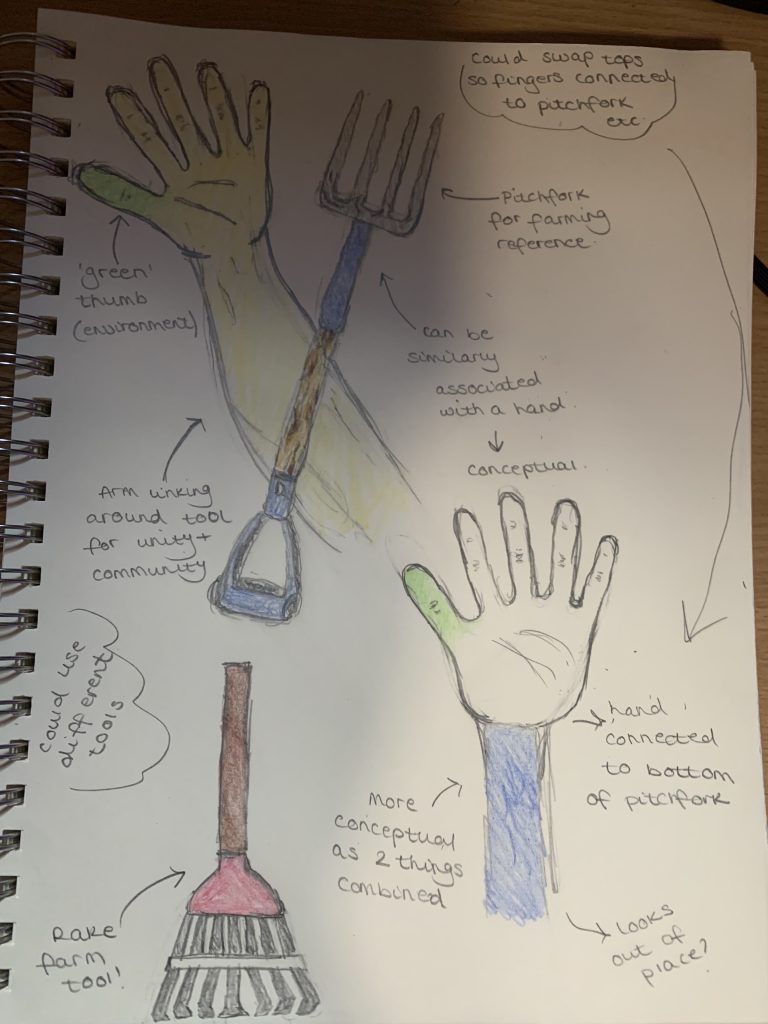
This logo is very simplistic but gets the main idea of the project across. The original sans-serif font used emphasises this simplicity and gives a very neutral stance while using the colour grey. (digitalsynposis.com, 2012). If it was to be redesigned, consideration to the two main words in the brand name: ‘community’ and ‘farm’ should be most important. When thinking of community, think of the coming together of families and friends enjoying each other’s company and working together to achieve a goal. Pairing this idea with some basic farming associations such as the tools that would usually be used would be a good way to conceptual design their logo. The specific tools that are used are ones that looked like hands so things like rakes and shears. Both apparatus have handles used for a more comfortable experience which relates to this idea. Starting with come basic sketches, the main idea was to use unity and the thought of arms crossing over but adding in the conceptual use of farming tools to link back to the community project. Luckily, these sketches really worked and combined freely. Experimenting with some colour schemes but again, Brown is associated with the Earth, wood and stone. It can further be looked into as a colour that represents dependability and reliability. Mainly, it can be found in wood textures and occasionally in stone textures. (Chapman, 2021).
Connecting the hand to the bottom of the tools emphasises the conceptuality to make sure that the meaning was really put into the viewers minds. After refining some smaller details, the ideas were put together and looked very complete to a standard which could bring in a higher volume of participants to their social enterprise. Hopefully in the future, software would be added into this piece to make it more technologically advanced and could make it look a lot more put together for the project with sharper lines and a more real feeling. The sketched ideas are a great start and would lead on to a meaningful piece of conceptual design. The conceptuality has been clearly explored to make this idea of community and farming crossing over and combining. Short notes and sketches can be seen below. (easthullcommunityfarm.co.uk, n.d.).
Bibliography
easthullcommunityfarm.co.uk, n.d. A Person Centered Supportive Environment. [Online]
Available at: http://easthullcommunityfarm.co.uk/
[Accessed 04 October 2021].
farmgarden.org, 2018. Social Farms & Gardens. [Online]
Available at: https://www.farmgarden.org.uk/
[Accessed 04 October 2021].
Chapman, C., 2021. Colour Theory for Designers, Part 1: The Meaning of Colour. [Online]
Available at: https://www.smashingmagazine.com/2010/01/color-theory-for-designers-part-1-the-meaning-of-color/
[Accessed 06 October 2021].
digitalsynposis.com, 2012. What different types of fonts mean and how to use them. [Online]
Available at: https://digitalsynopsis.com/design/font-psychology-emotions/
[Accessed 09 October 2021].