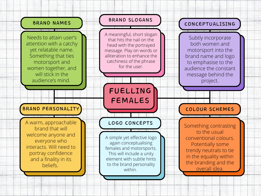
Brainstorming
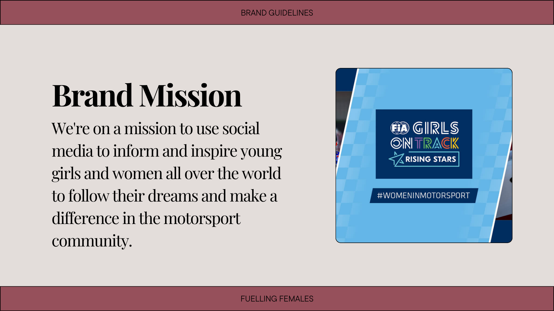
To begin the creation of my Women in Motorsport brand, I needed to start with brainstorming. Brainstorming is “a method design people use to generate ideas to solve clearly defined problems.” (interaction-design.org, n.d.). This initial activity will help gather all my thoughts to produce high-quality ideas and inspirations for my design project. For now, I will start producing a mind-map with 6 sections to let my basic thoughts behind the branding flow. I need to commence the ideas with a brand name, slogan, personality, colour scheme, and logo concept. Underneath these sections, I wrote down my initial thoughts on what was necessary to include and focus on when producing the assets. As you can see, each section is filled with a structured sentence that I can relate back to when creating each area of branding.
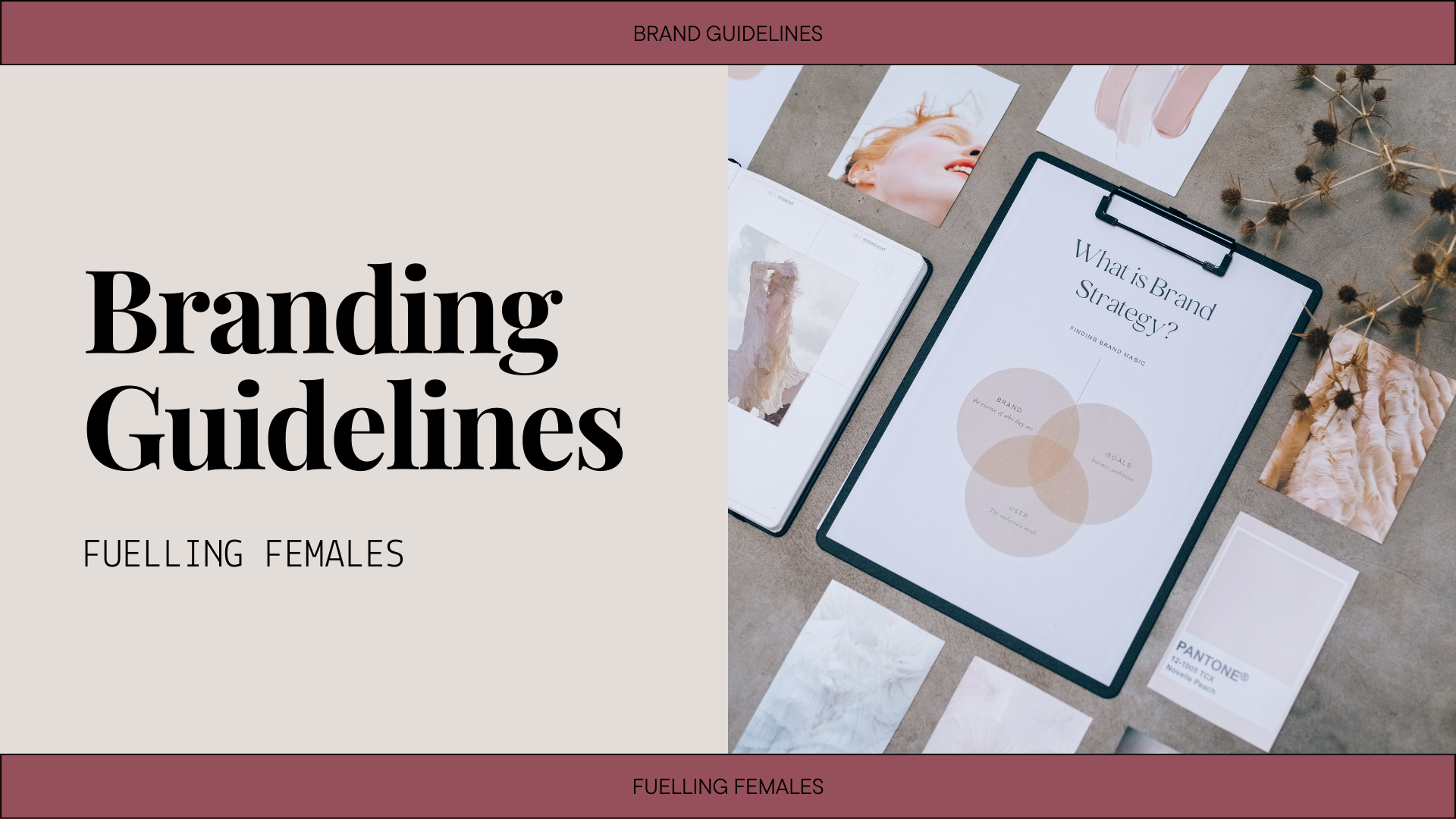
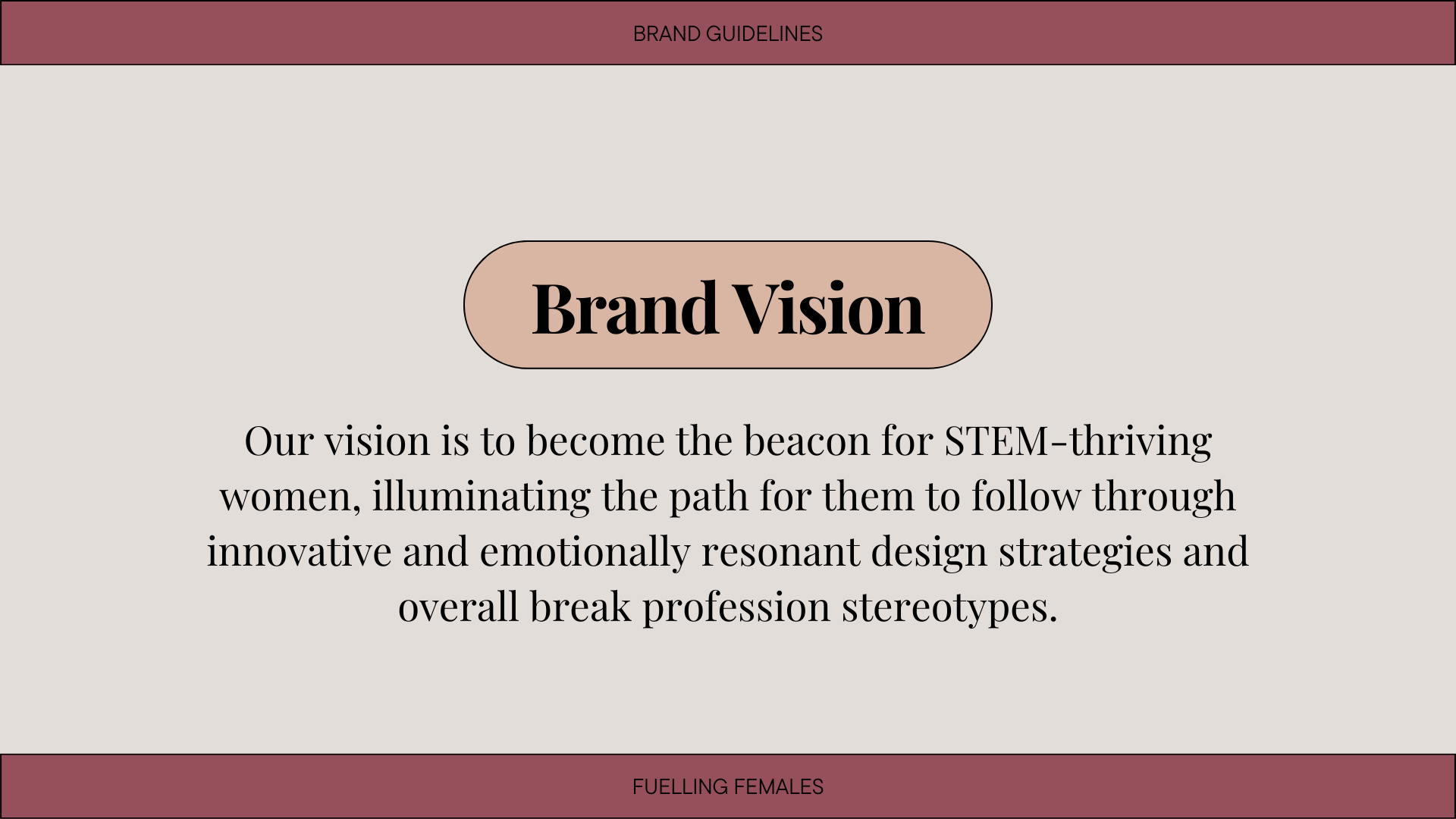
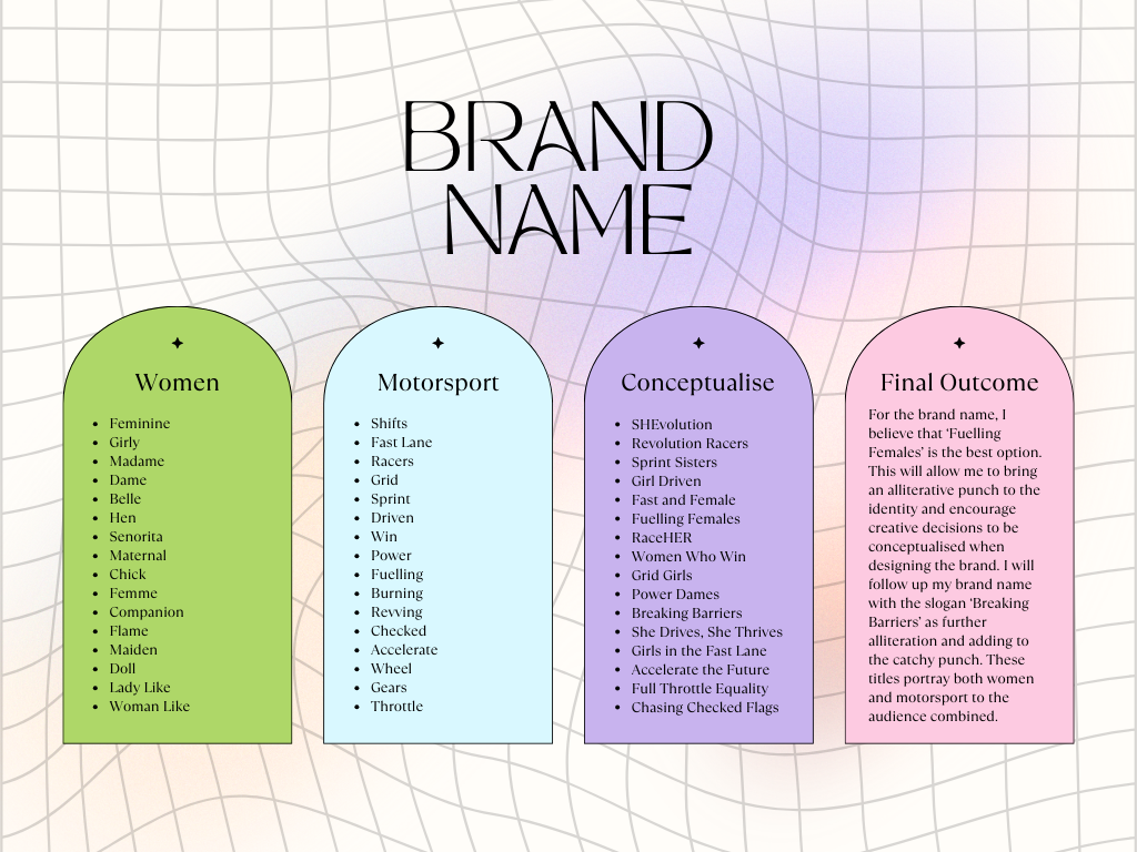
Once I was happy with the initial mind-map, I went on to confirming my final brand name and slogan. A technique I usually use when taking the first steps of producing a brand name is a conceptualisation column. I will begin with thinking of associated words based on the two topics I want to combine, and then create a separate column with some conceptualised ideas. This helps to remind myself of the focus of the brand and not steer off topic at the first step. After careful consideration within each column, I produced a large amount of potential names and slogans that I could use in the final construction of the brand, and continued to refine my ideas until I reached the perfect outcome. The final brand name I chose was ‘Fuelling Females’ as this uses captivating alliteration to ensure it sticks with the audience when viewing my content, and further will allow for interesting design choices when producing the graphic. To stay trending with my name, I ended up choosing ‘Breaking Barriers’ for my slogan. This solidifies the reasoning behind my company and will ensure that the user knows who they are interacting with online.
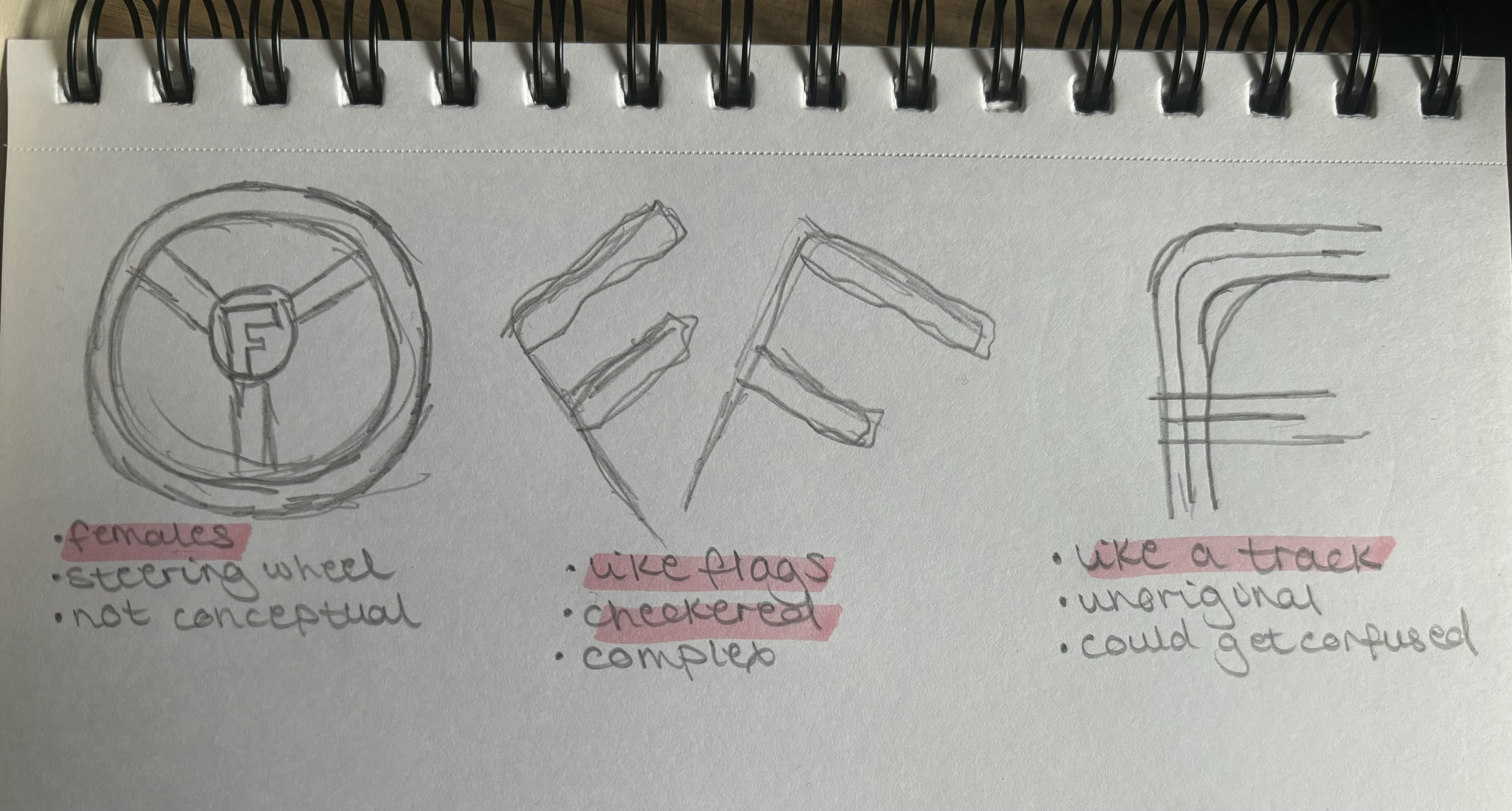
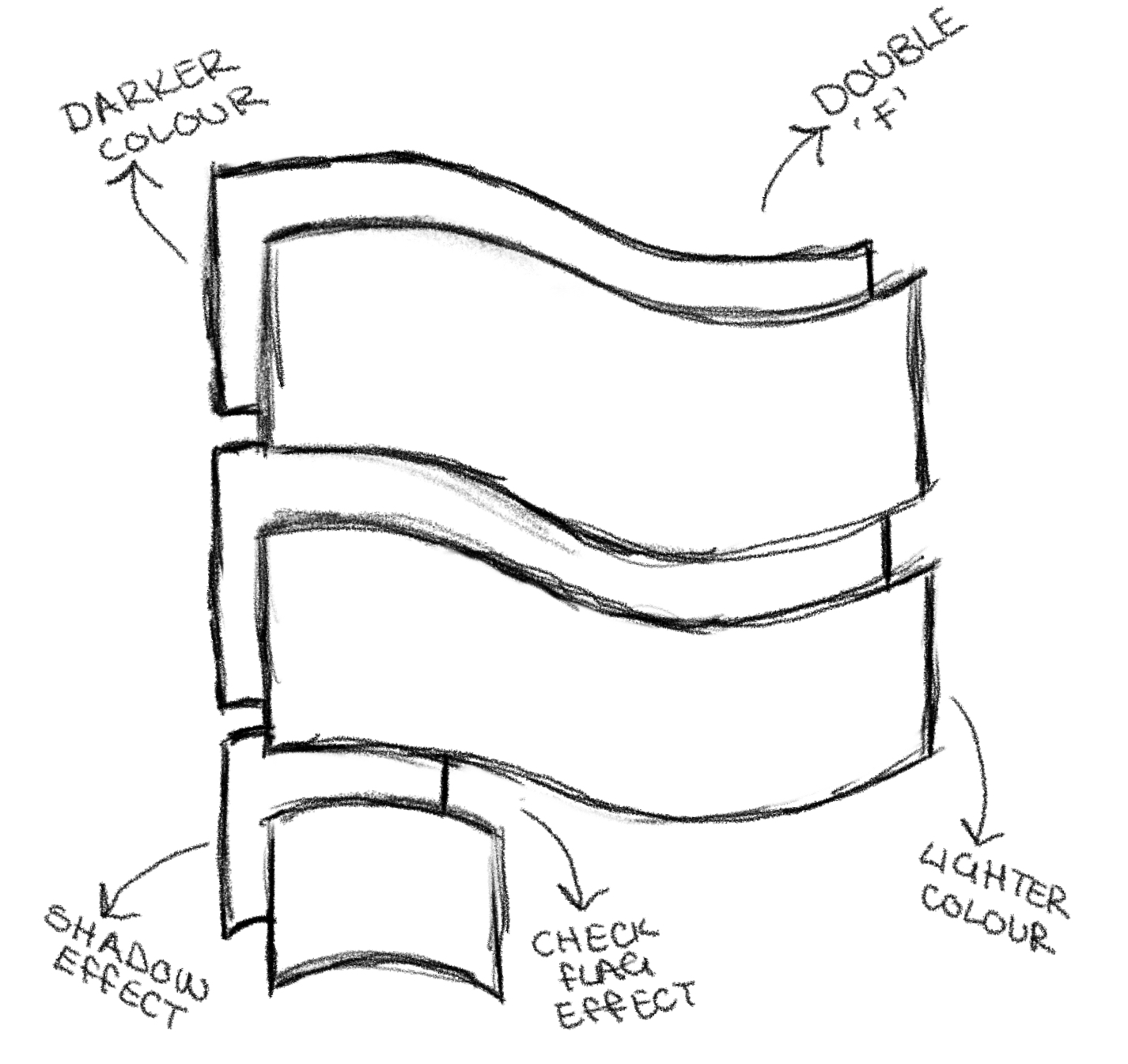
To end the brainstorming session and be successful in my future design choices, I decided to start sketching some rough outlines for potential logo concepts that I can further refine. Relating back to my conceptualisation word chart, I knew that I needed to try and include the words ‘Female’ and ‘Motorsport’ in the visual message. I tried to think of three key ideas to focus on to then combine for my final logotype. The first inspiration sketch consisted of a steering wheel to demonstrate how my brand will be centralised around females within the motorsport industry. However, this was deemed as not conceptual, so I moved on to the next rough design. This used flags to represent the F for females which I thought was a strong idea to use that hidden message to portray both ideas. The design was slightly off though so I moved on to breaking up the letter to try and refine the design further. The final sketch used the F like a track which refers to the original Formula One logo. I felt that this was unoriginal but could use a nice form of the logo that I was to create by using a minimalist view of a single letter.
Logo Development
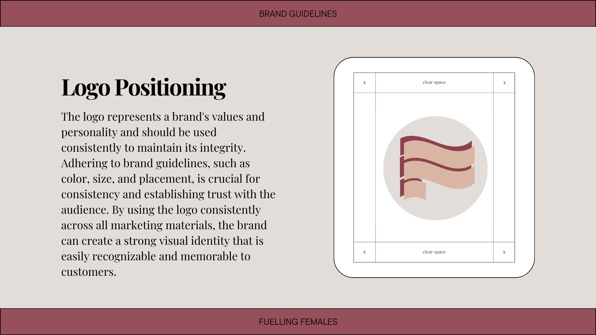
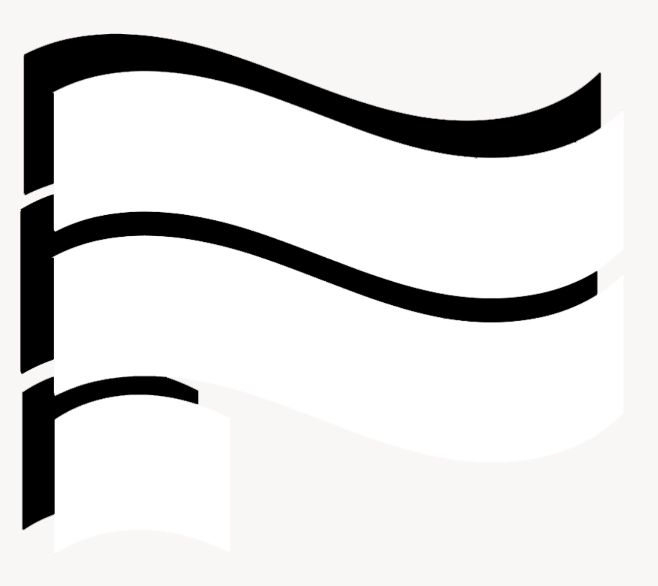
Once I had gathered some initial logo sketches, it was time to refine and decide on a final design for Fuelling Females. It was clear that an ‘F’ had to be involved in some way to represent the brand name but also remind the audience back to the main purpose which is females in motorsport. When thinking of the current Formula One logo, the bold, bright typography symbolises “the pursuit of excellence and the relentless drive to be the best”. (Noble, 2023). Throughout the design, there are clever hints within the negative space to further emphasise the importance of becoming number one in the highly competitive motorsport world. I know that my design must follow a similar pattern of this hidden message so that the simple design choice will hold a bigger meaning to my audience which is intended.
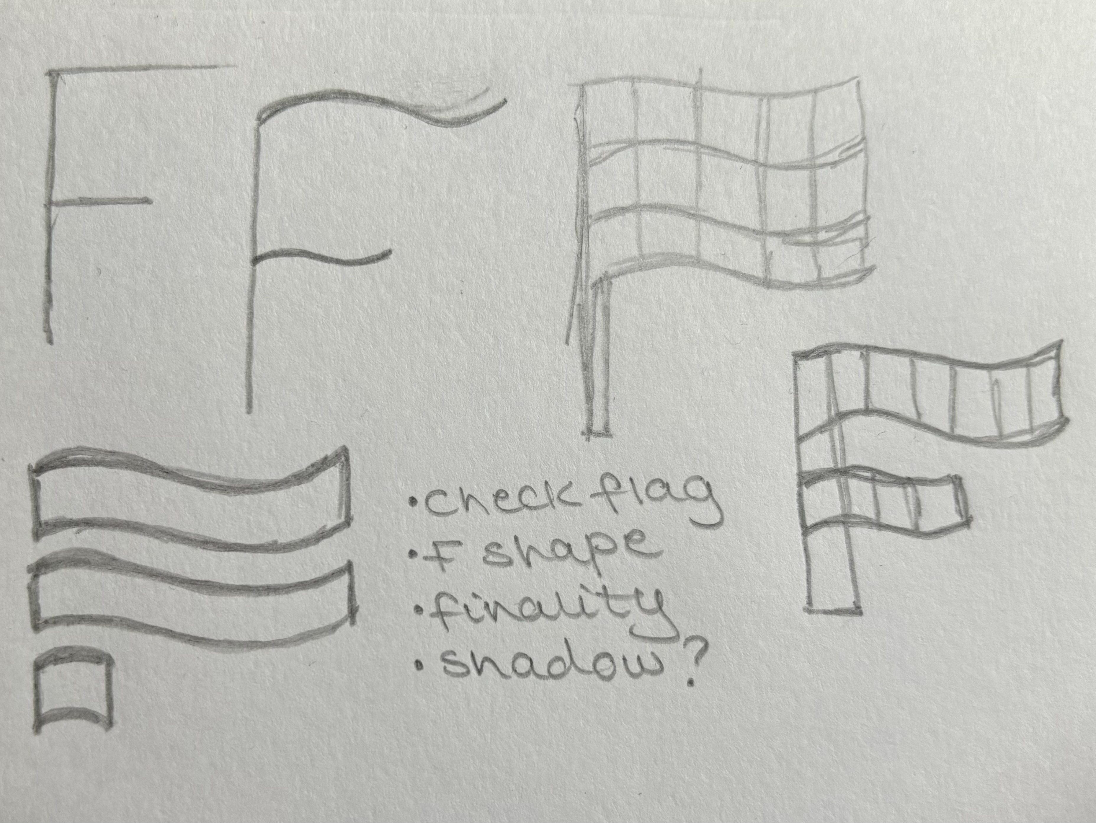
The final centrepiece reflects an “F” shape which will remind the user of the original brand name “Fuelling Females”. I then decided to repeat the F as a shadow so that the alliterative title can be represented within the logotype to further enforce this message. When sketching how I wanted the F to look, I knew it needed to be bold and empowering so that it was easily distinguishable throughout the design. I then thought about what I wanted my message to be within the logo so that the audience can easily tell what my brand is at first glance. Thinking about why I initially created this project, I decide on representing the finality of gender equality within the motorsport world and producing the finish line where we will have women competing in high category sports. Therefore, I used the idea of a checked flag as my reference and separated the lines within the F shape to produce this bold yet elegant design style. Not wanting to distract the audience away from the message behind the design, I decided to keep the logo like this and use a minimalist effect to pack a punch with the simple logo.

Colour Schemes
The history of the colours used within motorsport would relate back to the international racing colours for spectators to pick out their homeland hero’s amongst a crowd of cars. Now, fans of the sport must keep up with the ever-changing bold, bright, colours of their favourite cars every few years, “basis the principal sponsor for the Formula One team”. (Bhambwani, 2021). These striking colours relate back to the specified teams, causing idolism and symbolism between the chosen colour and Formula One team. (As an example, Ferrari have been sporting their Rosso Scuderia Red since the early 20th century). One major aspect of Tufte’s Principles of Colour is that said colour is used to label, which is done with a sharp conviction by all the teams on the racetrack. As previously mentioned, the loud and daring liveries help distinguish teams from other cars on the track. Colour labelling continues through to the spectators who turn up to the event in their masses displaying large portions of colours.
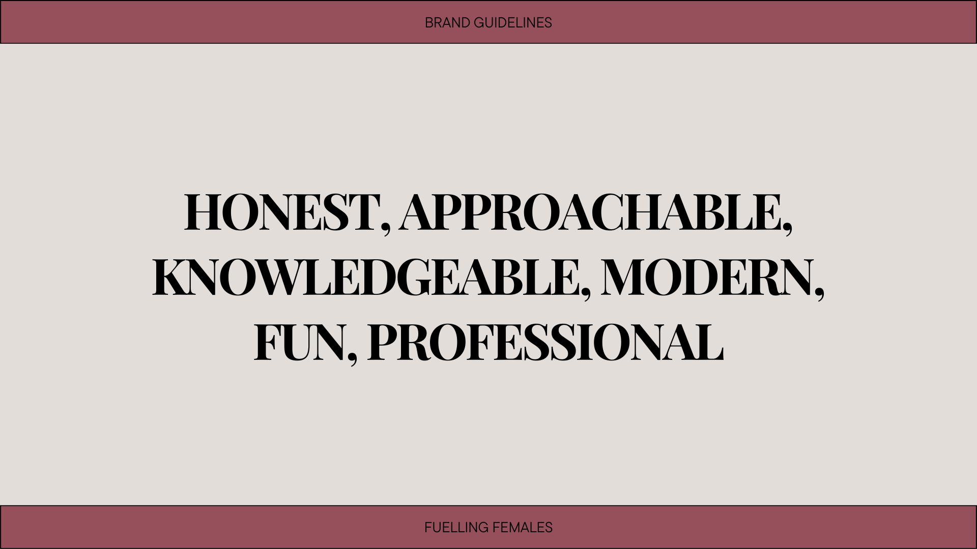
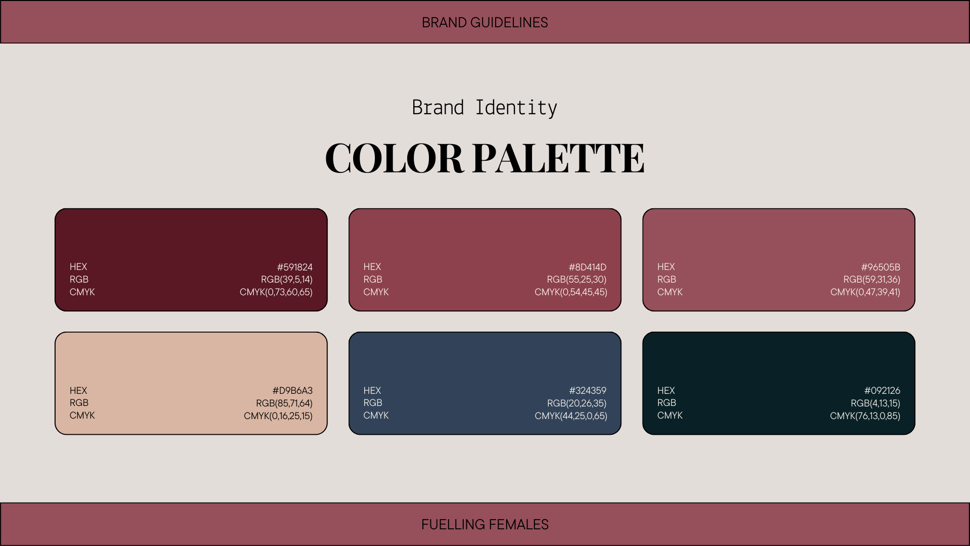
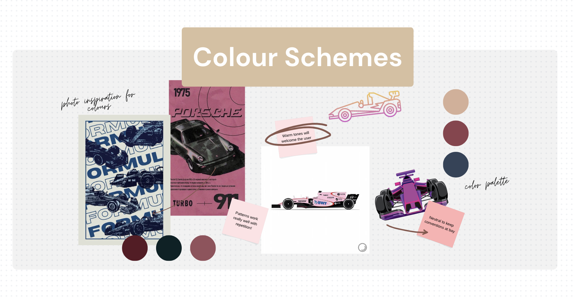
When thinking about the branding personality I want to convey to the audience, it was clear I needed to produce a neutral yet striking balance to represent the equality within the sport, but also create a symbolism that my audience can relate to every time they see it. The entirety of Formula One through a colour perspective explores bright, confident, attention-grabbing colours. I want to shy away from these usual conventions and produce a warm and inviting brand identity that elevates and compliments the bolder colours of the palette; the pinks and blues working harmoniously to soothe the readers eyes and mind. The design choices behind the pink and blue shades within the palette refer to conventional two colours associated with gender, and how I am aiming to demolish the stereotypes within the motorsport world for fans and aspirers. The audience will recognise the connected colours and can relate back to the representation of the brand personality and aim of the trademark.
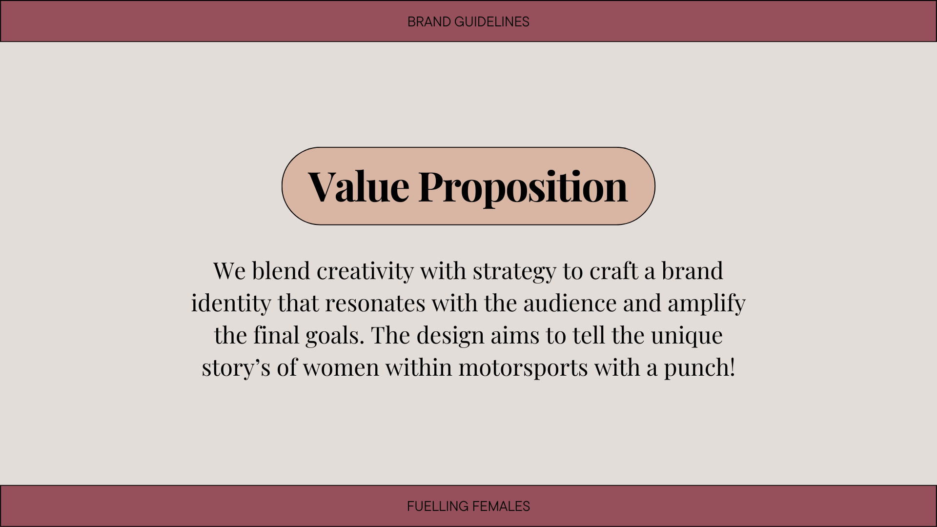
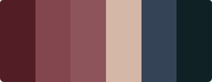
After researching current trending colour palettes that delve into the features I want to explore, I used inspiration from multiple to produce a warm and engaging scheme to use within my branding elements. Using Adobe Colour, I composed a custom harmony palette that would use 3 key colours as my starting point, and then produce a further 2 colours to combine them together. My final colour palette will transform my brand into a stylish yet informative environment that feels welcoming to anyone who approaches it.
Branding Elements
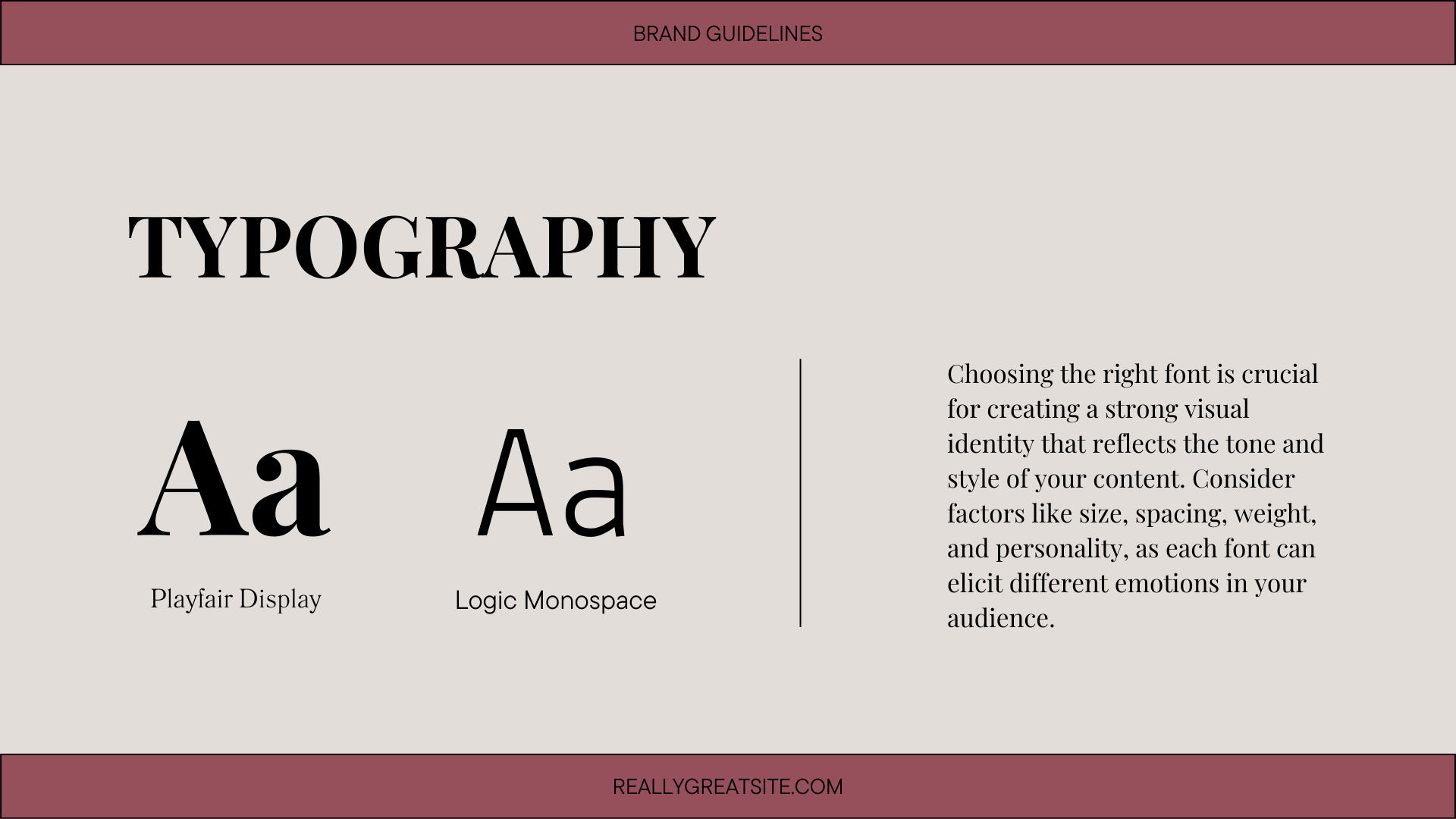
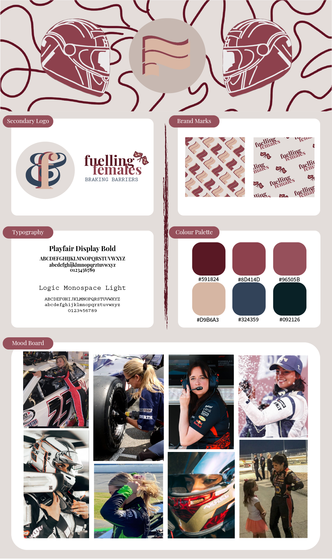
Now that I had completed my branding basics, it was time to put the entire process together in a branding board so that I could access my assets anytime I needed them. To begin, I produced a simple layout and a list of what I needed to include within the page starting with the main logo. This must be at the centre of attention as it is my main brand identity so will be used the most amount of times throughout my content. I went on to layout my final colour palette in a pleasing way using both the swatches and the Hex codes for easy access in the future. Next to this were my final decided typography options. Thinking back to my brand personality, I knew I needed a classy yet approachable font so that my audience will feel at ease when looking at it. Playfair Display is a serif font that portrays an elegant yet playful tone which compliments the earthy, warm colour palette. As a secondary font, I knew I wanted something simple yet effective and straight to the point which is why I chose Logic Monospace. This font pairing foreshadows the brand personality within and grabs the audience’s attention.
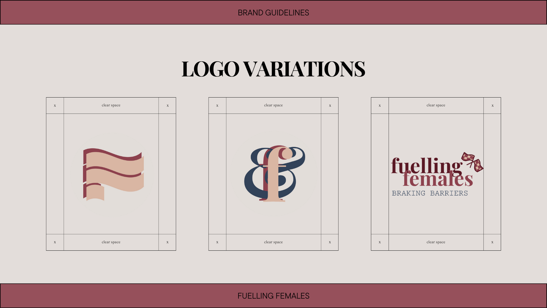
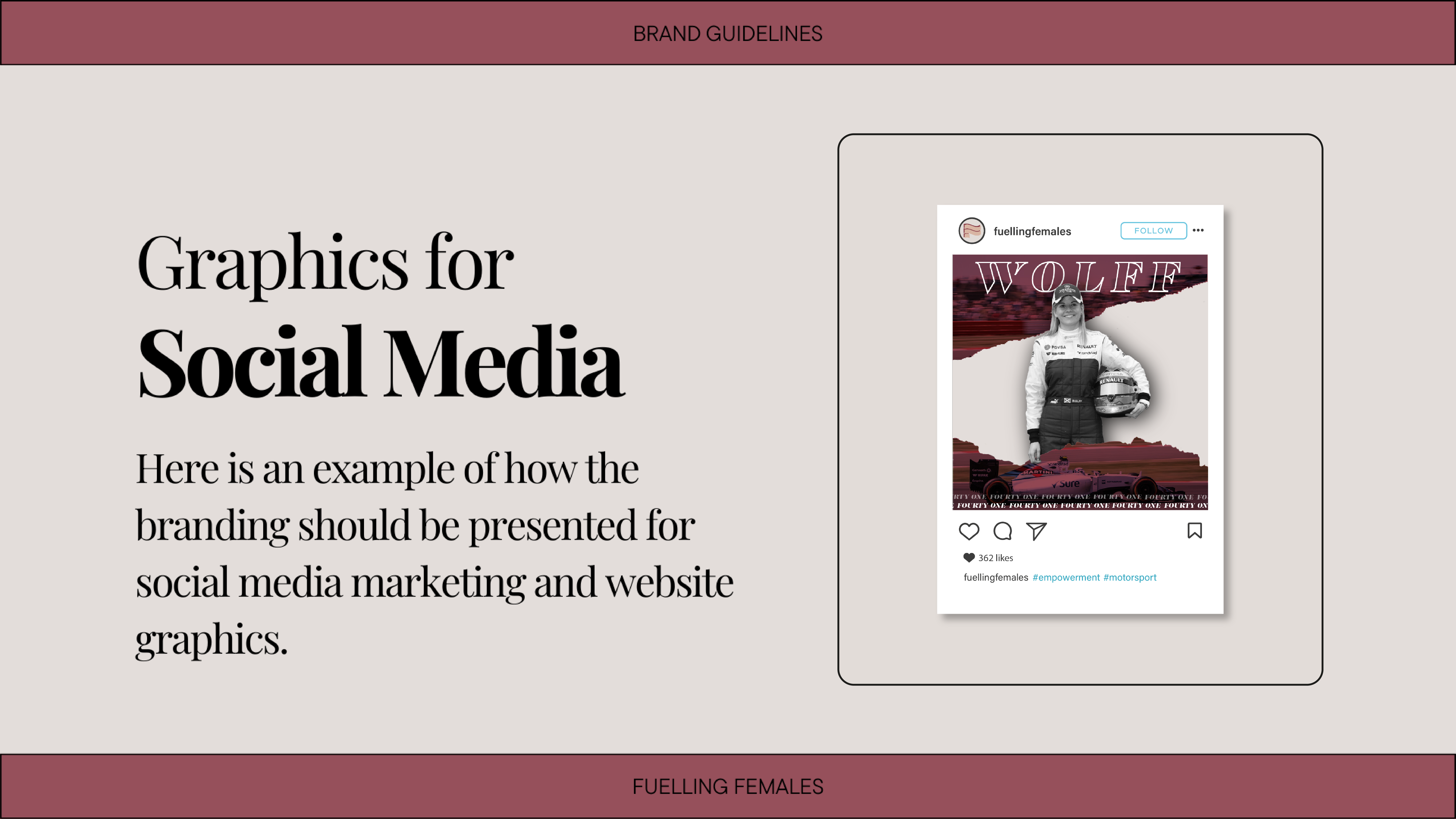
Moving on to the secondary logo’s; I wanted to produce some options that allowed me to vary the identity on different mediums when thinking of the final designs. The first one follows a similar outline to the original one in being two “F’s” with the same two colours involved however, I included an ampersand between the letters. Combined with the Playfair font, I finalised the look of the symbol as a reference to a Formula One racetrack. This will remind the use of the reasoning behind the branding and how it relates to promoting females within motorsport. The second logo is a simple display of both fonts and emphasising the tagline that is key to the brand identity and the entire project. I have deliberately used a play on words with “braking” to reference again motorsport, so the user has a constant reminder of the reasoning behind the designs. To finalise this logo, I created a small, checked flag icon to further display how we want this campaign to finalise the need for female awareness within the sport.
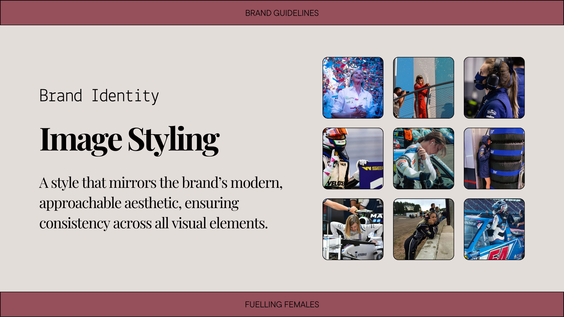
To complete my branding board, I added in a mood board to give me some reference images whenever I need to help produce ideas in relation to content. I ensured that each image was what I idolised my final goal to be, including female engineer’s and race drivers. These have all been referenced below. Once I had all the elements down on the layout, I concluded the piece with the colours and typography displayed within and added my own graphic to the top of the page. I wanted a simple header that tied in the entire branding process and again, reminded me of the purpose of this project. I produced a simple helmet graphic using the colours referenced in my colour palette and added a line design in the background which I feel adds to the outcome of this branding board positively.
Final Guidelines
Brand Guidelines are simply an instruction manual and rule book on how to communicate a specific brand. “They lay out all the visual details, as well as important notes about a company’s voice, tone, and messaging.” (Gaid, 2023). I decided to produce my brand guidelines in a digital downloadable presentation. It was key to take time when producing this document to ensure my brand image stays consistent no matter what platform I am designing for. This document was no exception when portraying the importance of brand uniformity as you can see through the colour, typography, and layout choices. This will not be a direct benefit to the audience however, it will guarantee an efficient and positive approach to the final designs that I create.