
Fairtrade is an arrangement between companies to help developing countries achieve a better trade relationship in which fairer prices are paid to the producers of the products. For the workers, this means their rights, safer working conditions, and equal pay. Whereas, for the shoppers purchasing the produce, it ensures high quality, ethically produced goods. (fairtrade.org.uk, n.d.).
This specific Fairtrade campaign has two main aims: to raise the public’s interest in Fairtrade’s bananas to positively impact the sales of the trade, and to express that a local alternative may have a larger influence on the world if its values are shared by everyone. The company wanted to introduce itself as a global player by subverting a highly known business (Nike’s) catchphrase ‘Just Do It’ to raise awareness. (act.adforum.com, 2014).

Fairtrade have kept the classic Nike font to symbolise and relate back to the powerful brand identity behind this poster. Then original typeface was created in 1988 and goes by the name of Futura Condensed Extra Black. Futura has a very strong design due to the bold, capital letters and wants their audience to think that they gain this strength by purchasing their products. Again, the typeface is extremely blocky and straightforward to get across this urgency. Fairtrade hopes that this will carry onto their message and will encourage buyers to go this route. The slogan continues this short and snappy process to stick into the viewers mind and will be remembered when they go to the shop and is looking at the bananas. This is just what Fairtrade want so that their produce will be purchased over others because of this rememberable type and poster. The kerning between the letters of the words is very close to stress the sharp slogan. (designyourway.net, n.d.).
The main use of the primary colour yellow will be to link back to the banana and make the graphic as simple as possible for the reader to understand. However, using some basic colour theory, it’s known that yellow is one of the brightest and most energising colours. Bright yellow is associated with hope and holds a sense of happiness and cheerfulness. This contrasting with the outstanding pink used for the background ensures the text stands out from everything else on the poster and just furthers the continuing need the poster explores for Fairtrade products to be brought. (Chapman, 2021). The full stop at the end of the text may not seem important but it is very symbolic linking back to the original brand identity and demonstrates the need for people to support Fairtrade.
Moving onto this healthy eating slogan created by Shutterstock who is a global provider of stock photography, music, and footage for the public to use for free. They claim to have the best quality stock images that can be used for mostly any online application. The image is a healthy eating catchphrase written in write on a black background that explains, ‘a little taste of heaven’, meaning eating healthier is heavenly and can lead to improving your lifestyle. (shutterstock.com, 2003).

This image looks very busy, and the typeface seems quite messy and unreadable. The generic black and white used will make viewers skim past this design which needs a revamp to entice an audience to eat more healthily. Among first look, you must re-read the text numerous times to understand what it says. Therefore, to begin with the redesign, a new typeface is needed. Below is a sketch that will be transformed in Illustrator to create a final overall design for this new bit of typography:
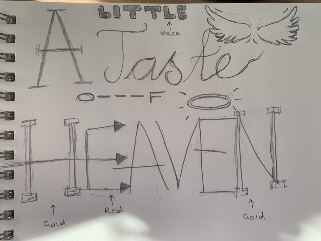
The initial thought process was to add a lot more extra detail in with the choices of fonts used and think of some ways that the words can convey the meanings through the design of type. The ‘A’ is small in the original slogan, so this has been changed and capitalised to stand out and emphasise the start of the phrase. Using the font ‘Dico Mono Slab’, this portrays the clean, sharp points needed to put forward the emphasis and beginning of the slogan. It has been altered to become Italic and larger to demonstrate the capitalisation. Contrasting with the word ‘little’, this is now a rounded design and is smaller than the rest of text to explore the words actual significance. In Illustrator, the text is created in ‘Hoss Round’ which is a spaced out, comfortable typeface which adds reassurance to the design.
‘Heaven’ is the main word and brings the most attention to the image. A lot of extra illustrations add to the visual aesthetics and make it the centre of attention. It is the largest word on the page and has multiple different designs throughout. Even as a sketch form, the design is already a lot more appealing to the eye and can be transformed into a well put-together design using some software. When putting this into Illustrator, it took the most detail. Using 2 different fonts and 3 different colours, this complex type design is the centre of attention to the slogan and uses clear connotations to display the text meaning in a visually pleasing matter. Overall, this redesigned image uses typography to explore the depths of using multiple typefaces and colour to entice and involve the audience more. (M, Veronika, n.d.).
Bibliography
act.adforum.com, 2014. Fairtrade – “Just do eat”. [Online]
Available at: https://act.adforum.com/creative-work/ad/player/34495762
[Accessed 09 October 2021].
Chapman, C., 2021. Colour Theory for designers, Part 1: The meaning of colour. [Online]
Available at: https://www.smashingmagazine.com/2010/01/color-theory-for-designers-part-1-the-meaning-of-color/
[Accessed 09 October 2021].
designyourway.net, n.d. What font does Nike use? The Nike font question answered. [Online]
Available at: https://www.designyourway.net/blog/graphic-design/nike-font/
[Accessed 09 October 2021].
digitalsynposis.com, 2012. What different types of fonts mean and how to use them. [Online]
Available at: https://digitalsynopsis.com/design/font-psychology-emotions/
[Accessed 09 October 2021].
fairtrade.org.uk, n.d. What is Fairtrade?. [Online]
Available at: https://www.fairtrade.org.uk/what-is-fairtrade/
[Accessed 09 October 2021].
M, Veronika., n.d. A little taste of heaven. Hand lettering food quote for your design. [Online]
Available at: https://www.shutterstock.com/image-vector/little-taste-heaven-hand-lettering-food-1072588883
[Accessed 2021 October 2021].
shutterstock.com, 2003. Turn ideas into achievements. [Online]
Available at: https://www.shutterstock.com/
[Accessed 09 October 2021].