Design Layout Theories and Ethics
A positive user experience is key to maintaining an active audience and seeing an increasing amount of users through the website and app traffic. What is an efficient way to keep people on a website and engaged in the content. “Adherence to web layout best practices that result in a combination of user-friendliness and an adaptability to changing trends and technology.” (Chapman, n.d.). A User Interface design may look incredible and modern, but if it doesn’t facilitate great usability then the page will be short lived. The standard ‘Card-Style’ website or companion app layout has become popular as they are well suited to “placing a lot of content on a page while keeping each piece distinct.” (Chapman, n.d.). This type of layout would work well for my website design because it allows separate content to be arranged in an orderly way but kept sectioned out which will not confuse new users. Due to their popularity, users find this layout familiar and comforting as they recognise the card-shaped items from the real world.
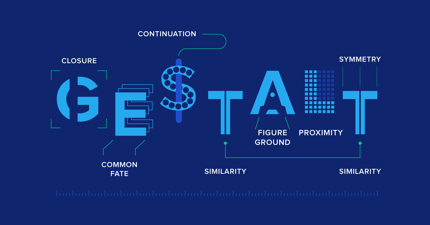
The Gestalt Principles help user’s understand “how we process visual information by either starting with the whole and then working our way to the parts, or by attempting to break a confusing whole into its simpler component parts.” (Williams, 2021). I will be using many of the seven layout design principles to ensure my user will receive the most efficient way of obtaining critical information possible. The seven laws are as followed:
- Principle of Proximity,
- Principle of Closure,
- Principle of Similarity,
- Principle of Continuity,
- Principles of Perception,
- Principle of Organisation,
- Principle of Symmetry.
(Williams, 2021).
The most important principle for website or app experience design is the proximity principle to ensure that objects close to each other are seen as related, while objects spaced further apart aren’t. I will use this theory when planning out the sections of my informative platform so that my audience will group relevant parts of information into each section. Further, I will display Gestalt’s principle of perception through background and foreground elements particularly on the introductory homepage. When several objects are juxtaposed, the eye naturally produces a sense of spatial relationships between them which means even simple arrangements of objects can be used to create a hint of narrative. I will carry this out on my launch page when the user will discover interactive elements combining coloured backgrounds, text, and graphic assets. Using each of these principles will guide the process of ensuring an efficient, user-friendly layout.
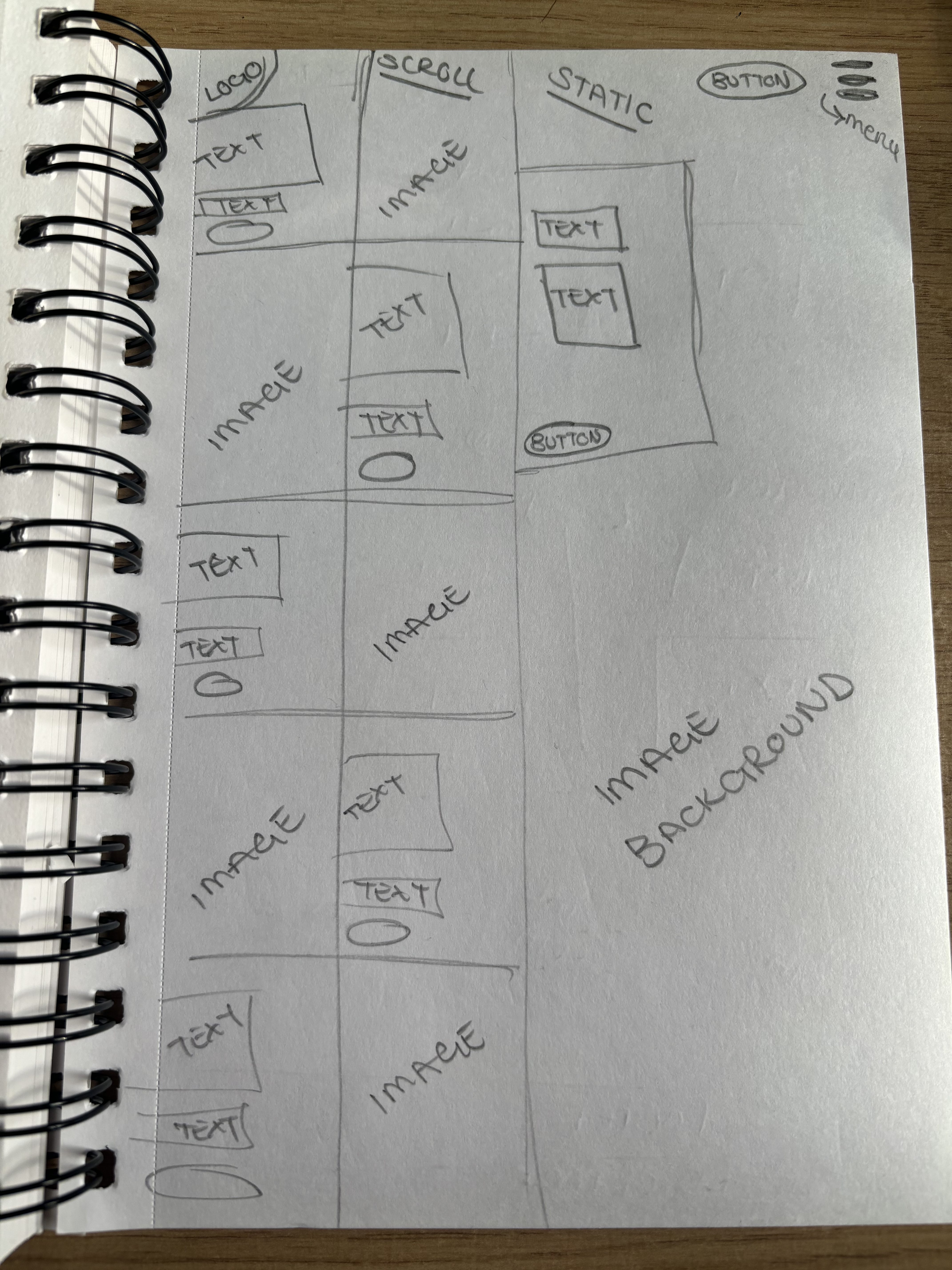
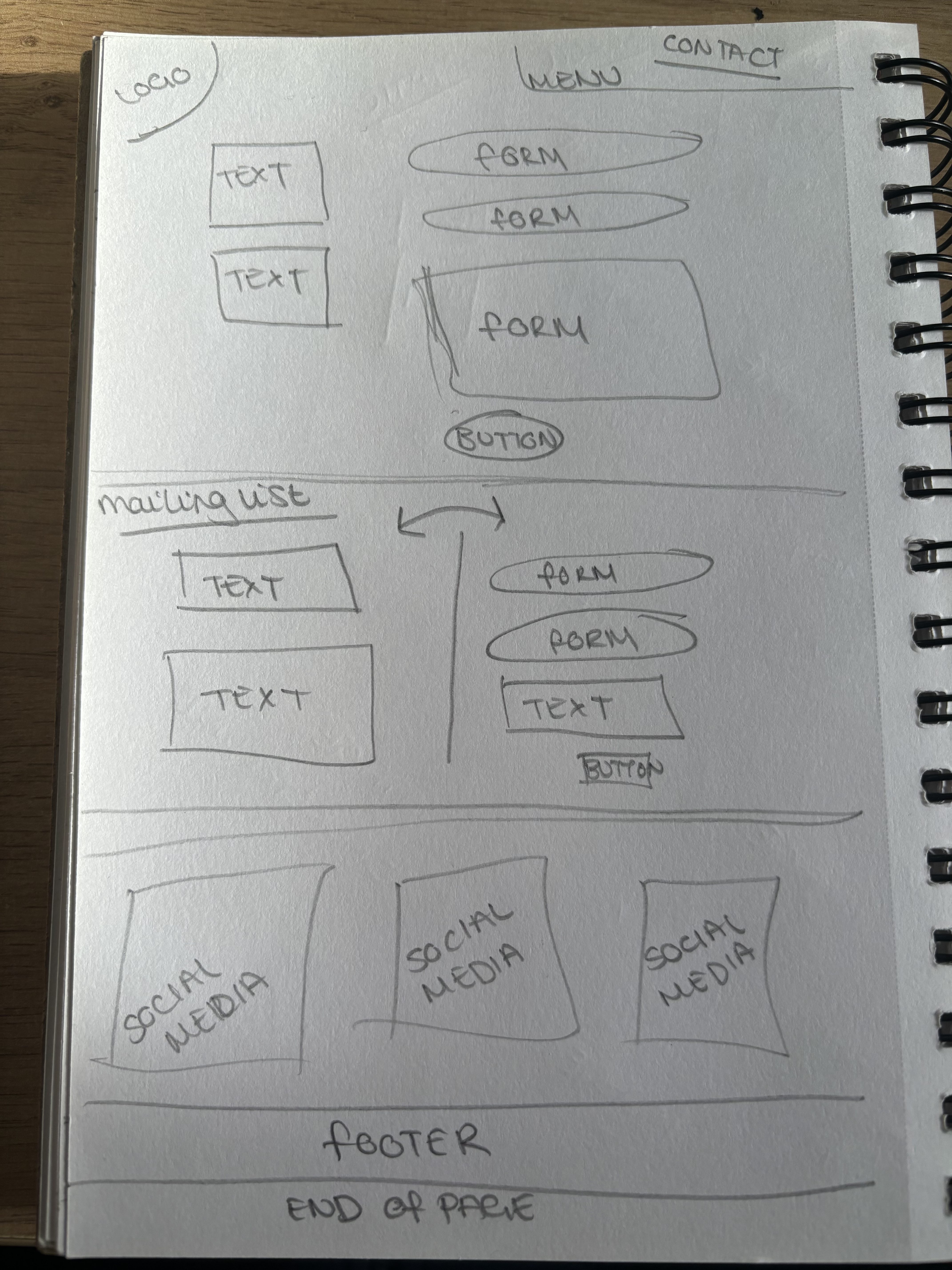
Website Layout Planning
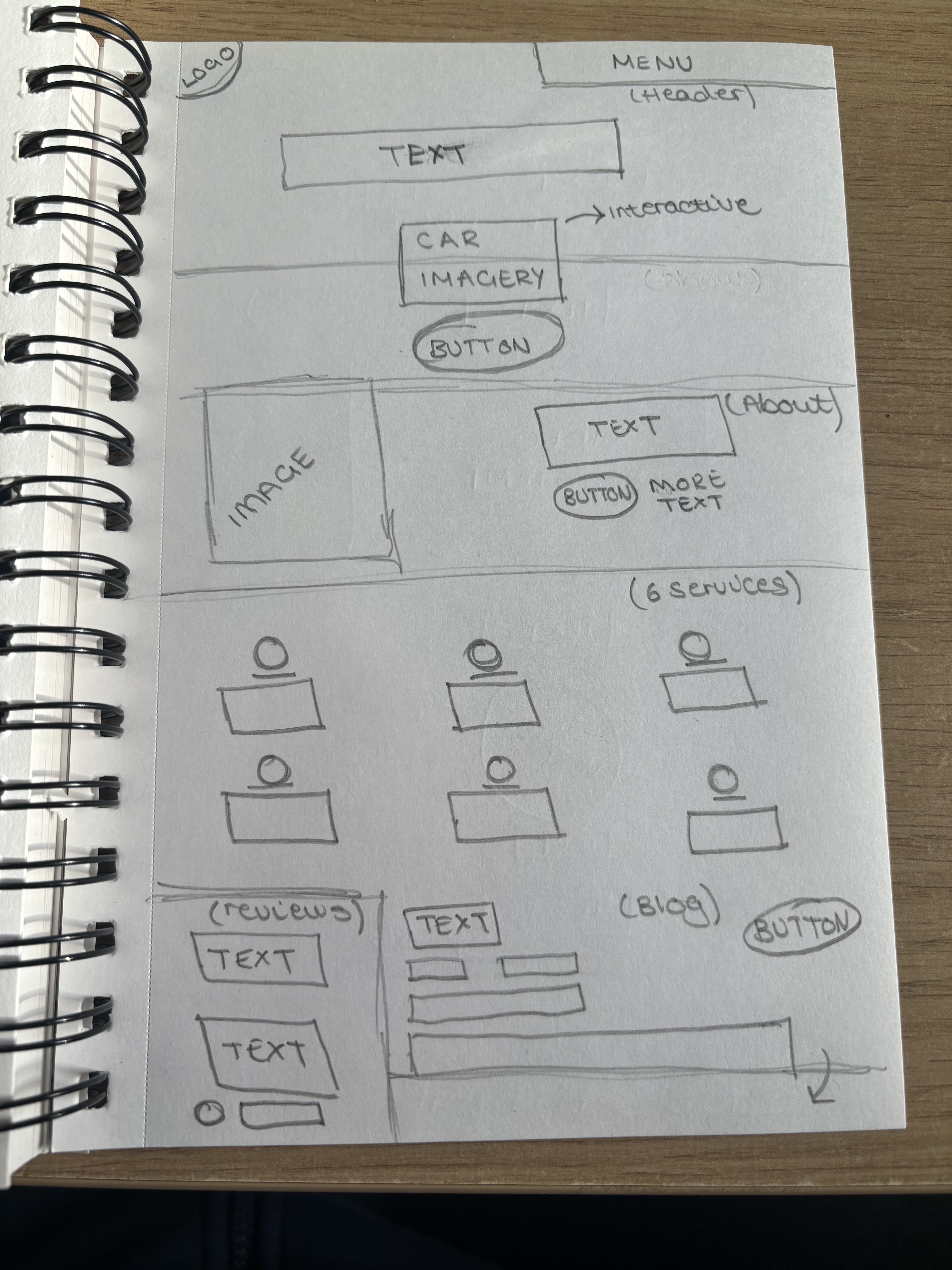
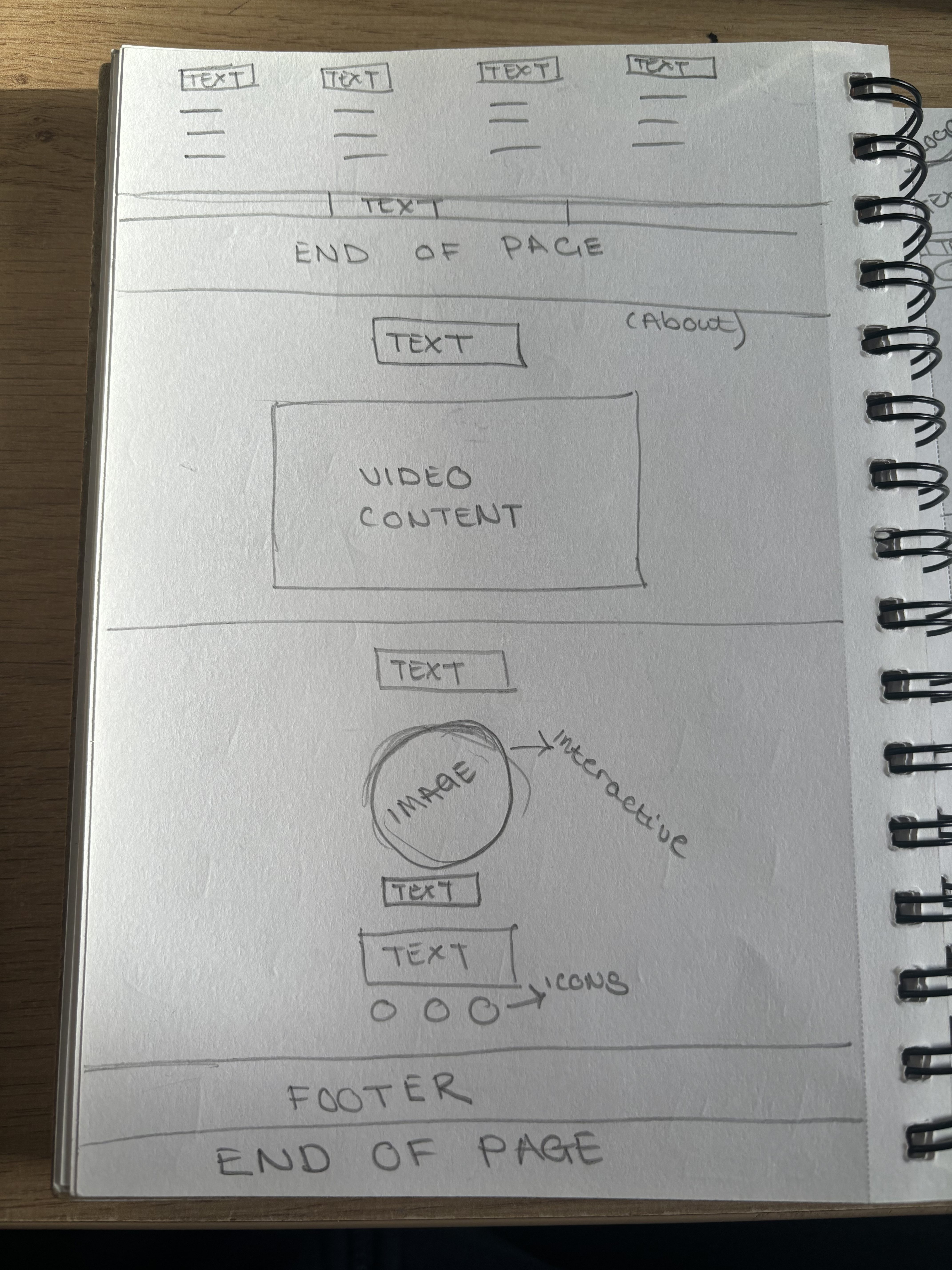
To start the initial planning process for my brands website, I need to gather information and notes on specific theories that will be implemented, and the purpose of the site. From the beginning, I knew I wanted to have an abstract, interactive homepage that will engage the user and make them want to explore the campaign further. After researching competitor websites, I concluded that I would commit a minimalist yet interactive layout so that it will remain accessible to a large audience. This homepage will remain relatively short, and the information will be gained when the user clicks to move to the separate pages of my site. These will retain the interactivity but also be more informative and provide relative information throughout. These parts of text will stay short and simple so that the user does not get bombard with too much information and become overwhelmed.
I am creating the final brand website on Wix as this is a familiar website software that allows me to focus on the design aspect rather than the production side. I will be using Wix tools throughout to ensure that the final graphical design will be as similar to the original planning as possible. Wix further allows brand settings to be produced so that my experience as a creator is as seamless as possible by adding brand colours and fonts to the design choices. Once the final design is complete, I will be able to publish a version under the brand’s identity so that the user will recognise and easily discover the content from the consistent brand guidelines uses. Using Wix as my chosen software will be the most successful way to produce a high-quality and informative website layout for the brand.
App Layout Planning
A successful companion app will introduce seamless interactivity and a more personal aspect to a brand’s personality which is the aim when designing the Fuelling Female’s app. A companion app should provide insights to the brand which a website or social media post cannot define, but also remain user-friendly and not cluttered. This will aim to be an all-access pass to the background and research behind why the campaign exists and how the brand will plan on progressing in the future. The layout needs to respect the previously mentioned principles and theories whilst also providing an interactive element that keeps the user engaged. I will use a minimalistic approach, like the website, that targets the wider demographic whilst remaining informative and attention-grabbing.
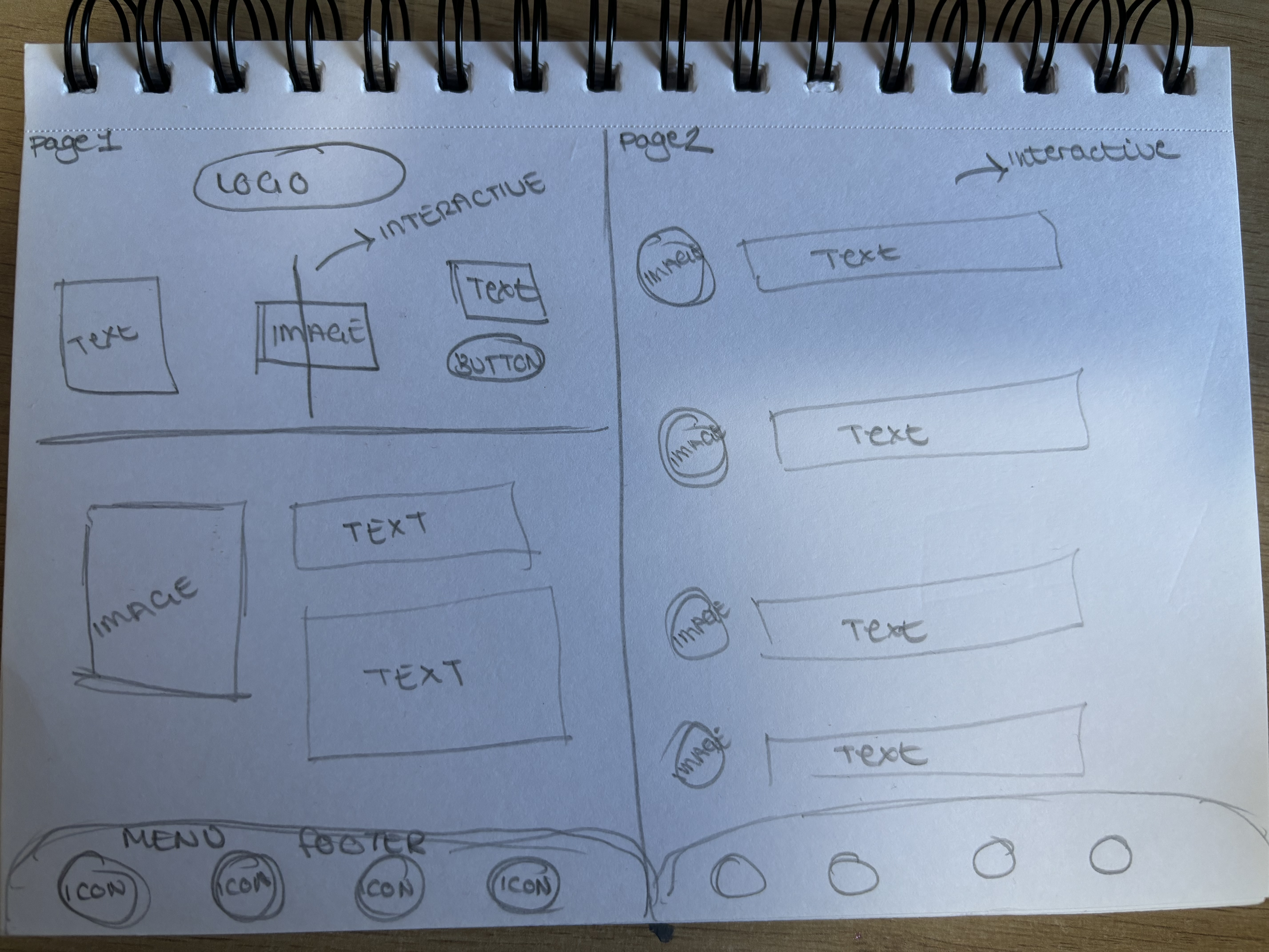
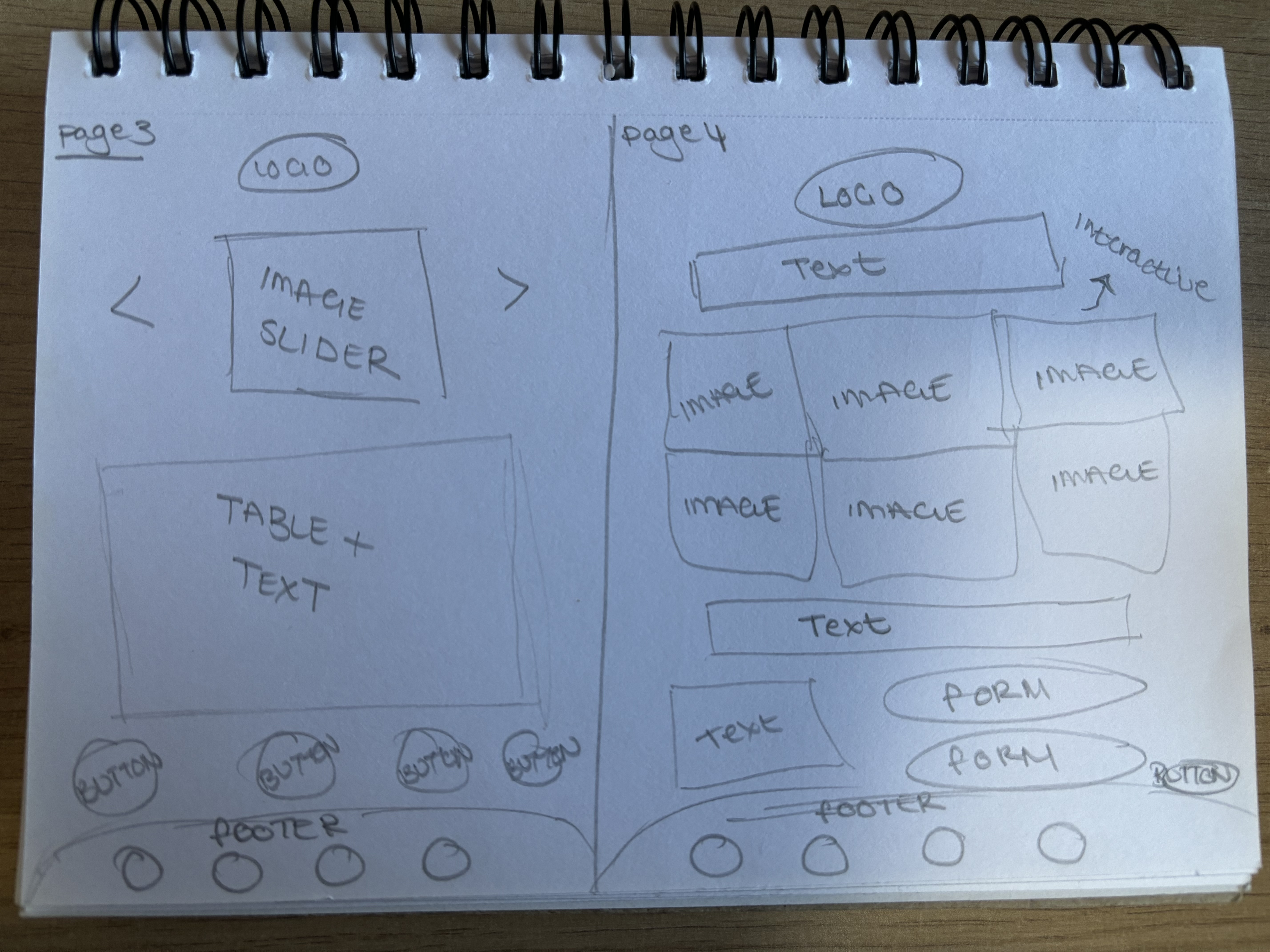
I will be prioritising the design aspect of the companion app to Adobe XD as this is the software I am most familiar with using when producing a seamless app. The key assets will include accessibility, seamless interactivity, and a responsive design that relates to the initial website; the branding needs to remain consistent for continuing brand identity. As you can see via the previous planning sketches, the layout will almost mirror the menu pages on the website but have its own flare and personal aspect. Using Adobe XD will ensure that the transition into different areas and pages of the app will remain smooth and seamless. I aim to focus on keeping simple interactions so that the app will be user-friendly and accessible to a wide variety of my intended audience and will have positive testing results. Using this specific software will ensure that user testing will allow for constructive feedback and help to refine the final companion app design.
High-Fidelity Mockups
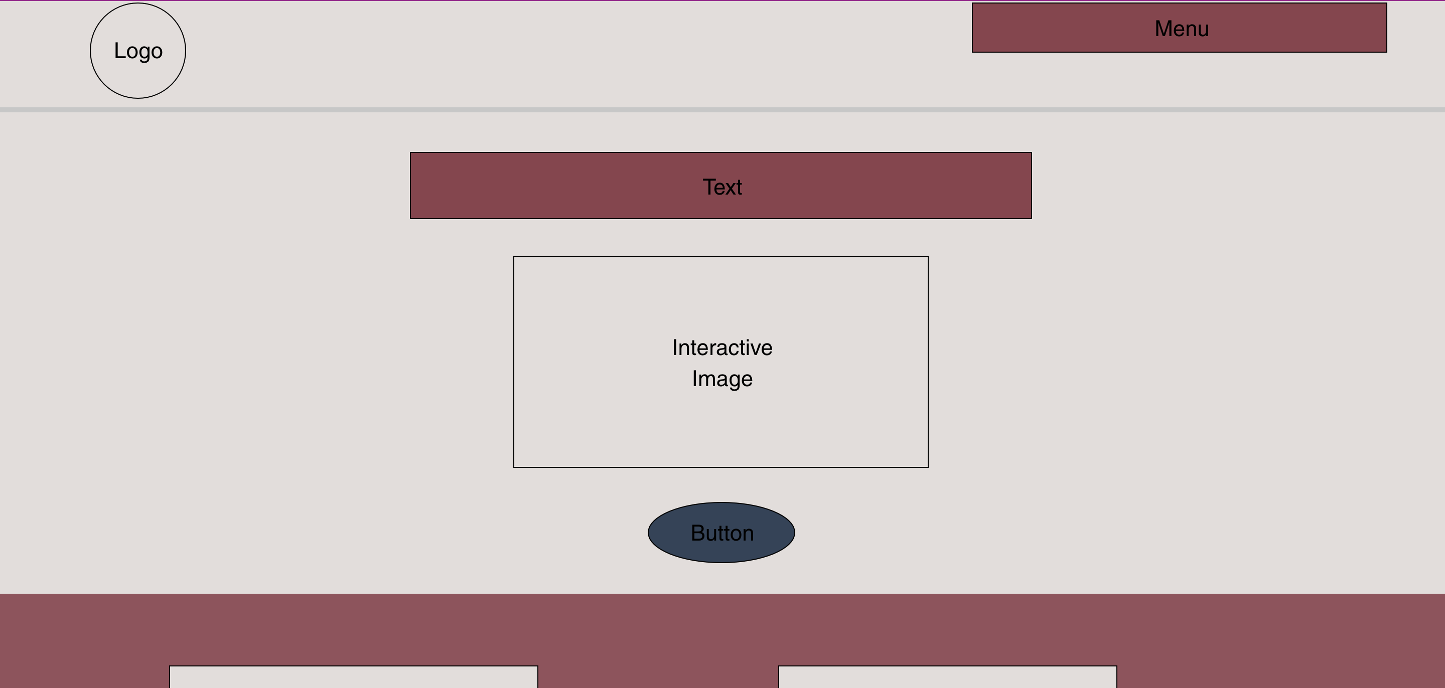
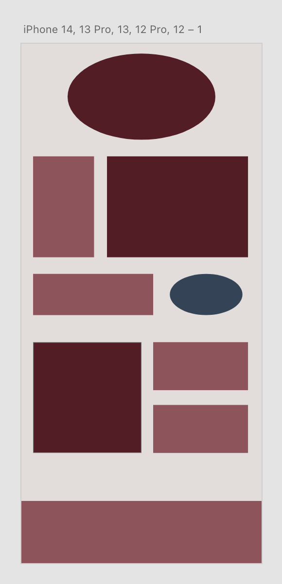
When creating my Mid-Fidelity mock up on the proposed software, it was essential to refer to my planning sketches so that everything remained aligned and consistent. Wix has brand tools to ensure that the colour palettes and typography are the same through every platform. Due to the previous sketches being complete, it was very simple to transfer these notes and theories onto software which will then lead on to adding the content and refining the final design. The homepage layout adjusted slightly to the original sketches as I want to emphasise the image interactivity as the main centrepiece that draws the user in. It was essential that any adjustments to the layout made where now as I don’t want to confuse the latter stage of adding information. Having a Mid-Fidelity layout has encouraged user testing as important stages throughout the design process.
Transforming the original website content onto my responsive app design was relatively easy and gave me the option to expand on the creativity of the layout with certain assets. The transition between Wix and Adobe XD was seamless, and the pre-planned layout was actively responsive when comparing it between platforms which is essential relating to the accessibility of the content. The body text is comparatively smaller due to the downsizing of the screen size and interactive elements like buttons are made larger due to the size difference between a user’s finger and a mouse. There are sections which are not included within the app such as the footer as this is unnecessary and not a convention within a mobile app, however this has been replaced with a menu at the bottom of the phone screen so that a user can easily control the content displayed. One of the most important responsive features is video rotation so that the user can maximise their viewing experience by rotating their phone and using the full size of the screen.
References
Chapman, C., 2018. Exploring the Gestalt Principles of Design. [Online]
Available at: https://www.toptal.com/designers/ui/gestalt-principles-of-design
[Accessed 30 April 2024].
Chapman, C., n.d. Web Layout Best Practices: 12 Timeless UI Patterns Analyzed. [Online]
Available at: https://www.toptal.com/designers/ui/web-layout-best-practices
[Accessed 24 April 2024].
Williams, J. M., 2021. Gestalt principles of design: The 7 key ideas. [Online]
Available at: https://webflow.com/blog/gestalt-principles-of-design
[Accessed 30 April 2024].