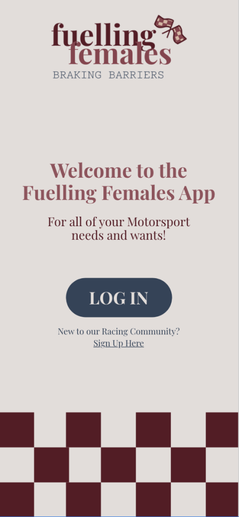
Final Asset Outcome
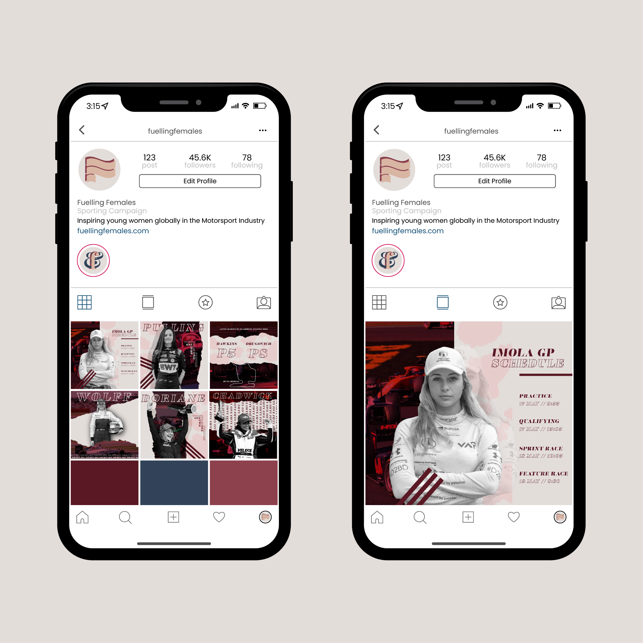
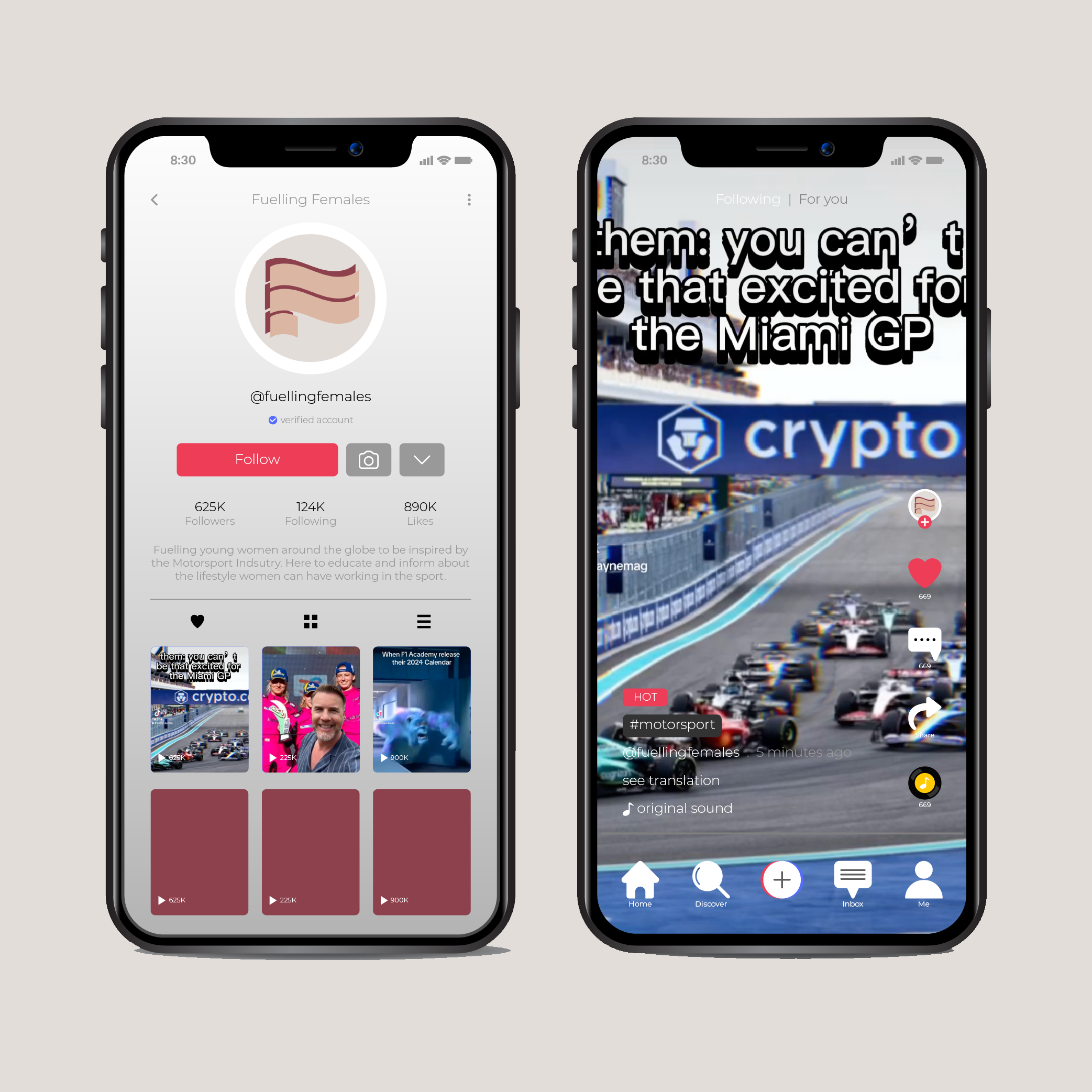
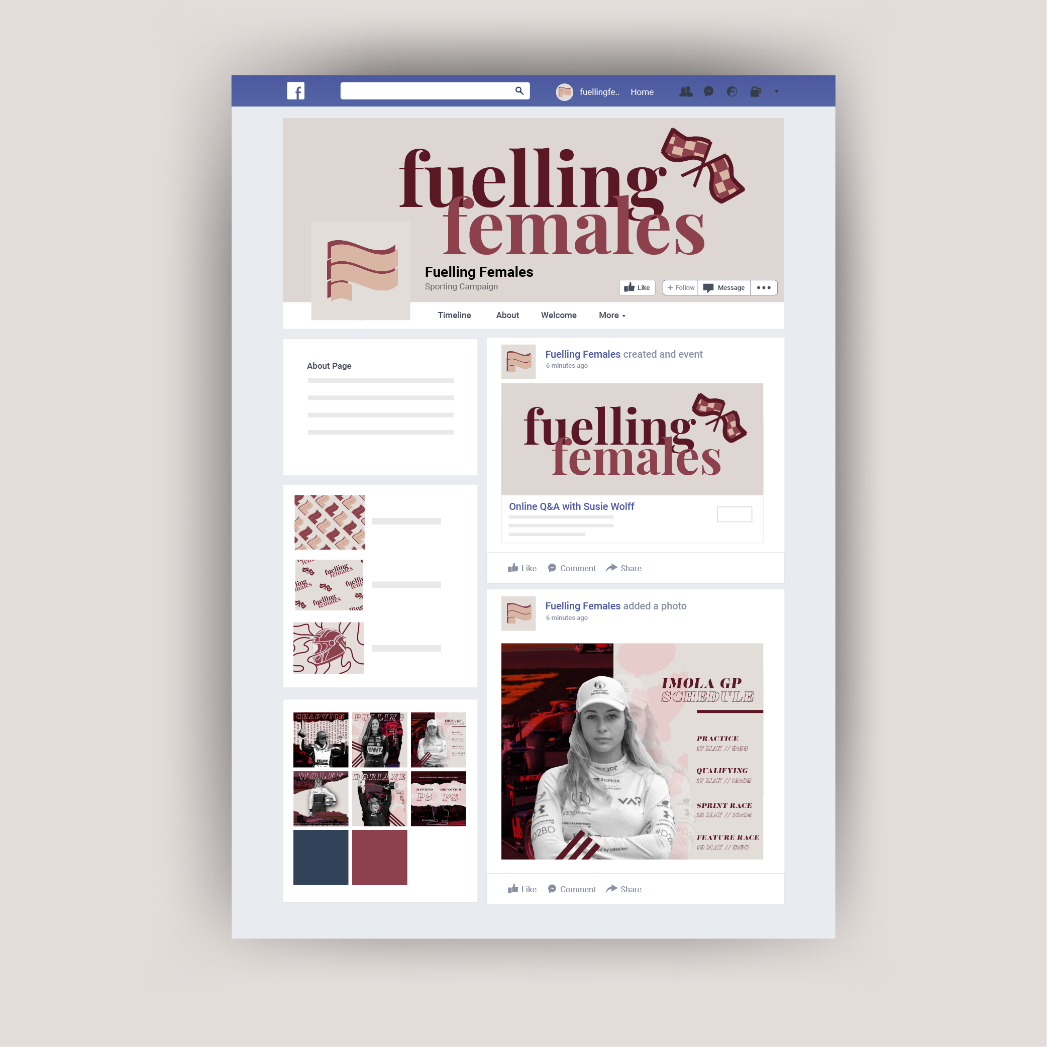
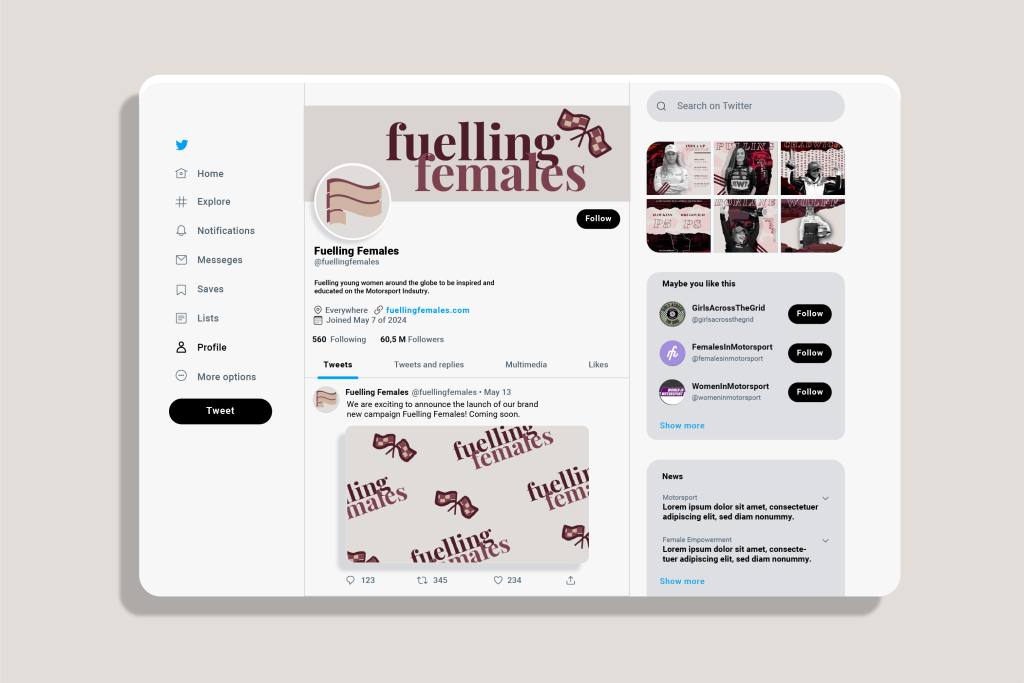
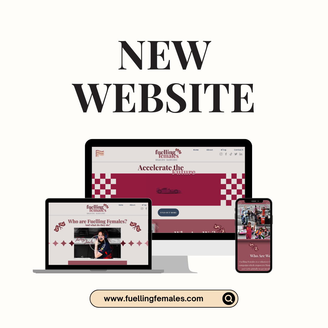
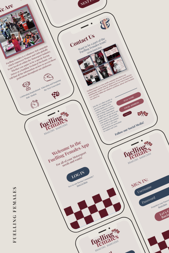
Reflecting on the previous development posts, combining social media marketing with digital online platforms and interactive apps can positively impact the growth of a project. Starting at the beginning, nailing the initial brand identity and message was crucial before creating further content to ensure that as a creator, I knew what the brand’s intentions were and how this needed to be conveyed to specific audiences. Easing in the branding through social media profiles and content allowed the audience to warm up to and soak in the idea behind the content they’re seeing online and what the progress targets are behind the campaign. Moving onto the larger website meant the user can explore larger amounts of content in their own time and learn more on specifics for what Fuelling Females are offering; this order process ensured the user was not overwhelmed in the initial stages. If they are intrigues, they could then move on to the final stage of the campaign which is the companion app to provide the call-to-actions for getting involved with the campaign. Each stage of the project works seamlessly with each other to provide an inclusive, educational platform for the target audience to access.
With every large-scale project, there were a lot of positives that equalled out with some challenges which were resolved through efficient planning and communication. One example would be when I was struggling to find correct ratio’s for each responsive asset that needed to be altered when viewing on different devices. It took a lot longer than expected which meant the Gantt Chart had to be altered so that the time frame extended to fill every aspect of the project. On the contrary, the creation of the website took a lot less time than anticipated and the user testing was very positive when it came to the final edits before publishing. This gave more time to work on ideas of how to present the ultimate mock-ups and conclude the creation of the campaign.
Design Choices and Context
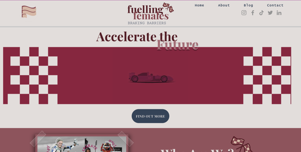
Throughout the entire project, it was crucial to foreshadow how certain design theories and procedures would be represented in the project. When producing the initial brand guidelines and assets, I used Tufte’s Principles of Colour and Small Multiples to reinforce the overriding brand message and how the viewer will recognise the message behind the assets when viewing the work. Moving onto the website design, I reflected on Gestalt’s Layout principles so that the user will feel at ease when navigating through content on the pages. Using the previously stated principles allowed me to constantly reflect on my design choices when planning each stage of the site. The final audience reactions to the combined platforms will highlight the original brand message of educating young females and inspiring them to follow their passions for working within the male-dominated motorsport industry and breaking stereotypes.
Mock-ups and Reflection
When releasing the final revisions of each digital asset, it was essential to complete a final usability test across each interlinking platform. If user’s could not access each platform from links or images, then that needed to change as we want them to be able to compliment and work with each other seamlessly. After having multiple users test each platform directly, they went on to be asked if they can access other platforms which all of them could easily do. Providing these results meant that there is a high success user accessibility rate and concluded the final revisions for each area of the campaign.