
Composition as a definition consists of the nature of something’s ingredients or constituents, the arrangement into specific proportion or relation and especially into artistic form. (merriam-webstrer.com, n.d.). This is important when designing anything as it’s what the audience is going to be watching and the layout needs to attract their eye.
The following poster is a great example of using composition to please the viewers and make people enjoy reading the information shown. The poster is a from a stock image site, so is not from an original farm shop, but I feel it explores the same concepts. It explains that they farm natural meat which they then either sell or transport to their restaurant ‘Meat House’ and use naturally own-sourced meat to prepare for their guests.

The Meat House poster uses great composition within the placement and contrast of text and images. The border of images are all different types of meat which relates back to the original brand identity. They have a cartoon like effect which explores the demographic of families coming together and bonding over a dinner with said meat. The images of the meat aren’t suffocating the text and leave a gap in between so that it’s not clustered and can easily be identified. The first thing the viewers eye catches is the main ‘Meat House’ text and logo in the middle of the page. The white box surrounding it makes it stand out against the light pink background colour that is displayed. The type is large and bold which almost forces the audience to direct their vision to it and can easily be told what this entire poster is for; it gets the point across simply.
Glancing your eyes to the bottom of the page, there is further information on the locally farmed meat and how they use ‘fresh products everyday’. This typeface is still serif but a lot thinner so that it doesn’t draw immediate attention. This backs up the title and emphasises what the reader has previously been told. The chosen pink/red colour palette is very easy on the eyes and plays a big factor in how a person can experience this poster. Colour is a critical element underpinning composition and can bring together otherwise unconnected or competing elements. (Guy, n.d.). Typically, meat is connotated with reds and pinks so the entire page can relate back to the founding idea and brand identity. Every part of the page is cleverly thought about and arranged so that the viewer can have a pleasant experience when looking and finding out information. (Seamartini, 2018).
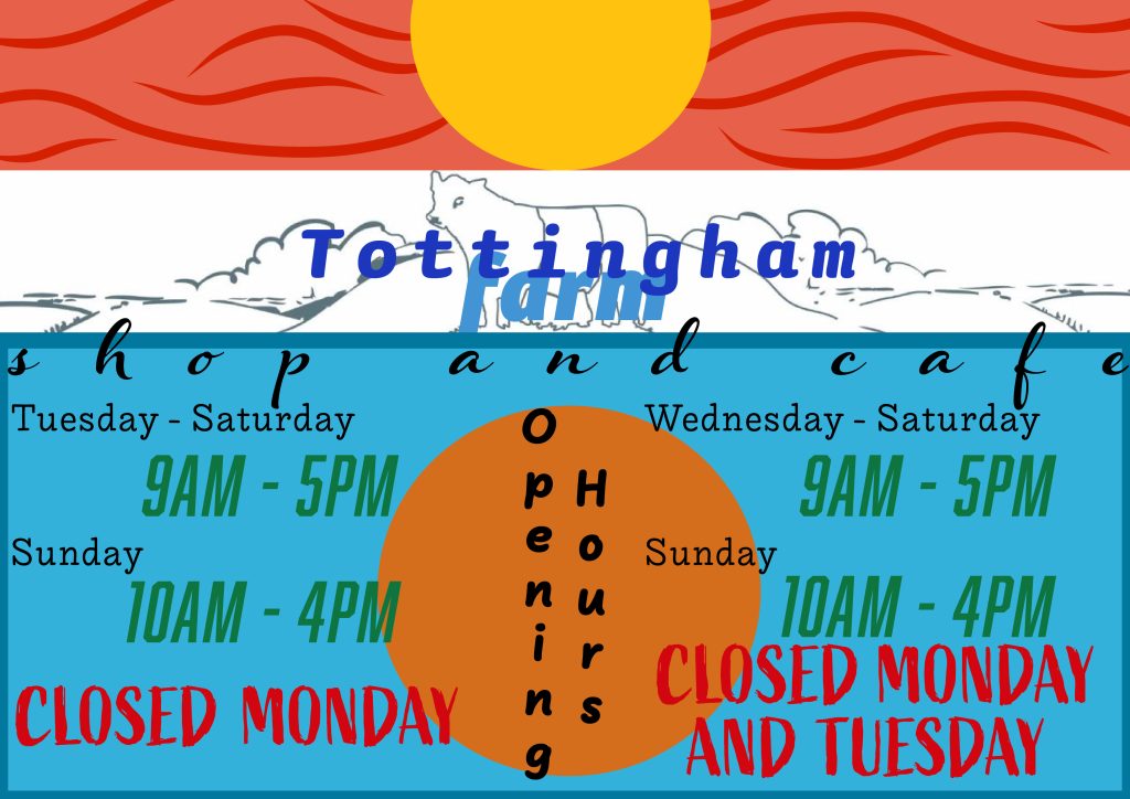
Tottingworth farm is a local shop and café which provide locally farmed and sourced produce which can either be purchased or consumed within their facilities. They strive of bringing families and the community together by learning about all the excellent ingredients which are grown in their local town. The following graphic is found on the website homepage and explores a very simple graphic explaining their opening times:

The aim for the redesign is to make the poster look more welcoming for families and to become aesthetically pleasing for people to glance at and gather information. The initial thought being what is an appropriate colour palette to use following the farming industry theme. Looking at colour theory, it is found that browns, greens, oranges, and blues display that agricultural feel the best. The layout and placement of certain aspects are key for this poster, so a plan and experimentation are necessary. In composition, the title would be classed here as the brand name and/or logo. It needs to identify the subject, attract the audience’s attention, and forecast the tone of the further information to follow. (Nordquist, 2018). Therefore, it is placed central, further to the top of the page, so that it is the first aspect that can be seen, and the demographic immediately recognises what this poster is about. The only part of this redesign that is unoriginal is the cow graphic which has been imported from the company’s website. (tottingworth.co.uk, n.d.).
The placement of the typefaces are in a way that the information can be easily read and guides the reader so that it can be taken in at a reasonable rate. The colours aren’t harsh on the eyes so will be pleasing when approached and clearly links to the agricultural branding that the poster is aiming for. It has family-friendly ora by the use of soft, rounded fonts and a calming layout which will entice and grow the intended demographic. As there are two sections of information to this poster (the farm shop opening times and the cafe opening times), it is split so that again, this information can be processed simply and isn’t difficult to communicate. The Tottingham logo is central to demonstrate the importance and so that composition is used to the advantage of the creator. Overall, the redesigned poster graphic in Illustrator shows a greater use of composition and places its elements in a more aesthetically pleasing way.
Bibliography
Guy, G., n.d. Colour Composition in Photography. [Online]
Available at: https://www.travelphotographyguru.com/travel-blogs/impact-of-color-in-photography
[Accessed 27 October 2021].
merriam-webstrer.com, n.d. Dictionary. [Online]
Available at: https://www.merriam-webster.com/dictionary/composition
[Accessed 26 October 2021].
Nordquist, R., 2018. The Title in Composition. [Online]
Available at: https://www.thoughtco.com/title-composition-1692549
[Accessed 27 October 2021].
Seamartini, 2018. Meat house or butcher farm shop sketch poster. [Online]
Available at: https://www.alamy.com/meat-house-or-butcher-farm-shop-sketch-poster-vector-meaty-delicatessen-of-cervelat-pepperoni-sausage-pork-filet-or-beef-steak-and-brisket-or-ham-b-image406687910.html
[Accessed 27 October 2021].
tottingworth.co.uk, n.d. Tottingham Farm cafe and shop. [Online]
Available at: https://www.tottingworth.co.uk/
[Accessed 27 October 2021].