
Beginning Planning Stages
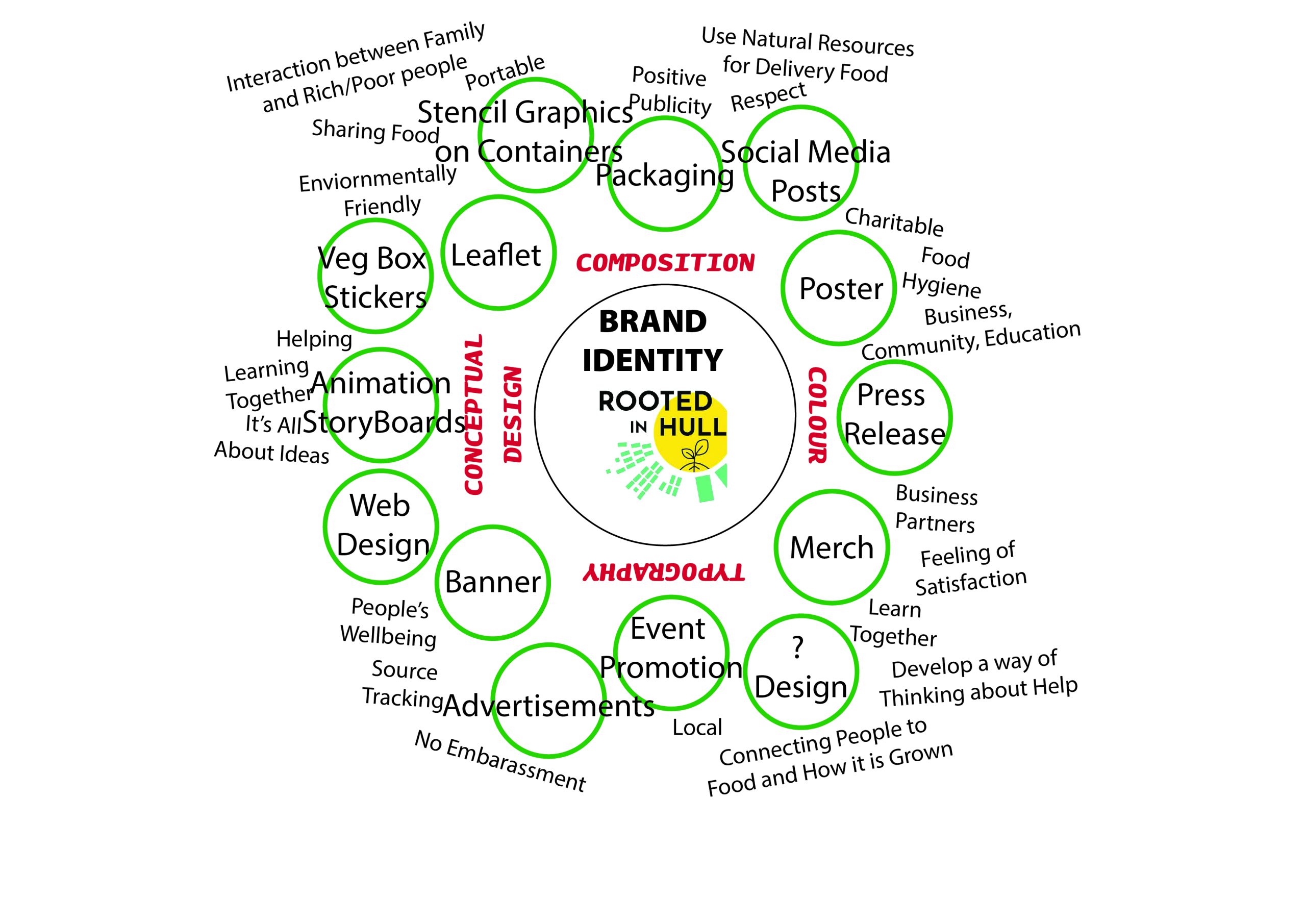
To begin the start of the project, a mind-map Master Plan was produced to discuss ideas on addressing Rooted in Hull’s graphic requirements. The key focuses were previously researched topics: colour, composition, typography, and conceptual design. The rough sketched diagram included Rooted in Hull’s philosophy, activities, ethos, and core concepts. Coming together, a mass diagram with plenty of thoughts was created to be allowed to move on and transform this design into Adobe Illustrator to become a professional composition.

Initially, an hour was given to produce an online graphic version of our mind-map. The main idea for this was to get all the words and phrases grouped up and set orderly so that later the aesthetics could be added in and played around with. The larger circles included 2D graphic design solutions that could be presented in our final original artwork pieces. Some of these examples included posters, vegetable box stickers, event promotion, and social media posts. Around that were some smaller words linking to what Rooted in Hull do and how they work. These look very clumsy and disordered on this early-stage piece but later this gets organised into smaller categories and is much more presentable. The key colours used in the beginning (greens and reddy-browns) link to greenery and conventions that would usually be seen with farming/agriculture. The overall idea was to make this Master Plan easily accessible to read and gives an organised overview of what could become of this project with Rooted in Hull.

Initial Software Planning
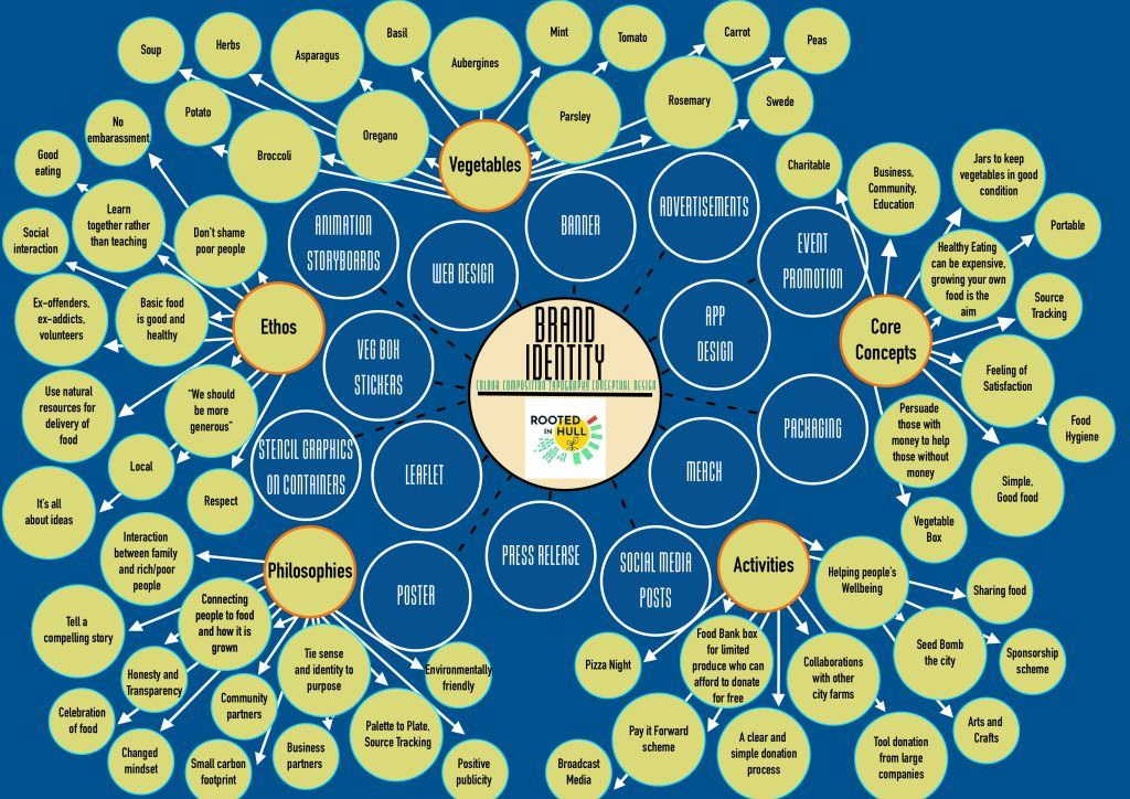
After the information was all gathered and set on the page into categories and sub-sections, the design process began. This was when the initial design was scrapped, and a more viable look was made. Foreshadowing the future graphic design standards that will be produced for the project, the simplistic blue, green, and cream colour scheme looks extremely professional and has slight connotation to the environment (especially the sea). These colours will be portrayed throughout the entire project. The fonts used on the mind-map are similar in the fact that the letters are slim and the letter spacing is minimal. The title is produced in ‘Baucher Gothic URW’ whereas the smaller text around the outside is ‘DIN Condensed’. These will be once again, used through the entire project and seen on many of the graphics created to keep in line with professionalism.
Central of the page is the current Rooted in Hull logo which was found on their website. (rootedinhull.org.uk, n.d.). This demonstrates who this Master Plan is for and what you will expect to be included. The topics get less broad the more outwards you go, and they all fall into each other’s categories. For example, in the advertisement category, you can then find vegetables since that is the company’s main source of income. Then there are a few ideas of some of the produce that is grown at Rooted in Hull’s site. Overall, the Master Plan is a great way to introduce ideas into a developing graphic project as you can easily access information in a pleasant way. This will help as we go on to look further into plans for the final pieces.
Final Design
Bibliography
rootedinhull.org.uk, n.d. Rooted in Hull. [Online]
Available at: https://www.rootedinhull.org.uk/
[Accessed 23 November 2021].