
Definition
Graphic standards provide a sound, flexible structure for using logos, colour and typography. Consistent brand application is essential. The logos must appear the same in every instance. They must have the proper colour selections, be in the proper proportions and be used in appropriate contexts. (usi.edu, n.d.).
Initial Research and Planning
Looking into very basic graphic standards, there are some screenshots and examples of pages from a Pacer manual – an XPO Logistics Company. They display good examples of how to layout this menu for our own future graphic standards manual that will be created for Rooted in Hull.


Using Software to create our own versions
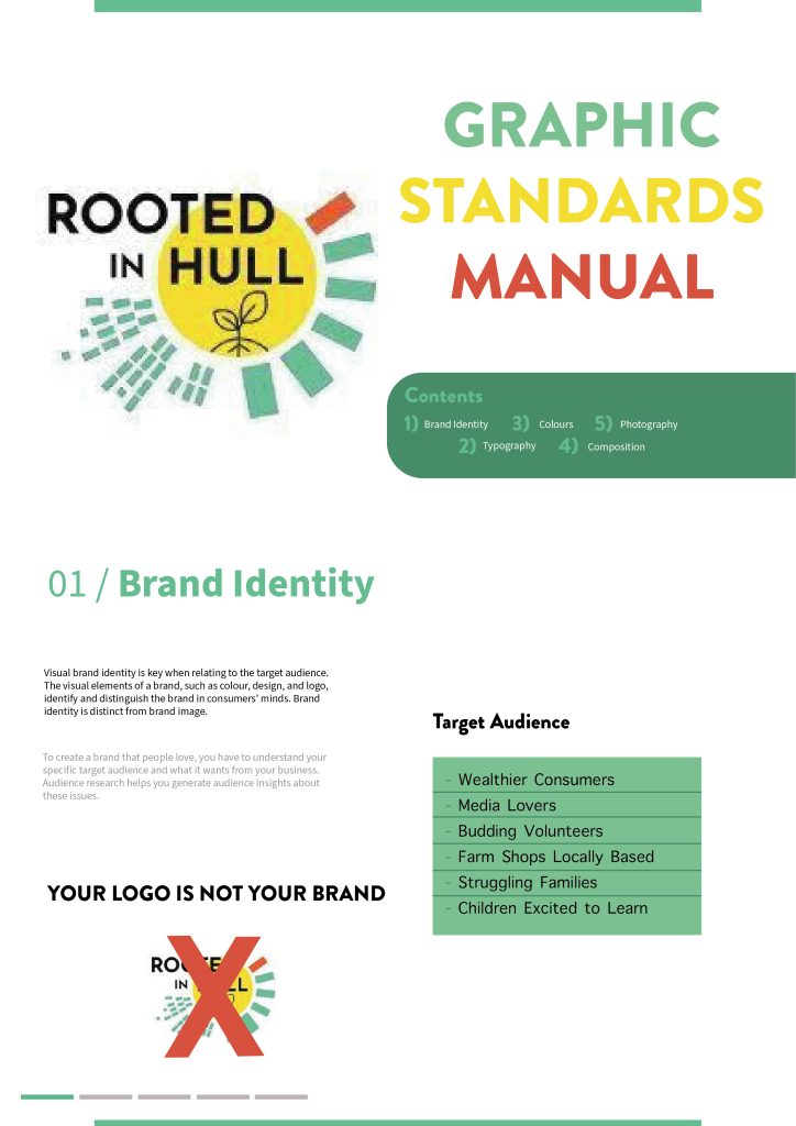
These pages were great inspiration when starting to plan our own manual for Rooted in Hull. The brief was to produce 3 x A4 pages that include 4 key approaches: typography, colour usage, compositional grids, and photographic advice. The manual also needs to be created in a format that goes beyond the normal, dry corporate approach. To begin, a title page is needed to demonstrate and explain what Rooted in Hull are and how this can be portrayed into their graphic standards. Obviously, the main logo appears and below is text to explore the brand identity and target markets.
Title Page (Page 1)
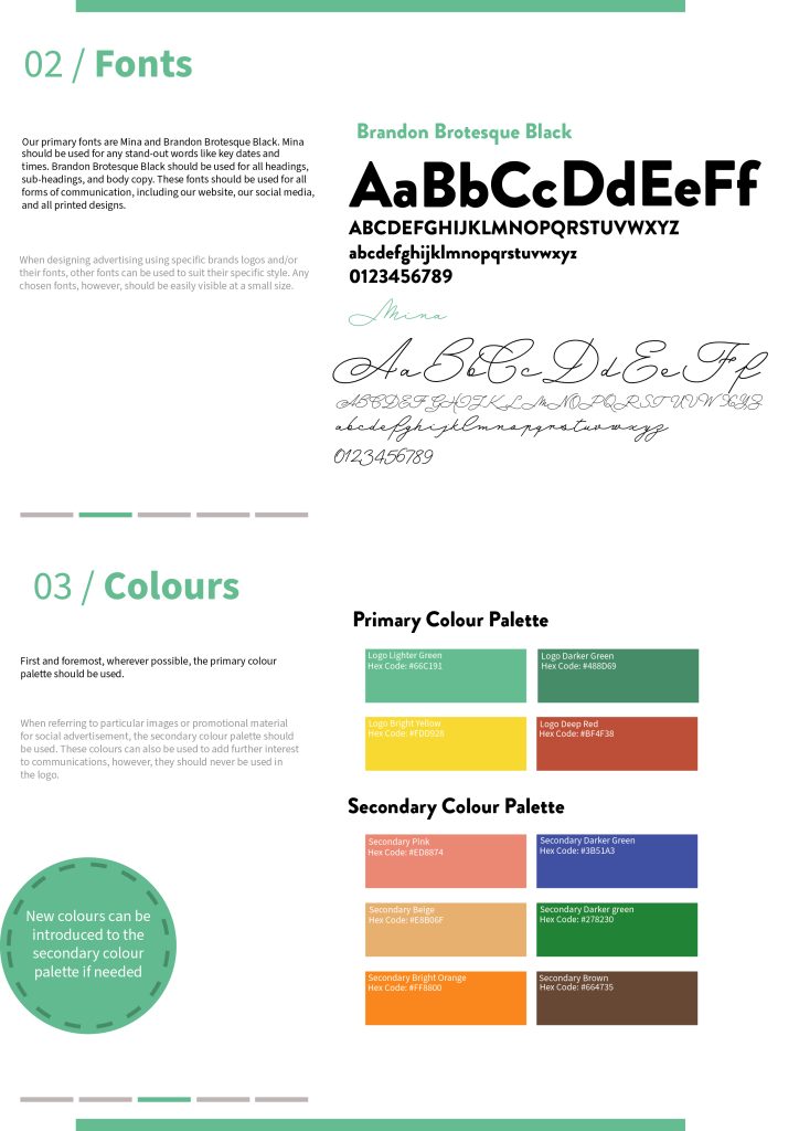
Then we move on to looking at typography and which specific fonts are used throughout the design process. Rooted in Hull have no disclosed what font their use in the logo, so the closest font was chose (Brandon Brotesque Black) so that accurate designs could be created. To make sure that the audience won’t get bored at looking at the same font over and over, the typeface Mina was used which is a cursive, delicate font. It is explained that Mina should be used to point out key dates and stand-out words and Brandon Brotesque should be the primary font. When looking at the colour section, there is a primary colour palette and a secondary one. The 3 key colours (lighter green, yellow, and red) are ones that are taken directly from the brand’s logo – the darker green is a few shades down from the lighter green. These are also heavily linked with agricultural connotations and references to growth and life. The secondary colours are ones that can be found throughout the projects original artworks that enhance the main colours. These can be altered if necessary and more colours can be added to evolve the palette.
Middle Page (Page 2)
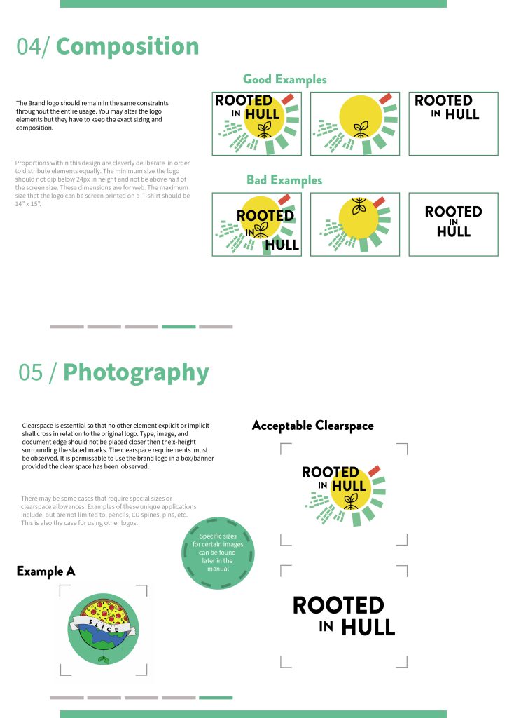
The final page includes the compositional grids that the logo can conform and photographic advice when positioning said logo in a design. The composition of the logo can be marginally altered to explore its different layouts, but it mainly is shown in its original state. This part of the booklet demonstrates acceptable alternatives and non-acceptable alternatives to further emphasise how critical it is to stick by these standards. The photographic advice displays the appropriate sizing for the logo to be shown at and specific sizes the text should be shown over said logo. It also explores how you can use other images when producing Rooted in Hull designs but they much provide context and help the audience understand the text in a visual way. These are both very important when conforming to the graphic standards that the brand stick by throughout design.
Final Page (Page 3)
Overall, these standards are straight forward and easily understandable so that designers for Rooted in Hull can follow this in the future.
Bibliography
stacktrain.xpo.com, n.d. Corporate Identity & Graphic Standards Manual. [Online]
Available at: https://stacktrain.xpo.com/Portals/0/Brochureware/StandardsManual.pdf
[Accessed 14 December 2021].
usi.edu, n.d. Importance of Graphic Standards. [Online]
Available at: https://www.usi.edu/brand/importance-of-graphic-standards/
[Accessed 14 December 2021].