
Introduction to Brief
The second and final original artwork project was to develop and produce a multi-facetted 2D graphic design project created from the Rooted in Hull Master Plan. It should include 3 separate parts and relate back to knowledge from the previously studied subjects: colour, typography, composition, and conceptual design. Possible examples for the chosen project range from web design, app design, a social media campaign, branding packaging, or farm shop identity. From personal interest, I chose the social media campaign and to specifically focus on enticing contributors to donate to the Urban Farm. The 3 different concepts that were picked are 3 different social media platforms: Instagram, Youtube, and Facebook. The plan is to transform the current accounts to be more lively and attract more donators, whilst also sticking to the graphic standards manual.
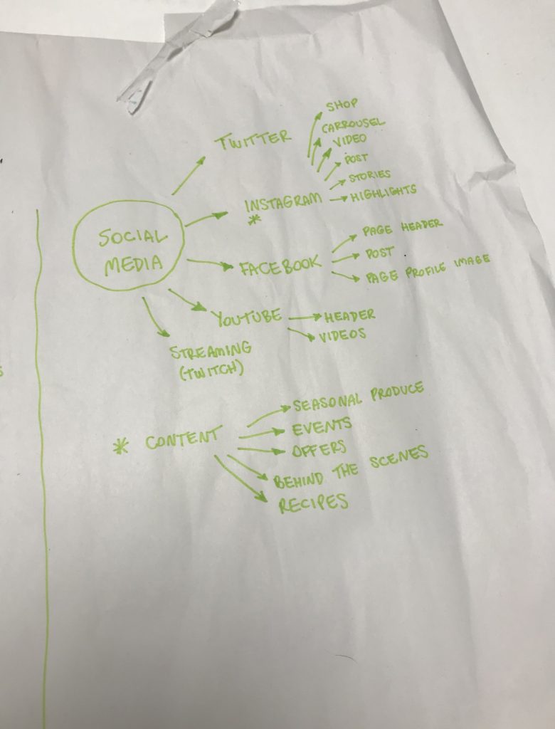
A small bullet point list was initially drawn out with ideas for content and where to display certain chunks of information.
Planning
Initial Research
The first step before reproducing the accounts was to research what fonts and sizes the platforms use as this needed to be as professional as possible when working for a client. Looking at Instagram initially, for a Square Post (which is what is created for this certain project) the recommended high quality size is 1080px by 1080px. Their stories and highlights are slightly different as they are vertical and should be 1080px by 1920px with an aspect ratio of 9:16. (Warren, 2021). The font that Instagram use is one of the most well-known typefaces in the world – Neue Helvetica. (designyourway.net, n.d.). When looking at Youtube the custom thumbnails sizes are recommended to have a resolution of 1,280 x 720 and should remain under the 2 MB limit. (support.google.com, n.d.). The overall used font for titles and descriptions of Youtube videos is Roboto and Roboto Mono. They can be found under the automated Adobe fonts. (Anonymous, 2017). Facebook is a lot more simpler and consists of using either Helvetica or Arial, the most popular fonts to date. (designyourway.net, n.d.).
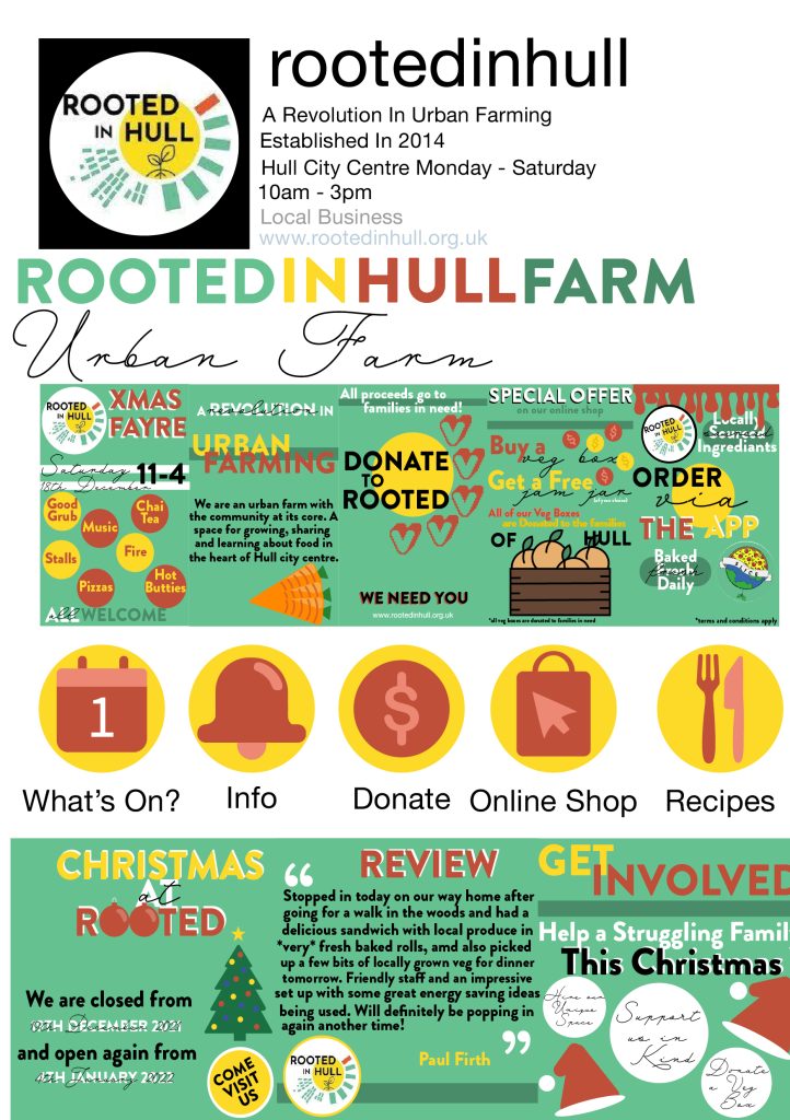
Adobe Re-Designed Instagram Pages
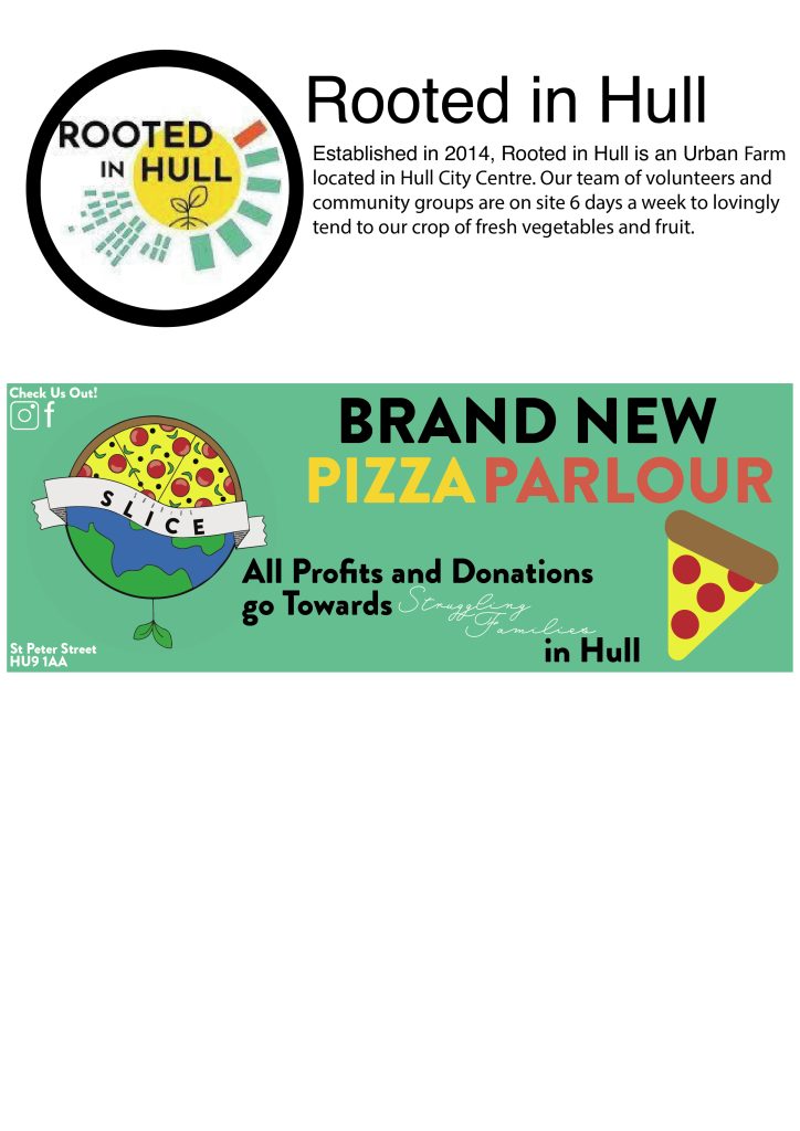
To begin, I gathered all my fonts and colours ready started sizing up boxes so that all of the proportions were correct and everything was accurate. The main areas that were focused on are the highlight reels images, the highlights post to match those reels and 3 posts that are on the feed. The profile picture consists of the original untouched Rooted in Hull logo. The bio has been slightly edited to focus on informing and attracting more guests to visit the farm. A link was included to the website so that anyone who cannot visit, can easily donate if they want to. The 5 highlights include: What’s on, Info, Donate, Online Shop, and Recipes. The colours used for these icons are taken from the graphics standards and are completely original.
The posts under each reel all have some sort of recollection back to encouraging the public to donate. They display the chosen fonts and relevant information needed in a simple composition so that visitors don’t have trouble finding this. The posts on the page are related to events happening in the current time frame and aim to promote events/ways to get involved with giving to the site. The middle post involves a good review so that people can see from other perspectives that it will be worth their time visiting and encourage them more. Below you can see that the left image is what the account at first look would look like and on the right it shows all the different components created/used to promote donations and overall be more inviting to new guests whilst also giving a professional look.
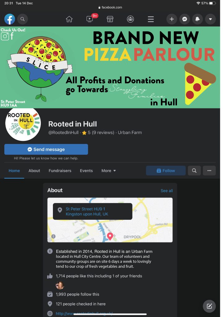
Adobe Re-Designed Facebook Pages
The Facebook pages don’t have many chances to use graphic design to explore Rooted in Hull’s tactics however the regular posts can be updated more frequently like the Instagram so that the public can access information if they don’t have multiple social media’s. The profile picture is again the same as previous yet the header is slightly altered. This aims to promote the new pizza parlour that is open on site and explains how the profits and any extra donations go towards helping local struggling families.
This is also great advertisement to gain good public reviews to the bakery and entice people to visit more frequently. This campaign is the excellent way to improve donations to help the families of Hull. The map is clear so that people won’t have issues in getting directions to the site and the information section clearly explains the basics to the Rooted in Hull company. This has been altered in comparison to the original Facebook page.
Adobe Re-Designed YouTube Page
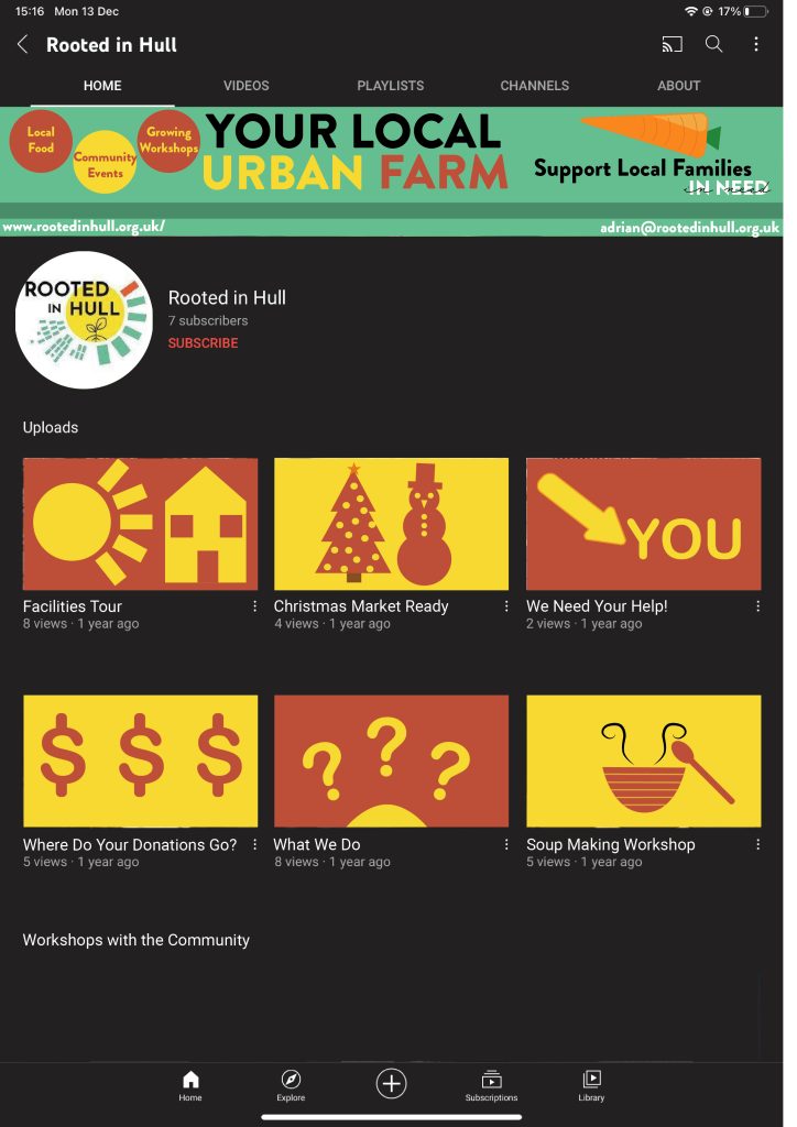
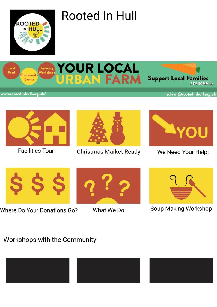
The final social media that was completed was the Youtube account. The aim was to make the video titles appealing and so that the general public can see for themselves what good Rooted in Hull is doing. The header gave some simple examples of what they do on the site and includes the address so that people can visit. Using ‘YOUR’ is great direct address so that the target demographic can feel like they’re personally involved. The profile picture stays continuous throughout the pages so that it is recognisable.
6 key video ideas are chosen that will pull in the viewer to click on them and the thumbnails match that attitude. They are all informal and the person viewing can get the relevant information they need that relates to the titles. All of the designs follow strict graphic standards yet are exciting for the eye and the choices made all link back to the Rooted in Hull’s identity and cause. At the bottom there is a smaller section that shows workshops within the community and is very specific to the raising money and donating part of the project.
Conclusion
This second original artwork project is extremely successful and heavily promotes Rooted in Hull’s idea of pressing the donation awareness so that more struggling families can be helped. It conforms to the graphic standards manual and uses graphic design to create new and upcoming social accounts for Rooted in Hull to promote their urban farm.
Bibliography
Anonymous, 2017. What font is used on YouTube for video titles etc.?. [Online]
Available at: https://www.quora.com/What-font-is-used-on-YouTube-for-video-titles-etc-It-is-not-Roboto
[Accessed 14 December 2021].
designyourway.net, n.d. What font does Facebook use in its app and website?. [Online]
Available at: https://www.designyourway.net/blog/typography/what-font-does-facebook-use/
[Accessed 14 December 2021].
designyourway.net, n.d. What font does Instagram use?. [Online]
Available at: https://www.designyourway.net/blog/typography/what-font-does-instagram-use/
[Accessed 14 December 2021].
support.google.com, n.d. Add video thumbnails. [Online]
Available at: https://support.google.com/youtube/answer/72431?hl=en-GB
[Accessed 14 December 2021].
Warren, J., 2021. Instagram Image Size & Dimensions for 2022. [Online]
Available at: https://later.com/blog/instagram-image-size/
[Accessed 14 December 2021].