
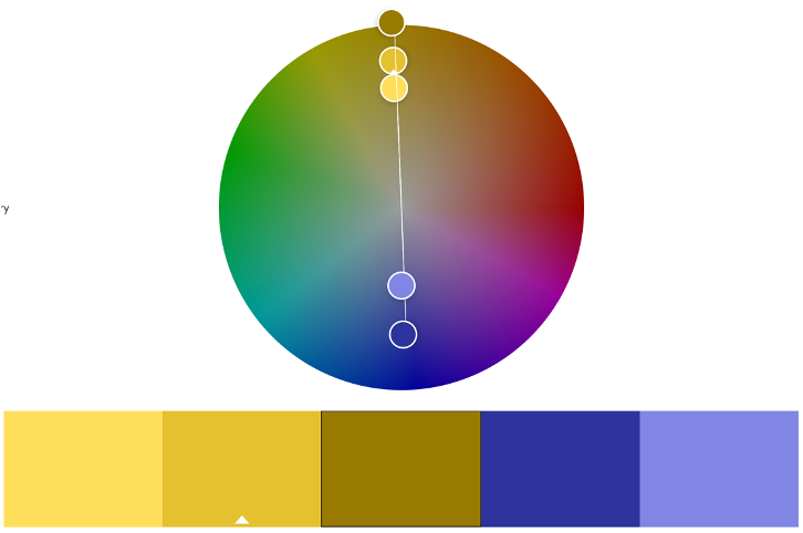
After completing a low-fidelity wireframe in the previous project, it was now time to think about creating a mid-fidelity prototype and discuss more in-depth choices to produce this. The first thought was to look at an appropriate colour palette to use when producing elements of the design. Since we are referencing a cheese festival, the obvious colour that comes to mind is yellow. Looking at the traditional colour wheel, the complementary colour of yellow is purple, therefore this would be a good option when comparing text and background colours in the model. Yellow is very much a warm, energetic colour yet purple is cool and mysterious. (J.L.Morton, 1995).
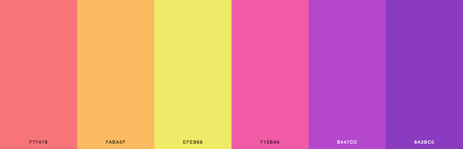
When looking at the some of the shades of yellow, these could easily be used as attractive details such as borders or backgrounds to enforce the energy and positive connotations to keep the user intrigued. (colorsexplained.com, 2021). However, we do not want to over-stimulate the viewer with too many confusing combinations as this will deter them and make it inaccessible. Comparing back to the low-fidelity prototype, I used yellow and black as a questionable pairing. Usually, this combination is a very alarming one and is combined to display hazards, therefore I want to change any black markings I previously displayed to a brown colour to again compliment the yellow tones. (simplified.co, 2021). The purple combinations will be light shades to ensure that they’re seen as the compliment colour and won’t take the attention away from the yellow central theme. Below shows the colour scheme created using Adobe Colours Complementary tool:
Continuing down the planning route, I wanted to create a mood board of numerous found images to help me when discussing design choices for the future templates. Mood boards relating to UI design are a great way to set out the look and feel of a future project without having to produce anymore work. You can include screenshots, videos, texts, and links that emphasise the style that you’re going for. (milanote.com, n.d.). Linking back to the connotations of the above colours, I wanted to create a collage that was bold and fun but also somewhat minimalist so that users can easily follow the thought process. The tone of the board needed to be outgoing and optimistic. (Ascanio, 2019).
My font decision matched my energetic theme, and I enlarged these so that it would stick into the viewer’s mind; using sans serif I felt was more modern and friendly. Besides just having colour-relevant images I wanted to include colour schemes too which I did by adding swatches to certain areas of the collage foreshadowing reference points when designing the prototype. These bright colours should trigger appropriate emotions for the audience. There are small sections of notes which you can see include keywords and suitable language that relate to how I want the prototype to evolve. (Ascanio, 2019).


References
Ascanio, P., 2019. A UX guide to designing better mood boards. [Online]
Available at: https://uxdesign.cc/a-mood-board-strategy-for-cohesive-visual-design-5620dec3fed7
[Accessed 09 May 2022].
color.adobe.com, 2021. Adobe Color. [Online]
Available at: https://color.adobe.com/create/color-wheel
[Accessed 09 May 2022].
colorsexplained.com, 2021. 99 Shades of Yellow Color with Names, HEX, RBG & CMYK. [Online]
Available at: https://www.colorsexplained.com/shades-of-yellow-color-names/
[Accessed 09 May 2022].
digitalsynopsis.com, 2012. 47 Beautiful Color Schemes For Your Next Design Project. [Online]
Available at: https://digitalsynopsis.com/design/color-schemes-palettes/
[Accessed 09 May 2022].
J.L.Morton, 1995. The Meanings of Purple. [Online]
Available at: https://www.colormatters.com/the-meanings-of-colors/purple
[Accessed 09 May 2022].
milanote.com, n.d. UI Moodboard Template. [Online]
Available at: https://milanote.com/templates/moodboards/UI-moodboard
[Accessed 09 May 2022].
simplified.co, 2021. The Color Psychology Behind Using Black & Yellow In Branding. [Online]
Available at: https://simplified.co/blog/design/color/black-yellow-branding-color-psychology/
[Accessed 09 May 2022].