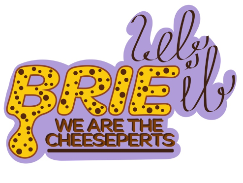
When looking at typography for the designs, there are many elements that need perfecting such as font style, colours, size, spacing, etc. (digitalsynopsis.com, 2012). When sketching the low fidelity prototype, the text was kept simple and bold. I wanted to reflect this in when designing the final prototypes, so I started to experiment with font combinations on Adobe Illustrator. My initial design choice was discussing the logo and what 2 fonts will be used and how these will complement each other and won’t confuse the viewer. Marigny Bold Italic was the most suited for the large ‘BRIE’ as it was extremely like the successful sketch version and was bold enough to allow me to customise the way it looks. The smaller font choice was also Marigny but the medium version which looks a lot different. This is a simple yet clear piece of copy which gets the slogan across to the audience.

When debating how to create the ‘let it’ part, I tried multiple fonts, but they didn’t fully achieve what I wanted it to, so I free-handed and drew what I felt was a more accurate representation. This provides a stylish and sophisticated look for the festival. (digitalsynopsis.com, 2012). Putting this all together created a fun, friendly festival logo that I could use and duplicate to other parts of the design. When thinking of the smaller copy throughout, it needed to be a clear and informative one so therefore, I chose DINosaur. Overall, the combination of fonts and design choices make the typography fit the style and feel of the design.
Considering the mid-fidelity prototype, this needed to be more advanced that the previously designed low fidelity, but not to as high of a standard as the final high-fidelity prototype. This means it’ll provide some of the critical information and functionality used but not all of it. It is more like a series of wireframes linked together to perform levels of interactivity. (Martinez, 2020). Since the logo graphic had already been created, that was used to display where this would go, but this was in black and white, so the colour scheme didn’t have to be finalized.
The whole design had relevant copy, but no images set in stone which won’t draw the viewer away from the interactivity side. Using Adobe XD, we were able to link screens and actions so that the app and website was reasonably functionable and can perform responses when it is engaged with. Below is a link so you can interact for yourself and see how this mid-fidelity prototype was successful. I have only completed a mid-fidelity prototype for the app screens as my high-fidelity prototype will be created using responsive design.
https://xd.adobe.com/view/b767e39b-e999-45e2-bc85-a0eb0c3a50f3-e234/
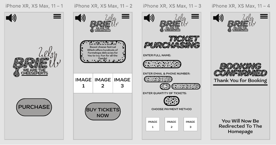
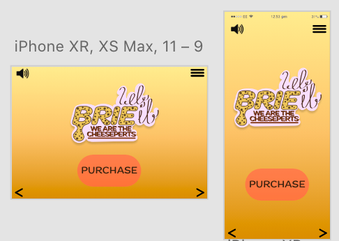
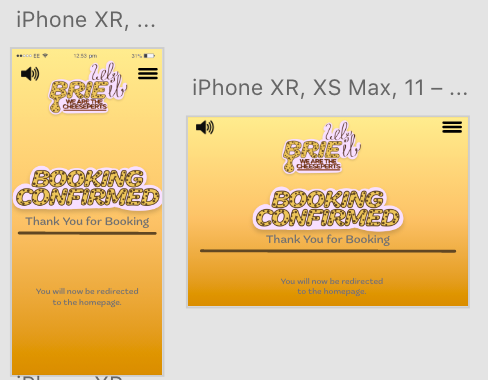
The second selection of layouts I looked at were created Responsive Design Layouts. This is a Graphic User Interface (GUI) approach used to create content that adjusts smoothly to various screen sizes. (interaction-design.org, 2002). This is important to ensure that web designs can easily be accessed on handheld devices and vice-versa. I decided to carry-out the mobile-first approach as handheld technology is becoming the preferred method of technology nowadays. This will ensure an easier practice because we only have to upscale for the desktop version and not have to resize if we were downscaling for the mobile.
There is a great tool in Adobe XD called ‘Responsive Resize’ which was extremely helpful when it came to producing these screens. I grouped elements such as ‘headers’ and ‘footers’ together so that it was organised and will scale accordingly. This was a very quick and efficient way of ensuring that my design is accessible for all devices. As you can see below, I used the previous mid-fidelity prototype to create this. I haven’t included responsive design from turning website into mobile as my approach when completing the high-fidelity prototype will always be mobile-first so the website will simply be upscaled.
References
digitalsynopsis.com, 2012. What Different Types Of Fonts Mean And How To Use Them. [Online]
Available at: https://digitalsynopsis.com/design/font-psychology-emotions/
[Accessed 10 May 2022].
interaction-design.org, 2002. Responsive Design. [Online]
Available at: https://www.interaction-design.org/literature/topics/responsive-design
[Accessed 10 May 2022].
Martinez, P., 2020. What is Mid Fidelity Prototype and The Usages of It. [Online]
Available at: https://mockitt.wondershare.com/prototyping/mid-fidelity-prototype.html
[Accessed 10 May 2022].